Intuition
I ran acorss this issue when I was testing a client’s website acorss different browsew, we use a font-family of Barlow Bold across the website for <b> or <strong> component to add a bit of visual highlight to the audience. After completed the development of the whole site mainly using chrome, I tested for the responsiveness and cross-browser via firefox and edge, of which all looks fine; Until I opened the website using safari, all the sudden all the text starting to look bolder and blurried.
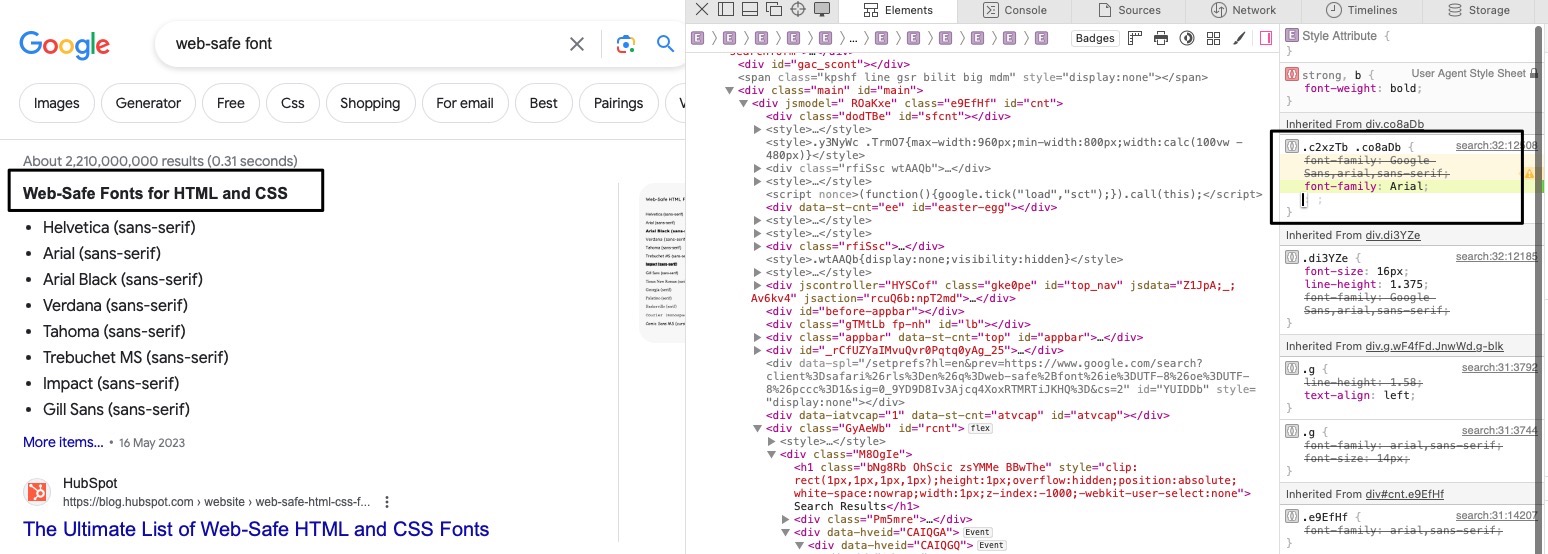
After some play-around I found the similar issue occuring on “Google”


A TLDR quick fix to make “safari and chrome font look the same” is to use one of the “web-safe front”, for instance “Arial”, like below:

