Why we need container query ?
Intuition - What does it differs to Media Query (@media)
You might be very familiar with controlling the style of the component depending on the device width via the @media query, for instance I’ve been using the following code snippets to style full-width component for all device endpoints in Drupal:
| |
Media Query is very handy for most cases, with a slight draw back that one will have to cater for every single relevant components’ style along with the styling for component of interest. Let me explain - say for instance you have two container both in a flex layout, you only care about the style for the first component, you want it to hide the long description text whenever its width is too narrow.
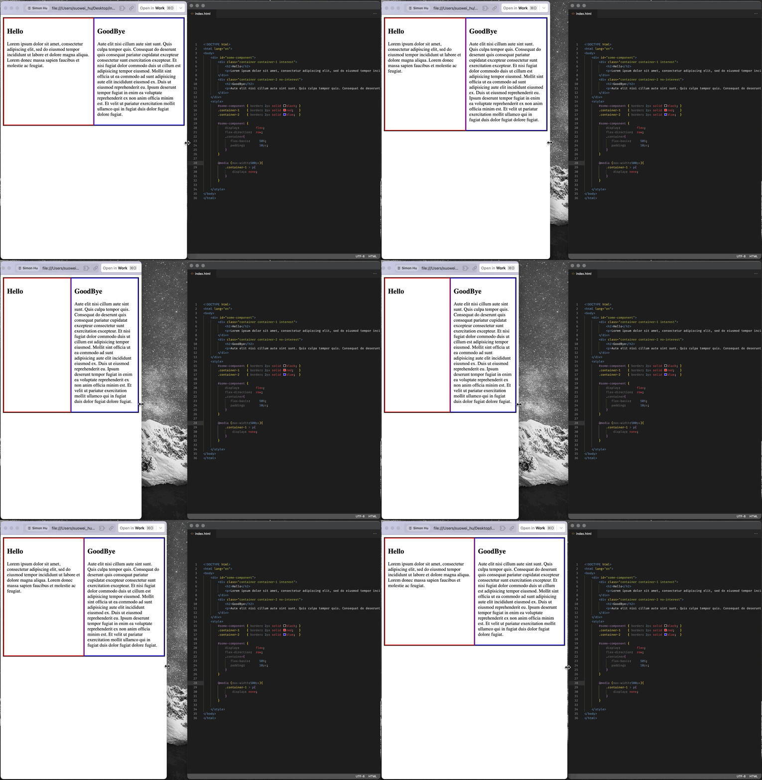
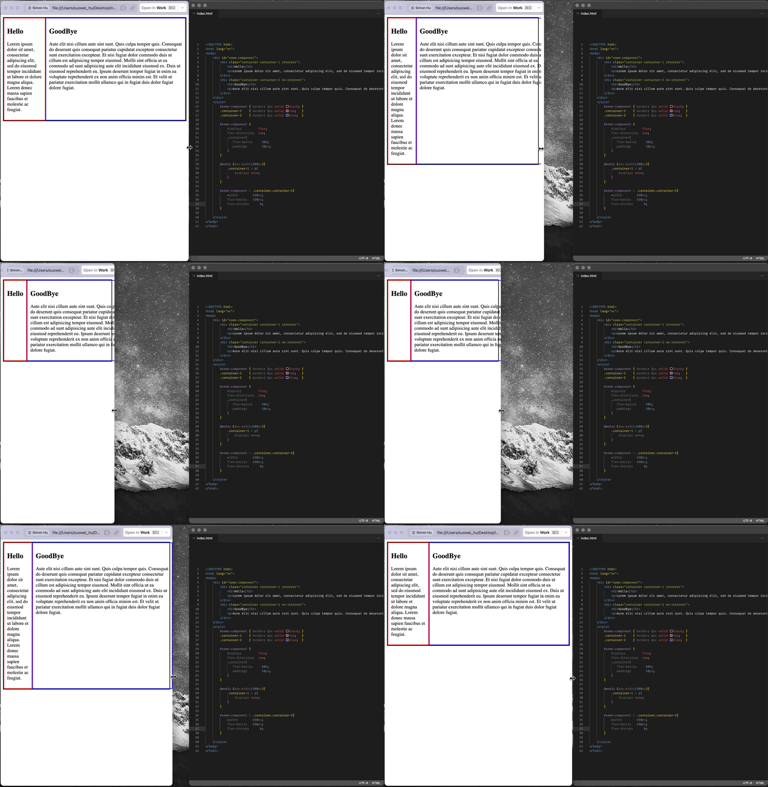
The above example showcase the example, when the screen reaches 500px upper echelon, the <p> component in the first container will be hidden; But truth of fact, we are not concerned with the width of device/breakpoint, in nature what we want to do is to hide the description when the container does not have enough space to display it gracefully (we are interested in the width of the container !). The media query will not 100/100 work for that, for example if the sibling component container-2 happen to get a fixed width that squeeze the container-1 to a smaller available flex space, the media query may no longer work. (this is just one example to showcase the challenges, the real-world scenarios are much more complicated)
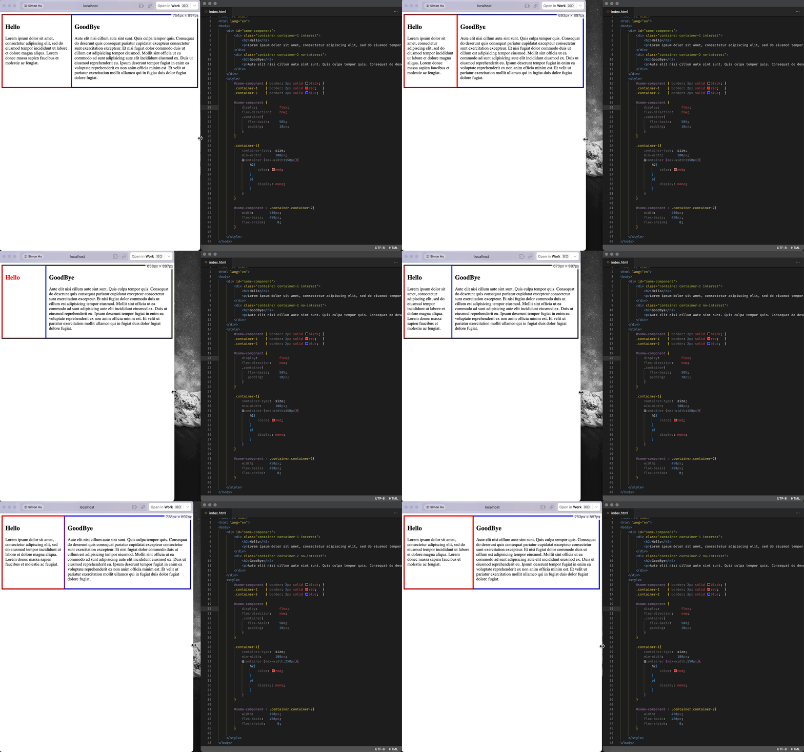
Container queries are essential in this context, as they enable components to manage their styles independently based on their own properties, such as width and height, rather than relying on potentially irrelevant global properties. This approach also enhances the “containerized” or “componentized” styling of containers.
Why care about CSS Container Queries?
Below are some of the reasons proposed by Geoff Graham at CSS-Trick (reference), for why we need to use container queries:
- When using a container query, we give elements the ability to change based on their container’s size, not the viewport.
- They allow us to define all of the styles for a particular element in a more predictable way.
- They are more reusable than media queries in that they behave the same no matter where they are used. So, if you were to create a component that includes a container query, you could easily drop it into another project and it will still behave in the same predictable fashion.
- They introduce new types of CSS length units that can be used to size elements by their container’s size.
Container Query (@container)
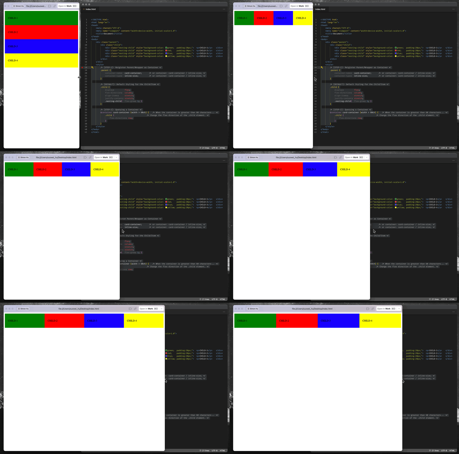
Container queries are come to people’s attention recently, unlike traditional responsive design techniques that focus primarily on the device’s viewport size, container query enables a whole world of possibilities of styling the website’s component based on it’s container’s width. Below is an example of the container query:
| |
Step-1: Register Parent/Wrapper as Container
To begin with, as aforementioned in the intuition, you will need to claim a container via container-type (since if you do not, the container’s size will have a reverse dependency towards its inner child):
- if you claim
container-typeto benormal, then none of the contianer query will work(because the containers width & height are all dependent on the child, in order for the query to work, a container cannot be sized by what’s in it !) - if you claim
container-typeto beinline-size, then you can later use container query on its width, but not the height - if you claim
container-typeto besize, then you can use container query on both the width and height
(*Optionally, you can also define a container-name, an unnamed container will match any containter that full-fills its wrapping selector. Below are an examples for the two:
Container-name : gif example
1 2 3 4 5 6 7 8 9 10 11 12 13#html <div class="parent"> <div class="child"> <div class="sub-child"> #css .parent{ container-type: size; container-name: example-container; } @container example-container (width > 200px) and (height > 200px){ .child{ ... } }Using Selector: gif example
1 2 3 4 5 6 7 8 9 10 11 12 13 14 15#html <div class="parent"> <div class="child"> <div class="sub-child"> #css .parent{ container-type: size; } .parent{ @container example-container (width > 200px) and (height > 200px){ .child{ ... } } }
Step-2: Querying a Container (and Styling Element within Container)
After declaring the container in the first step, you can then control the style of its inner element based on the container’s width (and/or height) property. The .child and .child > .sub-child element in the below example, represents an item in the container, whether it’s a direct child of the container or a further ancestor. Either way, the element must be in the container and it will get styles applied to it when the queried condition is matched.
| |
(*You can also query based on the container’s style, and device’s orientations, for instance:
| |
Containment API (container-type)
Relation between “Containment API” and “container query”
You might have noticed that in order for the @container query on the child to work, we always have to set containter-type property on the parent. And after some testting, it can be found that:
- When the parent’s
container-typeproperty is set tonormal(default), all of the@containequery on the child will not be evaluated (will not take effect); - When the parent’s
container-typeproperty is set toinline-size, the@containerheight associated query on the child will work as anticipated, the the@containerwidth query will work as anticipated; - When the parent’s
container-typeproperty is set tosize, all of the@containerquery on the child will work as anticipated;
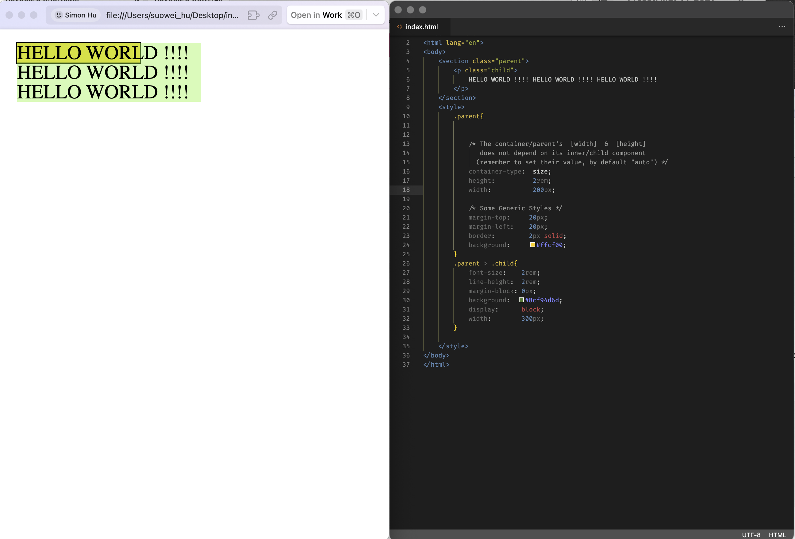
This ie because when we want to change child’s style based on its parent/container’s height/width, we DO NOT want the parent/container to depend on the height/width of the child.
Imagine a case where a parent component’s width is depending on its child (i.e. .parent{width:fit-content;}), and child’s width will be 200px when its parent has width less than 100px (i.e. @container(max-width:100px){.child{widht:200;}}); If the aforementioned constrain does not exist, then the whole component will keep looping/bouncing between 100px and 200px. Below is a similar example using font-size illustated in Josh Comeau’s post:

How does “Containment API” work ?
The container-type property have three different values:
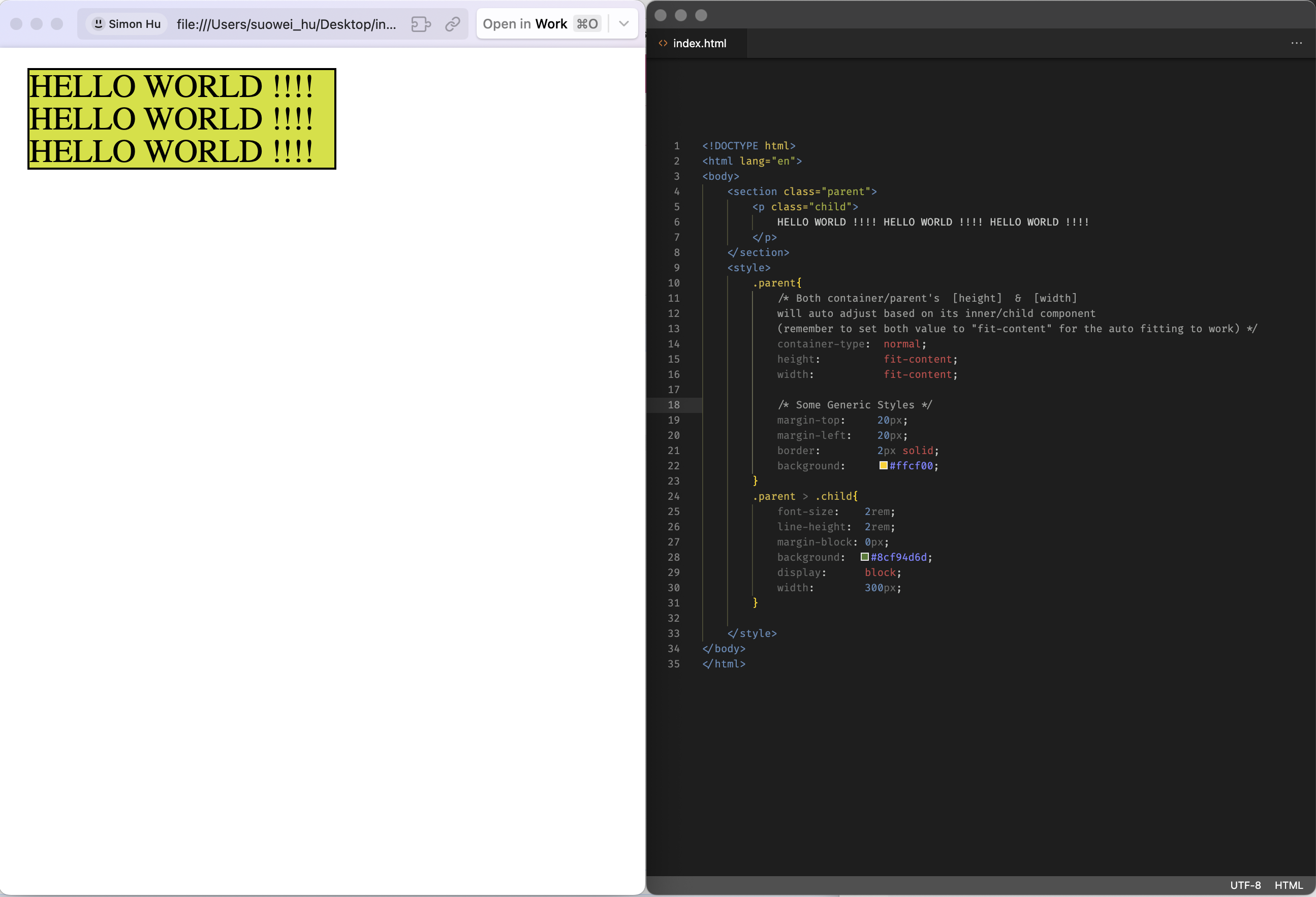
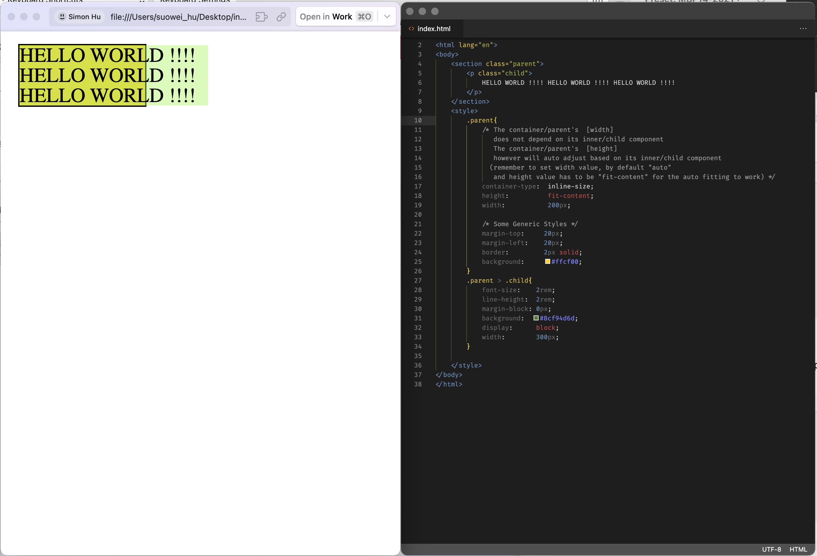
normal: both parent’s width and height can be dependent on the childinline-size: only parent’s height can be dependent on the child, width is either controlled by itself or its parentsize: both parent’s width and height are not controlled by its child
Let’s showcase them one by one:
Example-1: container-type: normal (link)
Example-2: container-type: inline-size (link)
Example-3: container-type: size (link)
