Version 1: JavaSctipt Toggler + CSS Class-name#
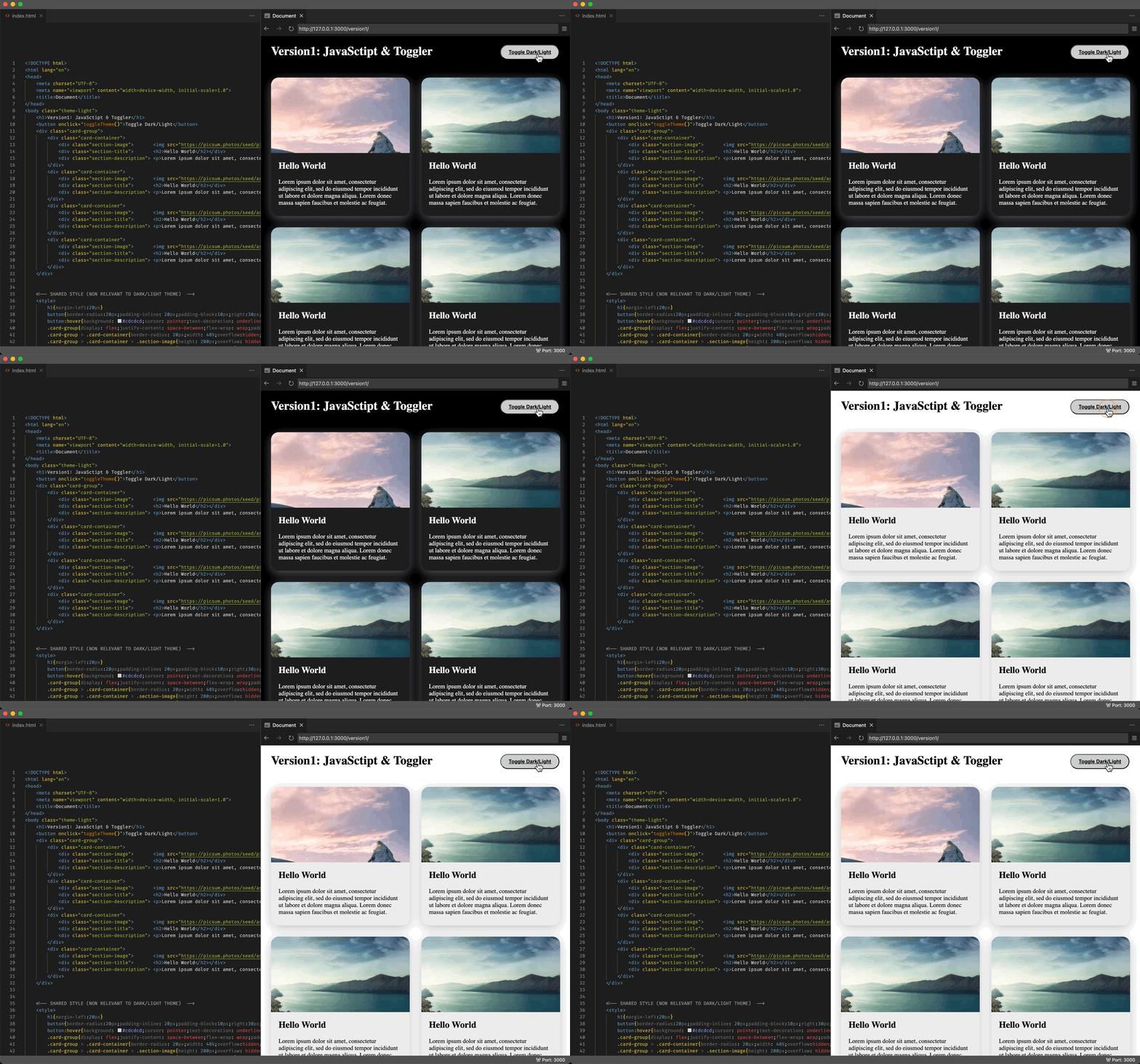
For the longest time, I never know about the media query or light-dark function, so here’s the approach I’ve been going with:

Below are the most relevant code snippets:
 1
 2
 3
 4
 5
 6
 7
 8
 9
10
11
12
13
14
15
16
17
18
19
| ...
<!-- TOGGLER FOR CALSSNAME & ITS SCRIPT -->
<button onclick="toggleTheme()">Toggle Dark/Light</button>
<script> toggleTheme = () => {
document.querySelector("body").classList.toggle("theme-light");
document.querySelector("body").classList.toggle("theme-dark");
}</script>
...
<!-- THEME SPECIFIC STYLE (LIGHT/DARK MODE WILL DIFF) -->
<style>
body.theme-light { background: white; }
body.theme-dark { background: black; }
body.theme-light h1 { color:black; }
body.theme-dark h1 { color:white; }
body.theme-dark .card-container {
color:white;
background: rgb(29, 29, 29);
box-shadow: rgba(215, 215, 239, 0.4) 0px 7px 29px 0px; }
...
|
The complete code can be found at: version-1.html
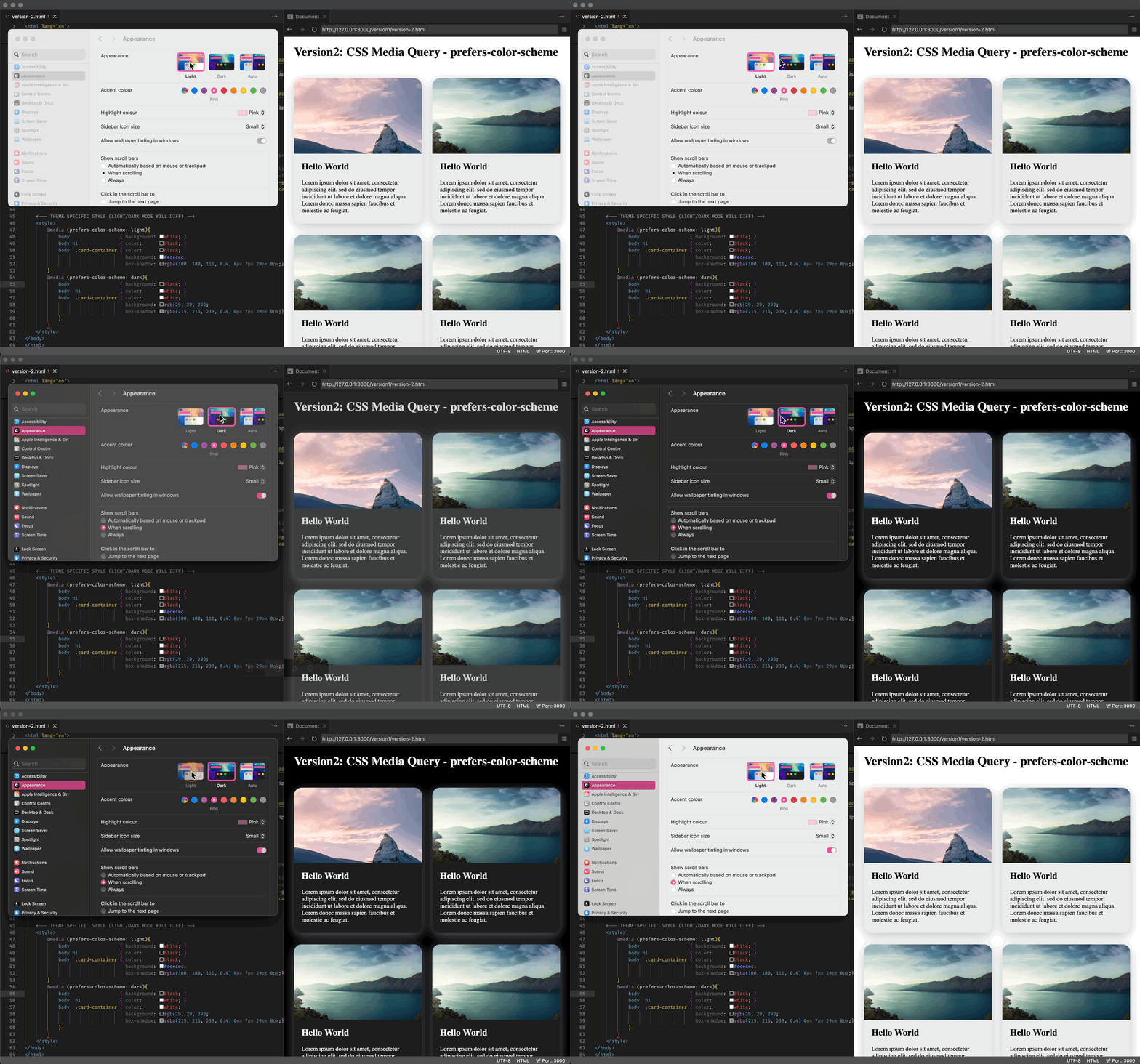
Here’s a more civilized way of implenting the dark/light feature that will display the website differently depending on the system setting:
The prefers-color-scheme CSS media feature is used to detect if a user has requested light or dark color themes. A user indicates their preference through an operating system setting (e.g. light or dark mode) or a user agent setting.

Below are the most relevant code snippets:
 1
 2
 3
 4
 5
 6
 7
 8
 9
10
11
12
13
14
15
16
17
| <!-- THEME SPECIFIC STYLE (LIGHT/DARK MODE WILL DIFF) -->
<style>
@media (prefers-color-scheme: light){
body { background: white; }
body h1 { color: black; }
body .card-container { color: black;
background: #ececec;
box-shadow: rgba(100, 100, 111, 0.4) 0px 7px 29px 0px;}
}
@media (prefers-color-scheme: dark){
body { background: black; }
body h1 { color: white; }
body .card-container { color: white;
background: rgb(29, 29, 29);
box-shadow: rgba(215, 215, 239, 0.4) 0px 7px 29px 0px;}
}
</style>
|
The complete code can be found at: version-2.html
Version-3: CSS Function - light-dark()#
I guess the the previous usecase should be able to cover all your needs, except for that it makes your codebase extremely messy, you would either have to seprate your dark-theme code and light-theme code in different sections (like shown in the above example), or have every single css rule to have this media query, which I am preety sure isn’t a good practice (as it will blow up your css file size un-necessarily):
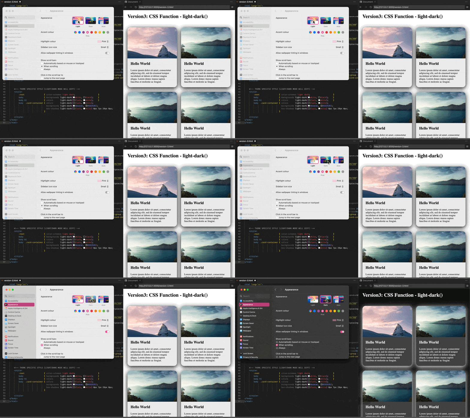
The light-dark() CSS <color> function enables setting two colors for a property - returning one of the two colors options by detecting if the developer has set a light or dark color scheme or the user has requested light or dark color theme - without needing to encase the theme colors within a prefers-color-scheme media feature query.

Below are the most relevant code snippets:
 1
 2
 3
 4
 5
 6
 7
 8
 9
10
| <!-- THEME SPECIFIC STYLE (LIGHT/DARK MODE WILL DIFF) -->
<style>
:root { color-scheme: light dark; }
body { background: light-dark(white, black); }
body h1 { color: light-dark(black, white); }
body .card-container { color: light-dark(black, white);
background: light-dark(#ececec, #353535);
box-shadow: light-dark(black, white) 0px 7px 29px 0px;
}
</style>
|
The complete code can be found at: version-3.html
Reference#
- https://www.youtube.com/watch?v=XtTcWT8XGug
- https://caniuse.com/?search=prefers-color-scheme
- https://caniuse.com/?search=light-dark
- https://developer.mozilla.org/en-US/docs/Web/CSS/@media/prefers-color-scheme
- https://developer.mozilla.org/en-US/docs/Web/CSS/color_value/light-dark
