[TOC]
Problem-1: odd looking last row….
Problem
This issue appear to be most common for me, when having items wrapping in a flex layout, the look of the last row is always somwhat non ideal (assuming you are using flex-direction:row):

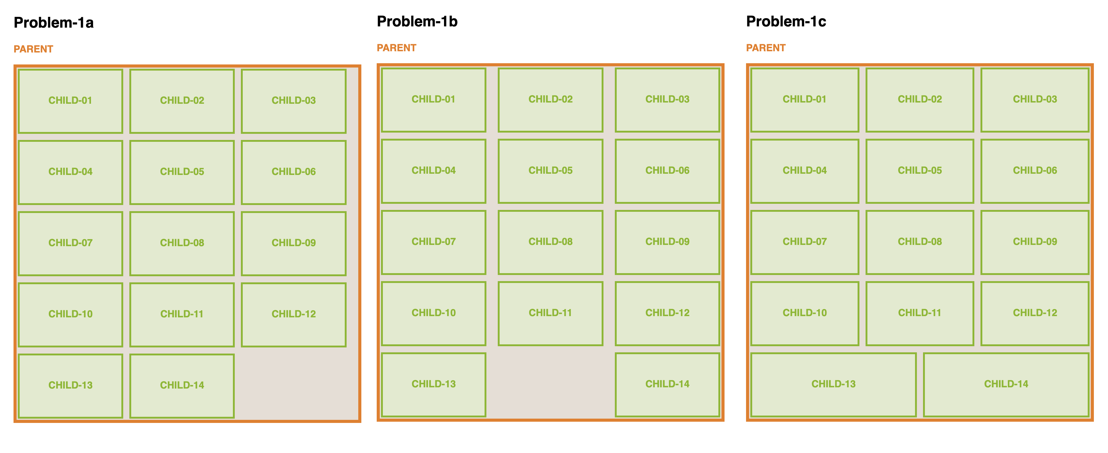
- Problem-1a: If you would want all the childrens in the same column to align up, then you may face the condition where the last column of have a bigger right gutter then the remainder of the columns; (see: screenshot or file)
- Problem-1b: If you come from problem-1a and solves it with
justify-content:space-between, then the problem of the big gutter for last column will be fixed, however the gutter in the middle seems to get to big, and the last row have a empty space in the middle (see: screenshot or file) - Problem-1c: if you come from problem-1b and solves it with
flex-grow:1, congratulations you solved all the probelm in 1a and 1b, but then again, the last column looks over-sized and doesn’t quite fit in the morder design styles. (see: screenshot or file)
Of course you may play around and fix it with many method, to name a few:
- Solution-1: by pixel matching
gapandflex-basisusingcalc(see: screenshot or file) - Solution-2: by adding
marginsto:last-of-type/:nth-of-type(3n)(see screenshot or file)
But the above solution, will only work for one breakpoint, you will need to do repeat this for every breakpoint. Generally speaking this issue seem to bother me every time, and I don’t seem to find a pattern on how to resolve it completely.
Solution
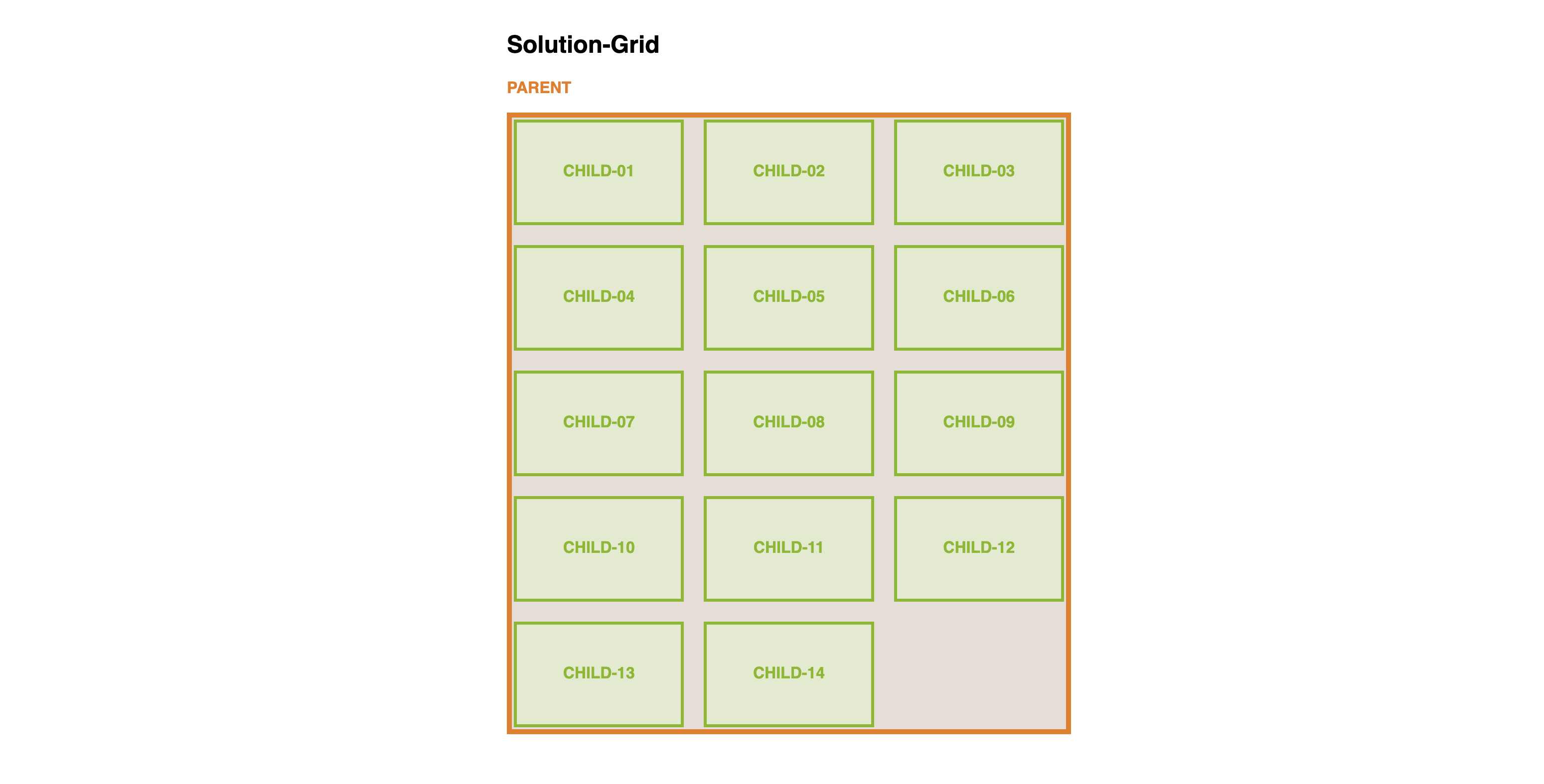
The best way to solve it is to use a grid layout instead of a flex layout (there’s this quote I found meaningful from Coding2GO’s video: “If it looks like a grid, then use CSS Grid!”); With flex layout only have control over one axis of the flow direction (main-axis), whereas with grid layout you have strict and explicit control over both main-axis and cross-axis. (see screenshot or file)

Problem-2: Infinite Scrolling on Mobile
Problem
This is one also happens very common, but can be easily over-looked. Usually when the device width get very small, to fit all the content of the child without wrapping to heavily, it is common to set with to 100% for child when device reaches certain break-point (e.g. @media (max-width:768px){.child{flex-basis:100%}}). Though this approach isn’t flawed in its styling, user experience wise it is not idea; Because unless you are working on a image gallery, a user is likely only want to skim at a portion of the cards along with its parent, but not having to go through all of the cards before getting to the other page content.

Solution
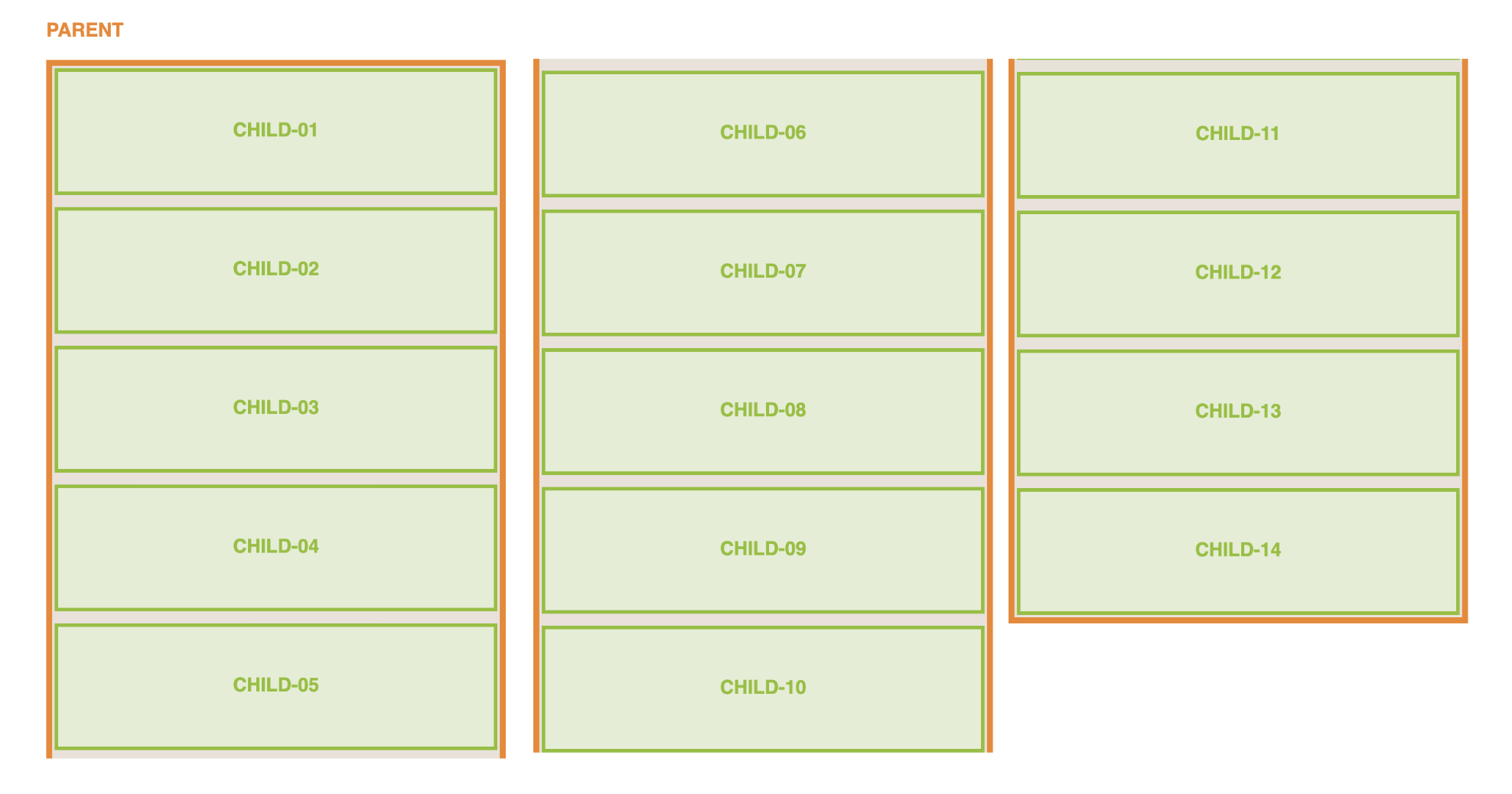
You may resolve it via using overflow-x + scroll-snap as shown in Coding2GO’s video, see below (or file):

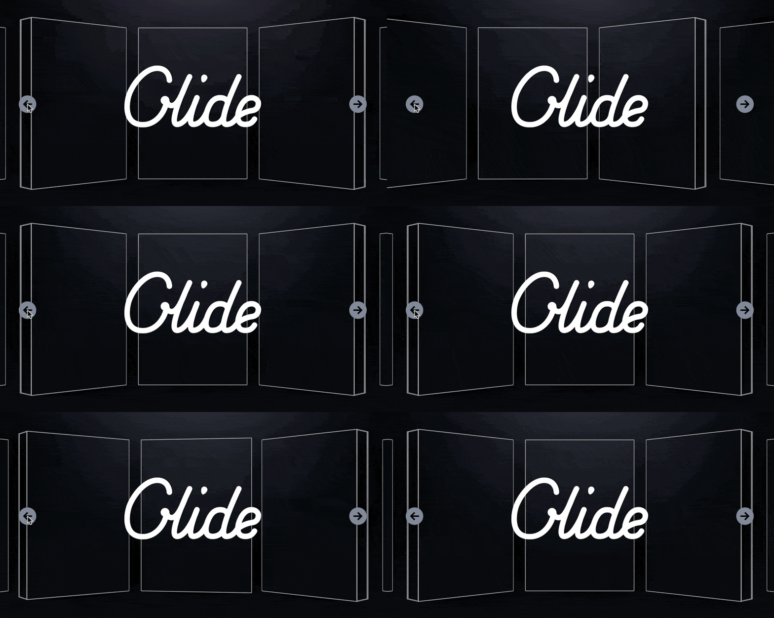
Or via external library such as slick-slider, glide.js or reveal.js to achieve the carousel effect through javascript:
