CVA in React

Class Variance Authority (CVA) is a utility for managing CSS class names based on various conditions. It helps create consistent and maintainable styles in React components by defining variants and conditional classes in a structured manner.

Why Use CVA?

  • Consistency: Ensures consistent styling across your application.
  • Maintainability: Simplifies managing conditional class names.
  • Readability: Improves the readability of your components’ styling logic.

In React you can implement a CVA component via the class-variance-authority library:

<Button> using CVA:

 1
 2
 3
 4
 5
 6
 7
 8
 9
10
11
12
13
14
15
16
17
18
19
20
21
22
23
24
25
26
27
28
29
30
31
32
33
import React from 'react';
import { cva } from 'class-variance-authority';

const buttonStyles = cva(
  'base-button',
  {
    variants: {
      size: {
        small: 'button-small',
        medium: 'button-medium',
        large: 'button-large',
      },
      color: {
        primary: 'button-primary',
        secondary: 'button-secondary',
      },
    },
    defaultVariants: {
      size: 'medium',
      color: 'primary',
    },
  }
);

const Button = ({ size, color, children }) => {
  return (
    <button className={buttonStyles({ size, color })}>
      {children}
    </button>
  );
};

export default Button;

Usage of the <Button> component:

 1
 2
 3
 4
 5
 6
 7
 8
 9
10
11
12
13
14
import React from 'react';
import Button from './Button';

const App = () => {
  return (
    <div>
      <Button size="small" color="primary">Small Primary Button</Button>
      <Button size="medium" color="secondary">Medium Secondary Button</Button>
      <Button size="large" color="primary">Large Primary Button</Button>
    </div>
  );
};

export default App;

(Referenced from: Media - Lorem ipsum)

CVA in Drupal

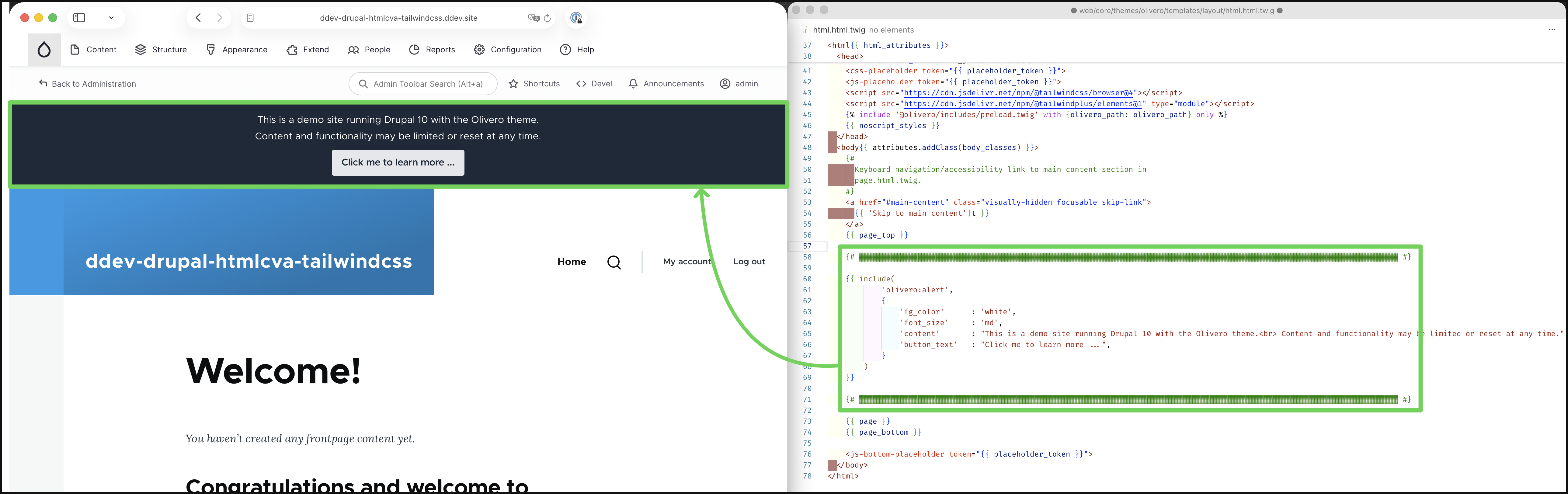
To make the html_cva twig function available in a Drupal environment, you can install this contributed module: CVA (Class Variance Authority) (link), below is an example usage of this function to create an Alert component.

Below are the code for the Alert SDC component:

your_theme_name/components/alert.component.yml

 1
 2
 3
 4
 5
 6
 7
 8
 9
10
11
12
13
14
15
name: Alert
description: 'An alert component for displaying important messages and notifications.'
status: stable
library: 'your_theme_name/alert'
props:
  content:
    type: string
    description: 'Alert message content'
  button_text:
    type: string
    description: 'CTA button text'
    required: true
  ...
  ...
  ...

your_theme_name/components/alert.twig

 1
 2
 3
 4
 5
 6
 7
 8
 9
10
11
12
13
14
15
16
17
18
19
20
21
22
23
24
25
26
27
28
29
30
31
32
33
34
35
36
37
38
39
40
41
42
43
44
45
46
47
48
49
50
51
52
53
54
55
56
57
58
59
60
61
62
{% set alert_container = html_cva(
    base: 'alert_container text-center p-4',
    variants: {
        bg_color: {
            gray:    'bg-gray-800',
            blue:    'bg-blue-800',
            red:     'bg-red-800',
            green:   'bg-green-800',
        },
        border: {
            none:   'border-none    border-2! border-gray-400',
            dotted: 'border-dotted  border-2! border-gray-400',
            solid:  'border-solid   border-2! border-gray-400',
            dashed: 'border-dashed  border-2! border-gray-400',
        }
    },
    default_variant: {
        bg_color: 'gray',
        fg_color: 'white',
        border:   'none',
    }
) %}

{% set alert_content = html_cva(
    base: 'alert_content',
    variants: {
        fg_color: {
            white:    'text-white',
            black:    'text-black',
        },
        font_size: {
            sm:    'text-sm',
            md:    'text-md',
            lg:    'text-lg',
        }
    },
    default_variant: {
        fg_color: 'white',
        font_size:   'md',
    }
) %}

{% set button = html_cva(
    base: 'alert_button text-gray-800! font-semibold px-4 py-2 rounded mt-2 block w-fit ml-auto mr-auto transition-all duration-150 hover:cursor-pointer hover:inset-shadow-sm hover:inset-shadow-black/30',
    variants: {
        color: {
            gray:  'bg-gray-200 hover:bg-gray-300',
            blue:  'bg-blue-200 hover:bg-blue-300',
            red:   'bg-red-200  hover:bg-red-300 ',
        },
    },
    default_variant: {
        color: 'gray',
    }
) %}


<div class="{{ alert_container.apply({bg_color, border}, class) }}">
    <p class="{{ alert_content.apply({fg_color, font_size}, class) }} "> {{ content|raw     }} </p>
    <a class="{{ button.apply({}, class) }}">                            {{ button_text|raw }} </a>
    </div>
</div>

And here’s an example usage using {{ include() }}

image-20251208131153497

  • Drupal Contributed Module - CVA (Class Variant Authority): link
  • Twig Documentation - Function html_cva(): link
  • Medium - Introduction to Class Variance Authority (CVA) in React - Lorem ipsum: link
  • GitHub - twigphp / html-extra: link (composer: link)
  • GitHub - twigphp /twig-extra-bundle: link (composer: link)