Clamp Overview
For the longest time, I have always mistakenly thought that there’s some super-power in the clamp() function, that it “automatically” picks a best number based on min, max, and preferred value given (e.g. if we have clamp(10px, 15px, 20px), the value can be any value between 10px ~ 20px )
But the truth is that clamp doesn’t have ANY magics in it !
The clamp(MIN, PREFERRED, MAX); function is equivalent as: max(MIN, min(PREFERRED, MAX))
The “fluid” part actually comes from the relative units such as:
- viewport-relative unit:
clamp(100px, 10vw, 200px)(relative to the viewport’s width) - parent-relative unit:
clamp(50px, 66%, 60px)(relative to parent’s width/height percentage) - font-relative unit:
clamp(10px, 1.2em, 16px)(relative to the parent element’s font-size) - container-relative unit:
clamp(30px, 10cqw, 70px)(relative to closest container)
The relative-parent will change depending on difference scenario, making the preferred value’s “absolute” value change with it, and this absolute value will be clamped by maximum and minimum threshold provided. (e.g font-size: clamp(10px, 0.5em, 15px), if parent font-size is within 20px ~ 30px (10px/0.5 ~ 15px/0.5) then the font-size will be 0.5rem; if the parent font-size is larger than 30px, the font-size will be 15px (upper-bound); if the parent font-size is smaller than 20px, than the font-size will be 10px (lower-bound).
More Example…
Example 1: Fluid Typography
Here’s a slightly more complicated example, of a <div> with a preferred value with combination both fixed and relative units in its min, max, and preferred value:
| |

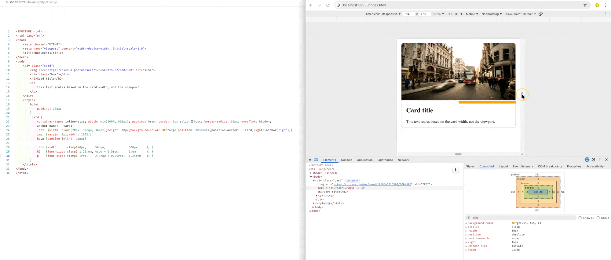
Example 2: Fluid Decoration Box
Here’s an example of fluid card using container query "
| |
Min-Max-Value Interpolation
If you want the unit (e.g. font-size) to adjust between certain two viewport sizes (e.g. the auto font-sizing magic from mobile to desktop), you can use this tool: “Min-Max-Value Interpolation” to preview and trial the values: