(aka: Custom Modal Implementation)
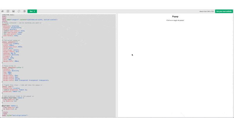
When building a popup modal without the HTML <dialog> element, it typically involves creating a div that expands to full screen width and height, and toggling its visibility using display:none and display:block. An example can be found in this W3Schools post: https://www.w3schools.com/howto/howto_js_popup.asp.
Example Custom Modal using <Div> Element#
*full code can be found at: index-custom-modal.txt
 1
 2
 3
 4
 5
 6
 7
 8
 9
10
11
12
13
14
15
16
17
| <!-- Trigger/Open The Modal -->
<button id="myBtn">Open Modal</button>
<!-- The Modal -->
<div id="myModal" class="modal">
<!-- Modal content -->
<div class="modal-content">
<span class="close">×</span>
<p>Some text in the Modal..</p>
</div>
</div>
<script>
// When the user clicks on <div>, open the popup
function myFunction() {
var popup = document.getElementById("myPopup");
popup.classList.toggle("show");
}
</script>
|
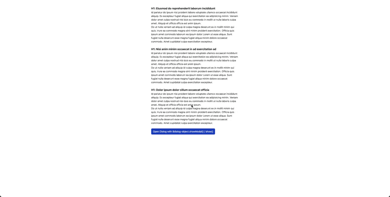
Building Modals using Native HTML <Dialog> Element#
The <dialog> HTML element represents a modal or non-modal dialog box or other interactive component, such as a dismissible alert, inspector, or subwindow.
The HTML <dialog> element is used to create both modal and non-modal dialog boxes.
- Modal dialog boxes interrupt interaction with the rest of the page being inert,
- Non-modal dialog boxes allow interaction with the rest of the page.
JavaScript should be used to display the <dialog> element. Use the .showModal() method to display a modal dialog and the .show() method to display a non-modal dialog. The dialog box can be closed using the .close() method or using the dialog method when submitting a <form> that is nested within the <dialog> element. Modal dialogs can also be closed by pressing the Esc key.
Example <Dialog> Modal HTML (using Tailwind to style):#
*Full code can be found at: index-dialog-modal.txt
 1
 2
 3
 4
 5
 6
 7
 8
 9
10
11
12
13
14
15
16
17
18
19
20
21
22
23
24
25
26
27
28
29
30
| <body>
<div class="...">
...
<button class="..."
onclick="open_dialog(event)">Open Dialog with $dialog-object.showModal() / show()</button>
...
</div>
<dialog id="example-dialog"
class="...">
<h1 class="text-lg font-bold">H1: Example Dialog Heading</h1>
<span>...</span>
<button class="..."
onclick="close_dialog(event)">Open Dialog with $dialog-object.close()</button>
</dialog>
</body>
...
<script>
const open_dialog = (event) => {
const dialog_object = document.getElementById("example-dialog");
if (dialog_object.open == false) {
dialog_object.showModal();
} else { console.log("Dialog already open !!!"); }
}
const close_dialog = (event) => {
const dialog_object = document.getElementById("example-dialog");
if (dialog_object.open == true) {
dialog_object.close();
} else { console.log("Dialog already closed !!!"); }
}
</script>
|

Example <Dialog> Non-modal (using Tailwind to style):#
*Full code can be found at: index-dialog-non-modal.txt
 1
 2
 3
 4
 5
 6
 7
 8
 9
10
11
12
13
14
15
16
17
18
19
20
21
22
23
24
25
26
27
28
29
30
31
| <body>
<div class="...">
...
<button class="..."
onclick="open_dialog(event)">Open Dialog with $dialog-object.showModal() / show()</button>
...
</div>
<dialog id="example-dialog"
class="...">
<h1 class="text-lg font-bold">H1: Example Dialog Heading</h1>
<span>...</span>
<button class="..."
onclick="close_dialog(event)">Open Dialog with $dialog-object.close()</button>
</dialog>
</body>
...
<script>
const open_dialog = (event) => {
const dialog_object = document.getElementById("example-dialog");
if (dialog_object.open == false) {
- dialog_object.showModal();
+ dialog_object.show();
} else { console.log("Dialog already open !!!"); }
}
const close_dialog = (event) => {
const dialog_object = document.getElementById("example-dialog");
if (dialog_object.open == true) {
dialog_object.close();
} else { console.log("Dialog already closed !!!"); }
}
</script>
|
In the meanwhile, different framework may also have their way of implmenting modal natively, for instance the following:
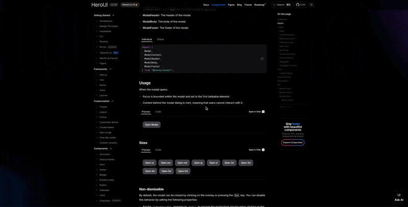
HeroUI (Next.JS)#
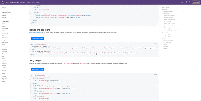
Boostrap (CSS Framework)#
References#