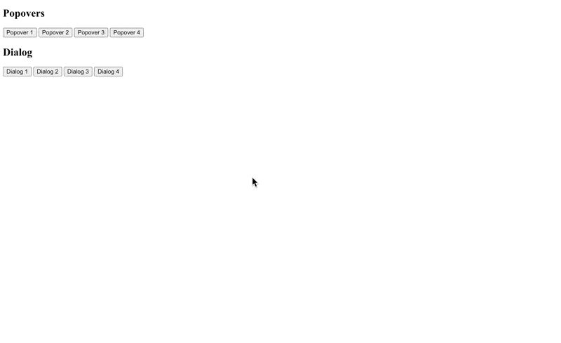
Demonstration
(in browser that does NOT support the anchor position API: 2025-06-12T115714.gif)
(the source code of the above can be found at: index-dialog-popover.html.zip)
Differences
Modal vs Non-Modal Behaviour
- The Popover API always creates non-modal overlays. This means users can continue interacting with the rest of the page even when a popover is open
- The
<dialog>element supports both modal and non-modal dialogs. A modal dialog prevents interaction with the rest of the page until it is dismissed, making it suitable for critical interactions or required user input
Implementation
- The Popover API is an attribute (
popover) that can be added to any HTML element, making it flexible for various UI needs - The
<dialog>is a dedicated HTML element with a JavaScript API for showing and hiding dialogs, and can also be combined with the popover attribute if needed
Positioning
- Popovers are typically anchored to a trigger element and support implicit anchor positioning via the anchor position api, making them ideal for context-sensitive overlays.
- Dialogs are generally centered or fixed in the viewport and do not have built-in anchor positioning
Usage and Typical Scenarios
- Use the Popover API for lightweight, contextual UI components such as tooltips, dropdown menus, teaching bubbles, or notifications—where the user should not be blocked from interacting with the rest of the page.
- Use
<dialog>for modal interactions that require user attention and input before proceeding, such as confirmation dialogs, forms, or alerts