In this post, we explore the integration of the Drupal Radix theme with Tailwind CSS, a utility-first CSS framework that enhances the design and responsiveness of web applications. The article delves into the benefits of using Tailwind CSS within the Radix theme, including improved styling capabilities and a streamlined development process.
Introduction
What is Radix Theme ?
According to the project page of the Druapl radxi theme: link
Radix is the original component-based theme for Drupal. It comes with Bootstrap 5, Sass, ES6, BrowserSync, BiomeJS built-in.
Basically it is a boostrap theme with a bunch of devleopment tools scaffold to assist with the devleopment of the website. For me personally, it stands out for its pre-configured Laravel Mix bundler to automatically compile the SASS, opens up BrowserSync, and copy assets over to the \build folder; And watches over the files changes to re-compile the code, and send reload signal to BrowserSync when required.
What is Tailwind CSS ?
According to tailwind’s landing page: link
A utility-first CSS framework packed with classes like flex, pt-4, text-center androtate-90 that can be composed to build any design, directly in your markup.
To my understanding, the Tailwind CLI will watch over the utility classes you have in your working directory, and generate an tailwind-output.css file based on the utility classes that you have used in your files, for instance bg-purple-500. And you have the ability to add your own utilities via an tailwind-input.css file, for instance variants for colors, font-size, breakpoint and more.
With the help of Tailwind CSS, you won’t have to seprate your HTML and CSS in two different places (as in declaring classname and set styles for classname two different locations). What’s more, you will have access to a world of mordern component library using Tailwind CSS. The components in these libraries are not only easy to implment (comparing to developing your own from scratch), but also adhere to the up-to-date best practices such as accessibility and responsiveness (e.g. DaisyUI, ShadCN).
Setup Instruction
Installing Radix Theme & Configure Sub-Theme
Install the theme via
composer:1composer require 'drupal/radix:^6.0Create the sub-theme using the
drush command:1 2drush --include="web/themes/contrib/radix" radix:create radix_subtheme_name # OR drush --include="./themes/contrib/radix" radix:create radix_subtheme_nameInstall the required dependencies
1 2 3 4 5cd "web/theme/custom/radix_subtheme_name" # Open sub-theme created in previous step nvm use # Use same node version as declared in the .nvmrc file npm install # install dependencies as specified in package.json into node_modules folder cp .env.example .env.local && vi .env.local # edit environmental variable "DRUPAL_BASE_URL" used as BrowserSync's Proxy Domain npm run watch # use laravel mix to build and bundle the theme and start watching for changesEnable the subtheme and set it as the default theme
1 2drush then radix_subtheme_name -y; drush config-set system.theme default radix_subtheme_name -y;You might want to customize the Radix’s Boostrap SASS file to align with your design, for instance I always start by changing the primary color from the default
bluetoblack(more variable can be found at: link):1 2/** [src/scss/base/_variables.scss] **/ $primary: #000;
Installing Tailwind CSS via Laravel Mix
Install dependencies via
npm install:1npm install tailwindcss @tailwindcss/postcss postcssCreate your tailwind input file:
1 2 3 4 5 6 7 8 9 10 11 12 13 14 15 16 17 18 19 20 21 22 23 24 25 26 27 28 29 30 31 32 33 34/** [src/css/tailwind-css-input.css] **/ /* Use Custom Prefix for Tailwind Classnames <---- Instead of using hover:bg-red-500, use opc:hover:bg-red-500 */ /* (this is to prevent the situation where tailwind and boostrap uses the same classname, for instance .container)*/ @import "tailwindcss" prefix(twclass); @theme { /* Boostrap colors <--- such that you can acecss radix bootstrap colors via utility classes*/ --color-primary: var(--bs-primary); --color-secondary: var(--bs-secondary); --color-success: var(--bs-success); --color-info: var(--bs-info); --color-warning: var(--bs-warning); --color-danger: var(--bs-danger); --color-light: var(--bs-light); --color-dark: var(--bs-dark); /* Change breakpoints <--- such that they align with the radux theme boostrap breakpoints*/ --breakpoint-xs: 0; /* 0px */ --breakpoint-sm: 36rem; /* 576px */ --breakpoint-md: 48rem; /* 768px */ --breakpoint-lg: 62rem; /* 992px */ --breakpoint-xl: 75rem; /* 1200px */ --breakpoint-xxl: 87.5rem; /* 1400px */ --breakpoint-2xl: 100rem; /* 1600px */ --breakpoint-3xl: 120rem; /* 1920px */ } :root{ /* Override some boostrap default styles as you wish*/ a{ text-decoration: none; &:hover{text-decoration: underline;}} input, select{ margin-bottom: 16px; } }Here’s an example of complete: tailwind-css-input.css I used in one of my project as reference
Configure your
webpack.mix.jsto includetailwindas a PostCSS plugin:1 2 3 4 5 6/** [webpack.mix.js] **/ mix.postCss( "src/css/tailwind-css-input.css", "build/css/tailwind-css-output.css", [require("@tailwindcss/postcss")] );
(An example of such file can be found at: example_webpack.mix.js)
Re-run
npm run watchand check for the existance of tailwind output file:1 2 3 4 5 6npm run watch cd build/css && ls main.style.css main.style.css.map tailwind-css-output.css tailwind-css-output.css.map(*if you run into infinite loop rebuild/recompile issue, you can solve it via disabling the manifest file in the mix.options
1 2 3 4 5 6 7 8 9 10mix .sourceMaps() .webpackConfig({ devtool: 'source-map', }) .disableNotifications() .options({ processCssUrls: false, manifest: false, <------------ Add this line });
```
Declare the output tailwind as the sub-theme’s library, and let the theme import it by default:
1 2 3 4 5 6 7 8 9 10 11 12 13 14 15# [radix_opc.libraries.yml style: css: theme: build/css/main.style.css: {} js: build/js/main.script.js: {} dependencies: - core/drupal + tailwind-css: + css: + theme: + build/css/tailwind-css-output.css: {}1 2 3 4 5 6 7# [radix_opc.info.yml] ... libraries: - radix_opc/style - radix_opc/bootstrap-icons + - radix_opc/tailwind-css - ...Import the page radix component and attempt to write some Tailwind utility class (here I imported a CTA component from the tailwind plus library: https://tailwindcss.com/plus/ui-blocks/marketing/sections/cta-sections)
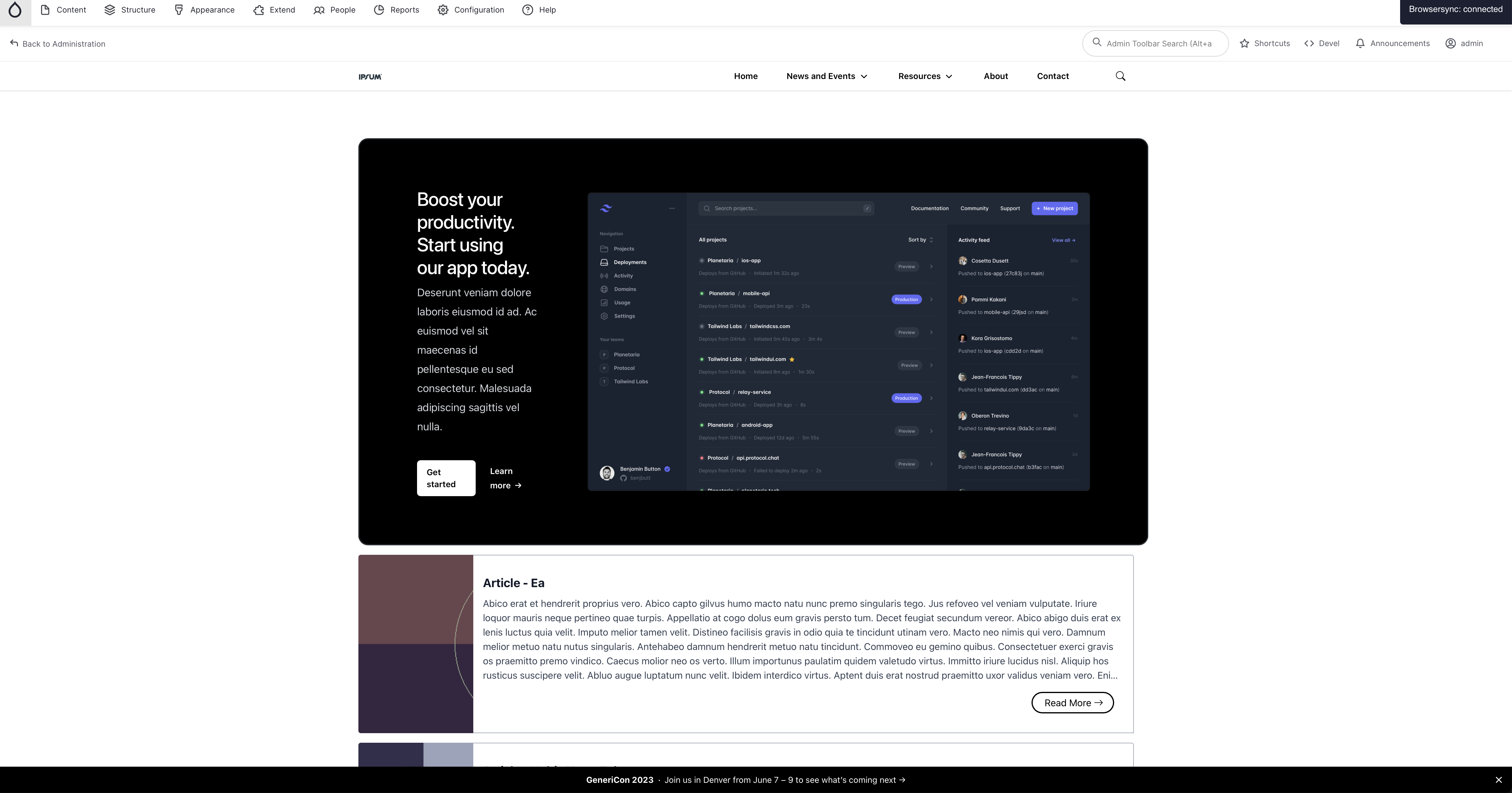
1
2
3
4
drupal-radix-cli add page drupal-radix-cli add page-brand drupal-radix-cli add page-content ddev drush cr1 2 3 4 5 6 7 8 9 10 11 12 13 14 15 16 17 18 19 20 21 22 23 24 25 26 27 28 29 30 31 32 33 34 35 36 37 38 39 40 41 42 43{# page-content.twig #} <main{{content_attributes.addClass(page_main_classes)}}> ... {% if page.content %} <div class="page__content" id="main-content"> <div {{ page_content_container_attributes.addClass(page_content_container_classes) }}> {% block page_inner_content %} - {{ page.content }} + <div class="twclass:bg-white"> + <div class="twclass:mx-auto twclass:max-w-7xl twclass:py-24 twclass:sm:px-6 twclass:sm:py-32 twclass:lg:px-8"> + <div class="twclass:relative twclass:isolate twclass:overflow-hidden twclass:bg-gray-900 twclass:px-6 twclass:pt-16 twclass:shadow-2xl twclass:sm:rounded-3xl twclass:sm:px-16 twclass:md:pt-24 twclass:lg:flex twclass:lg:gap-x-20 twclass:lg:px-24 twclass:lg:pt-0"> + <svg viewBox="0 0 1024 1024" class="twclass:absolute twclass:top-1/2 twclass:left-1/2 twclass:-z-10 twclass:size-256 twclass:-translate-y-1/2 twclass:mask-[radial-gradient(closest-side,white,transparent)] twclass:sm:left-full twclass:sm:-ml-80 twclass:lg:left-1/2 twclass:lg:ml-0 twclass:lg:-translate-x-1/2 twclass:lg:translate-y-0" aria-hidden="true"> + <circle cx="512" cy="512" r="512" fill="url(#759c1415-0410-454c-8f7c-9a820de03641)" fill-opacity="0.7" /> + <defs> + <radialGradient id="759c1415-0410-454c-8f7c-9a820de03641"> + <stop stop-color="#7775D6" /> + <stop offset="1" stop-color="#E935C1" /> + </radialGradient> + </defs> + </svg> + <div class="twclass:mx-auto twclass:max-w-md twclass:text-center twclass:lg:mx-0 twclass:lg:flex-auto twclass:lg:py-32 twclass:lg:text-left"> + <h2 class="twclass:text-3xl twclass:font-semibold twclass:tracking-tight twclass:text-balance twclass:text-white twclass:sm:text-4xl">Boost your productivity. Start using our app today.</h2> + <p class="twclass:mt-6 twclass:text-lg/8 twclass:text-pretty twclass:text-gray-300">Ac euismod vel sit maecenas id pellentesque eu sed consectetur. Malesuada adipiscing sagittis vel nulla.</p> + <div class="twclass:mt-10 twclass:flex twclass:items-center twclass:justify-center twclass:gap-x-6 twclass:lg:justify-start"> + <a href="#" class="twclass:rounded-md twclass:bg-white twclass:px-3.5 twclass:py-2.5 twclass:text-sm twclass:font-semibold twclass:text-gray-900 twclass:shadow-xs twclass:hover:bg-gray-100 twclass:focus-visible:outline-2 twclass:focus-visible:outline-offset-2 twclass:focus-visible:outline-white"> Get started </a> + <a href="#" class="twclass:text-sm/6 twclass:font-semibold twclass:text-white twclass:hover:text-gray-100"> + Learn more + <span aria-hidden="true">→</span> + </a> + </div> + </div> + <div class="twclass:relative twclass:mt-16 twclass:h-80 twclass:lg:mt-8"> + <img class="twclass:absolute twclass:top-0 twclass:left-0 twclass:w-228 twclass:max-w-none twclass:rounded-md twclass:bg-white/5 twclass:ring-1 twclass:ring-white/10" src="https://tailwindcss.com/plus-assets/img/component-images/dark-project-app-screenshot.png" alt="App screenshot" width="1824" height="1080" /> + </div> + </div> + </div> + </div> {% endblock %} </div> </div> {% endif %} </main>See the changes take place:
(*Alternatively, you may install via Tailwind CLI, other than npm run watch you will need to manually run the npx @tailwind/cli ... --watch command everytime your close/open your project. See: Get started with Tailwind CSS)
Conclusion
You can find the outcome of the above setup at: https://github.com/SuoweiHu/radix-tailwind-scaffold-base