Introduction
Skeleton load animations are lightweight placeholders that mirror a page’s final layout, turning waiting into understanding. By revealing structure immediately, they set clear expectations, reduce perceived wait time, and prevent layout shifts.
This visual bridge helps users form a mental model of what’s coming, improves continuity, and feels faster even when the actual load time doesn’t change. When designed with subtle motion, progressive rendering, and accessibility in mind, skeletons signal polish and trust—far more reassuring than a generic spinner.
Intuition
Skeletons are often used when a website encounters long loading times due to either:
- Fetching large data (e.g., images or CSV files)
- Complex processing (e.g., calculations for data)
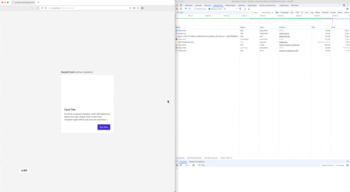
For instance, let’s consider a card with an image, title, body, and a button: If the image is fairly large or the user is experiencing slow internet speed, then below is what they’ll see. Notice how the image area is originally blank until the resource finishes loading. (Compare this to when you have a fast internet + small image.)
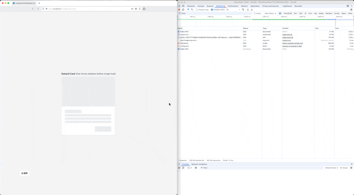
With skeleton, this “loading time” can be handled much more elegantly:
Implementation
Before implementing any logic code, you will need to create a skeleton component that looks visually similar to your component of interest. In the example below, we’ll use the DaisyUI Card component to showcase:
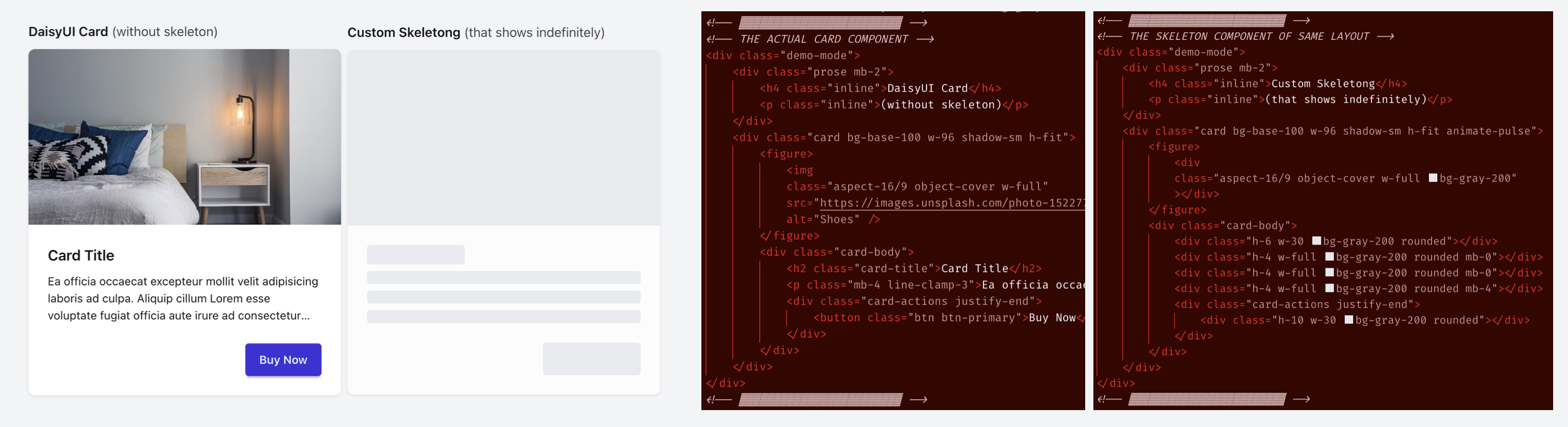
Next, depending on how your component determines that the “data has finished loading/processing,” you will write it slightly differently, but the idea is to hide the skeleton and show the actual component whenever the actual one is ready to be displayed. In the case of the DaisyUI Card component, this happens when the image finishes loading:
| |
The complete source code of this demo can be found here. (Run npm install then npm run build before previewing index.html)
(Note: If you are working with a framework such as React, you could simply use ternary operators such as the following on line 11:)
 1
 2
 3
 4
 5
 6
 7
 8
 9
10
11
12
13
14
import { useState, useEffect } from "react"; import Card from "./components/Card"; import Skeleton from "./components/Skeleton"; function App() { const [loading, setLoading] = useState(true); useEffect(() => { const id = setTimeout(() => setLoading(false), 1000); return () => clearTimeout(id); }, []); return (<div className="flex justify-center items-center h-screen"> {loading ? <Skeleton /> : <Card />} </div>); } export default App;(See this video for more details.)