Blow are some quick scribble notes after skimming through Flavio Copes’s CSS Handbook, 2025 edition:
CSS Function: clamp()
By using the clamp(minimum, preferred, maximum) function, you can clamp a value within a range specified by min and max provided:
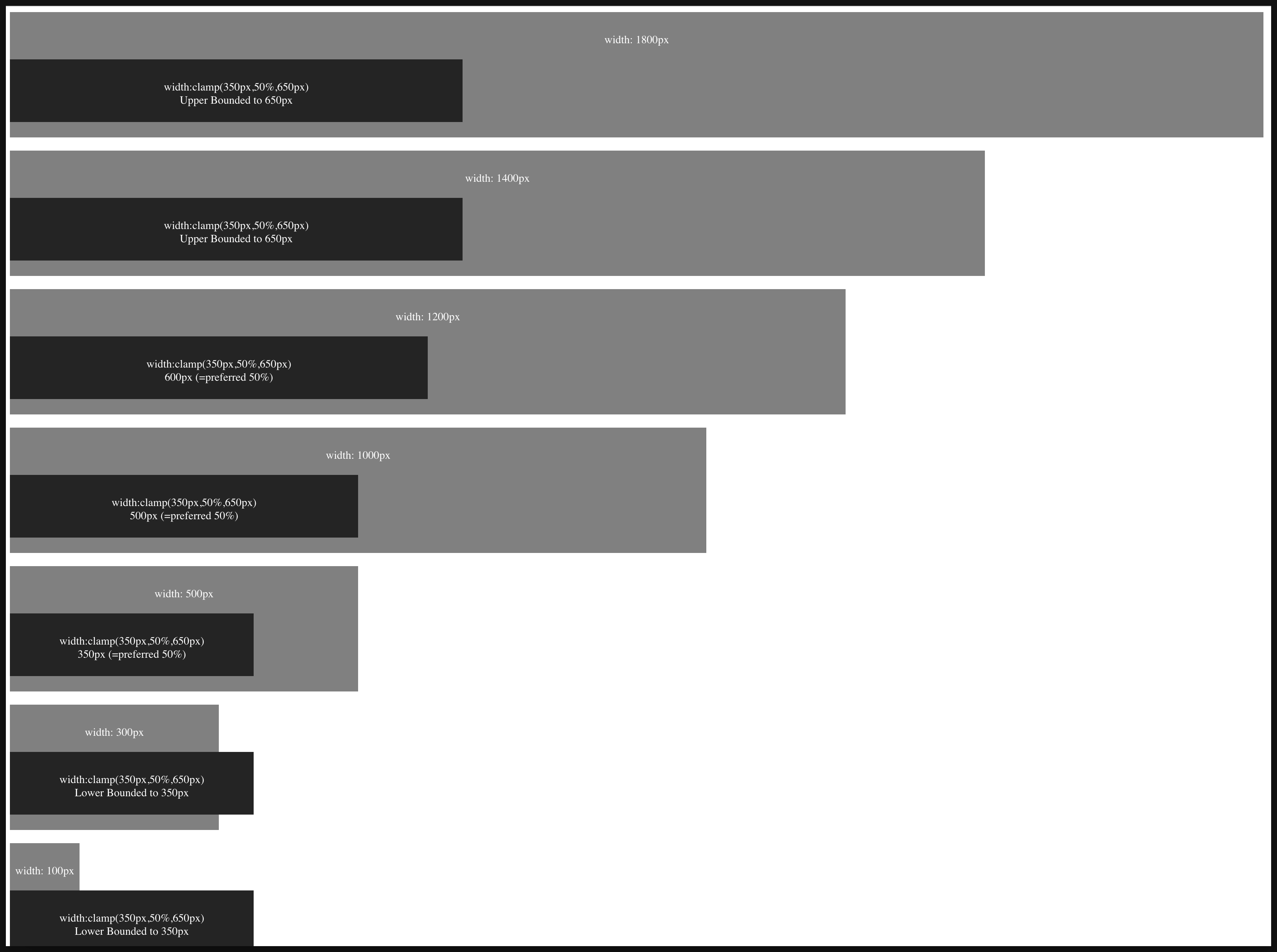
(Example can be found at: index-clamp.html)
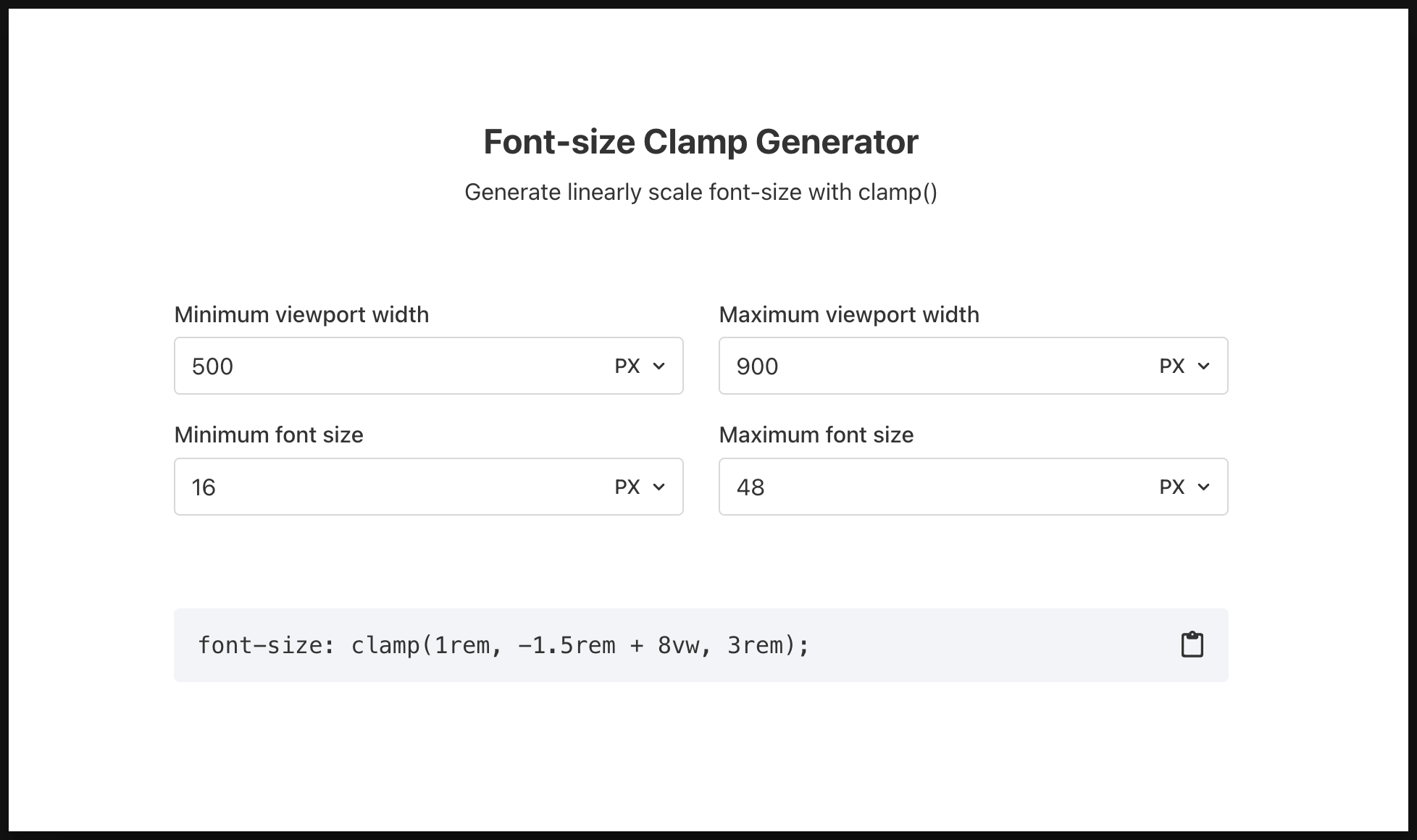
You can also use clamp to specify font-size in certain range using, you can generate this using this tool: Font-size Clamp Generator - Generate linearly scale font-size with clamp()
CSS Property: border-width keyword
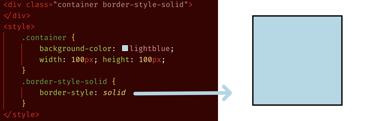
By default the border-width is medium, and default border-color is black, see below example of div after just applying border-style:solid:
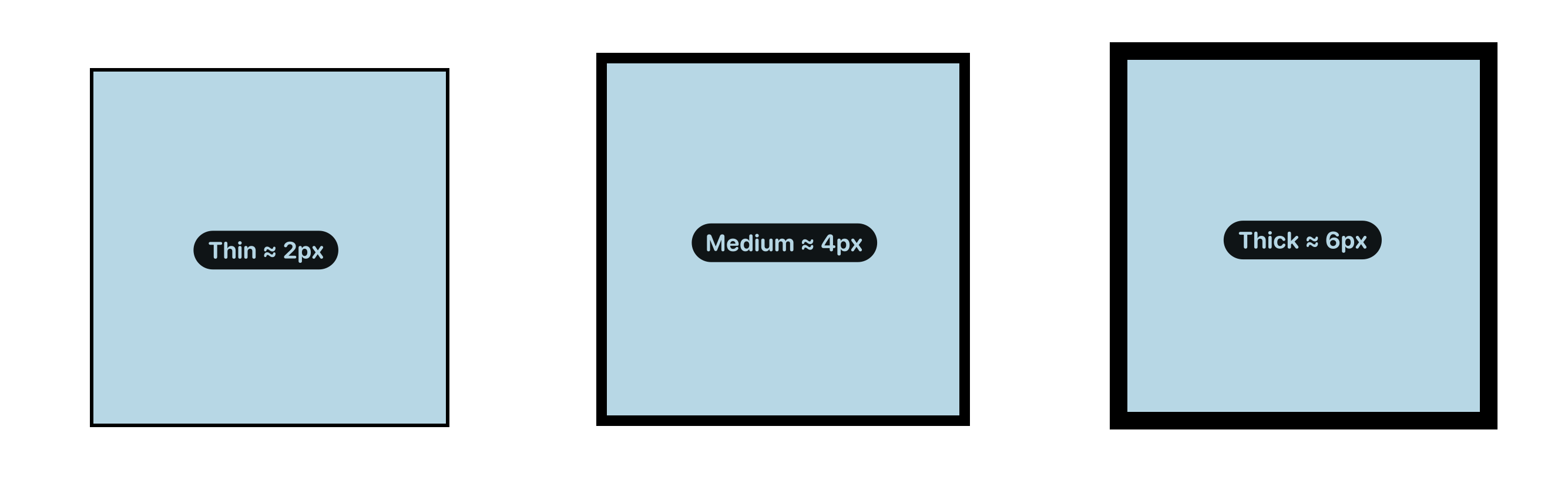
And instead of positive numerical values such as 10px, you can put in named values: thin, medium, thick, as shown below:
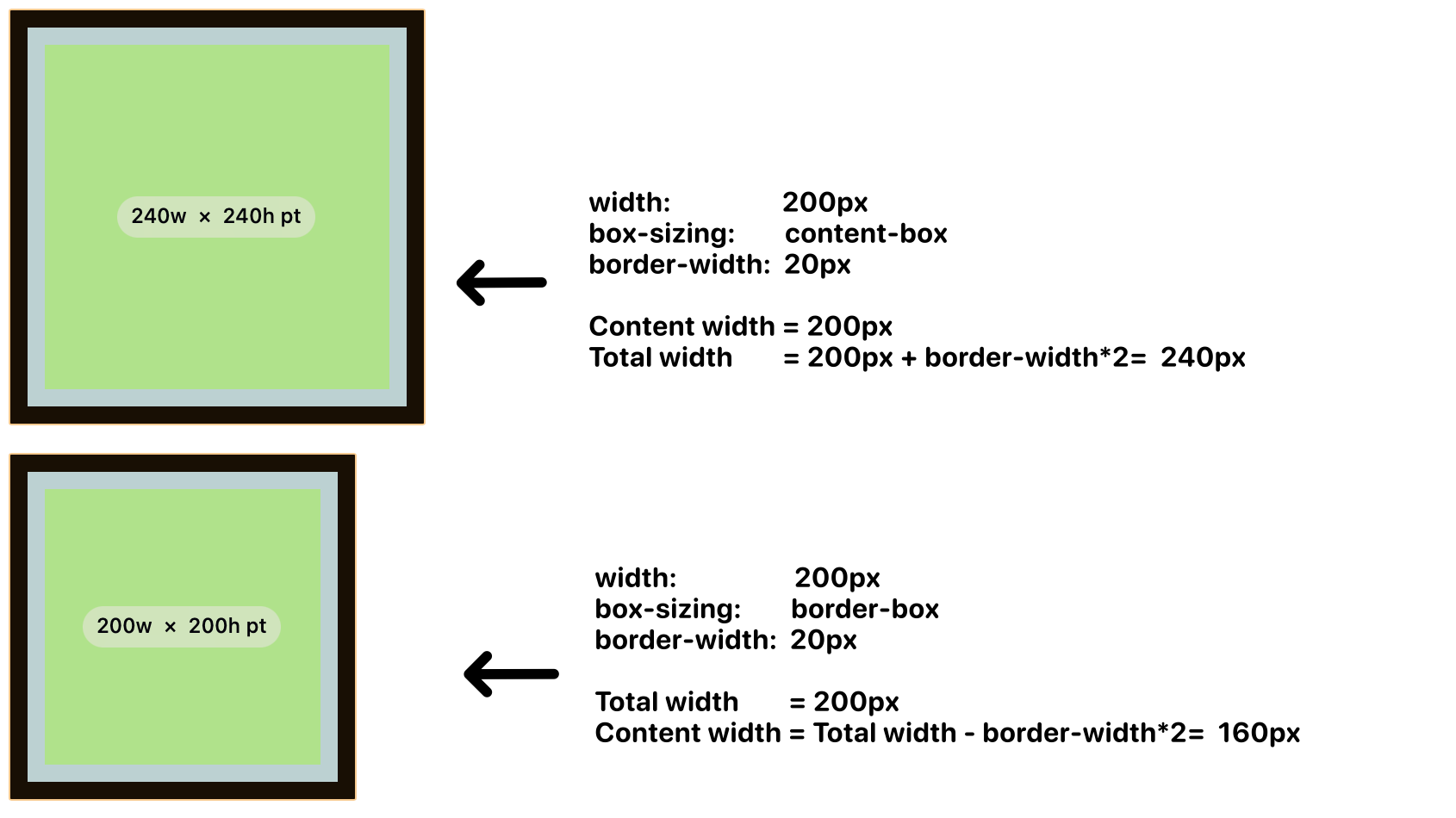
CSS Property: box-sizing
It is recommended to always use “box-sizing:border-box”, in fact many CSS reset / normalise libraries, for instance tailwind’s reset, to include the following:
| |
(*quick illustration to let you differentiate the “border-box” and “content-box”
CSS Property: clip-path
You can use the clip-path to create a “masked” clipping region to create some very interesting effect:
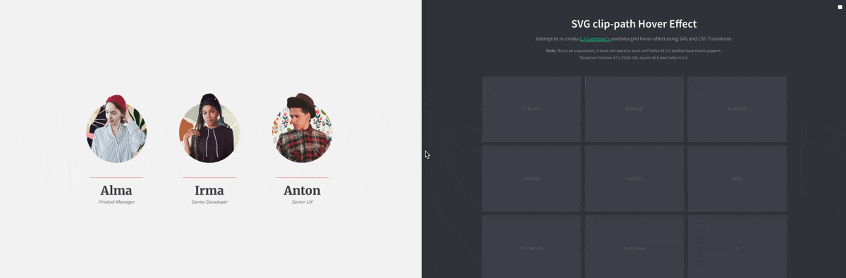
You may use one of these tools to create your clip-path:
You can find the above examples in CodePen:
CSS Modern Unit: Container Query Unit
According to MDN’s documentation:
cqw: 1% of a query container’s widthcqh: 1% of a query container’s heightcqi: 1% of a query container’s inline sizecqb: 1% of a query container’s block sizecqmin: The smaller value ofcqw,cqh,cqi,cqbcqmax: The larger value ofcqw,cqh,cqi,cqb
(*In most cases, that is in horizontal writing mode, cqi is equivalent to cqw (and cqb is equivalent to cqh), but be careful when you are dealing with language that could writes in vertical such as Chinese and Japanese.
They can be handy when you work with container query, when you want to size something NOT based on explicit number unit (e.g. 100px) NOR its direct parent (e.g. 45%), but rather, on what’s declared as “container”:
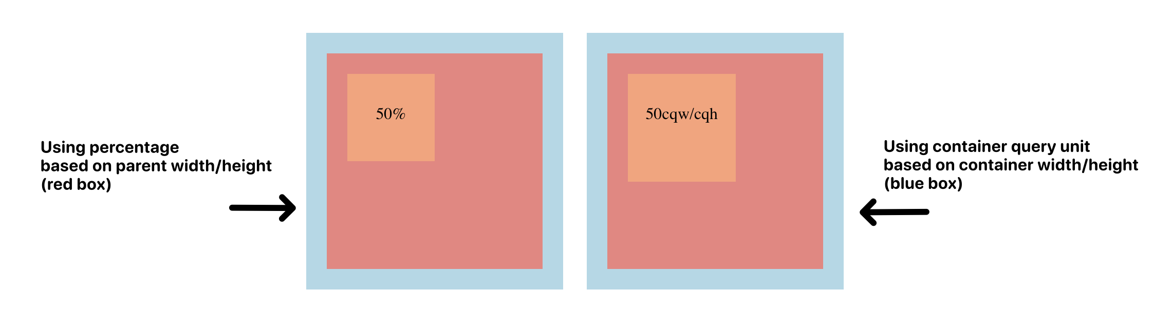
You can find the example here: index-container-query-unit.html (notice how to right one is slightly larger ? because its 50% is based on the “blue box” rather than the “red box”)
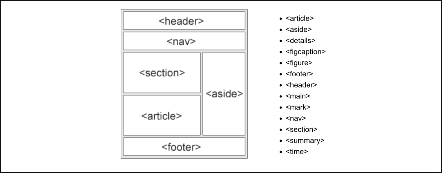
Semantic HTML Element
Other than the regular non-semantic HTML element div, h1-h5, ul/ol/li, …; You should consider to other the semantic HTML element as much as possible, below are some of the common ones shared at W3School: <article>,<aside>,<details>,<figcaption>,<figure>,<footer>,<header>,<main>,<mark>,<nav>,<section>,<summary>,<time>
You can find the full list of available semantic elements at:
By using semantic HTML you get the following benefits: (from most to least important)
- Improved Accessibility
- Enhanced SEO
- Increased Code Readability and Maintainability
- Future-Proofing
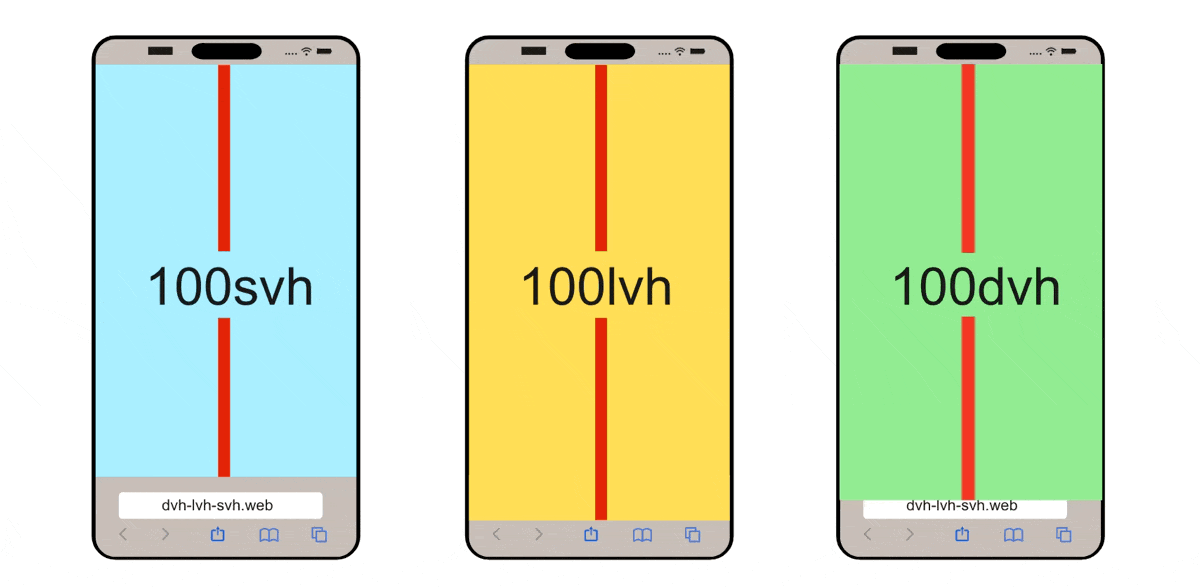
CSS Modern Unit: Dynamic / Static ViewPort Height Unit for Mobile
If you are working on mobile, these units: {dvh, svh, lvh} are important for you, this video explained it well: https://www.youtube.com/watch?v=4YfBYWXHvPo
(source: dvh löst Probleme mit CSS height: 100% und 100vh - Stil mit Stil)
Position-Context & Stacking-Context
“Position-context” refers to the area within which an HTML element’s position is determined, established an ancestor element. The default position context is the <html> element, when changing an element to have position:relative , it creates a new “position-context” relative to that element, all of its child’s positioning will be based on this new “position-context”.
See these post for more details:
- MDN: https://developer.mozilla.org/en-US/docs/Learn_web_development/Core/CSS_layout/Positioning#positioning_contexts
- Web.Dev: https://web.dev/learn/css/z-index?hl=zh-cn
“stacking-context” is very similar, when you have position:relative/absolute/sticky it creates a new “stacking-context”, and all of its child’s stacking based on z-index will be based on this new “stacking-context”.
See these post for more details:
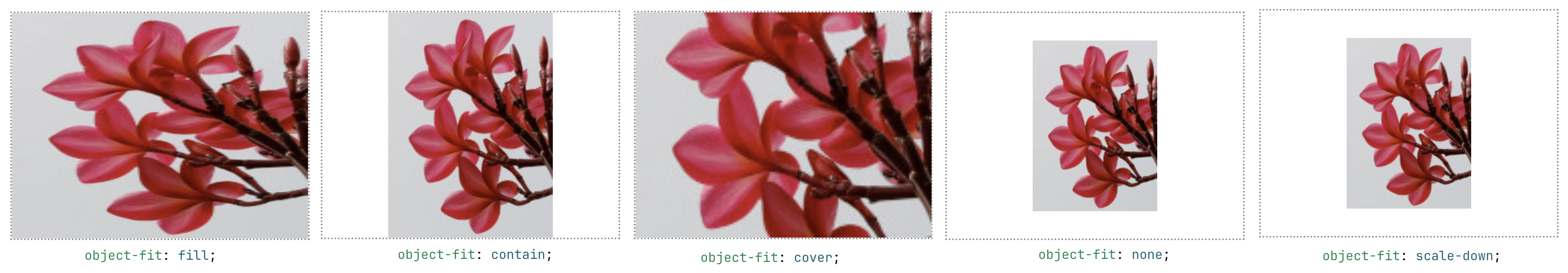
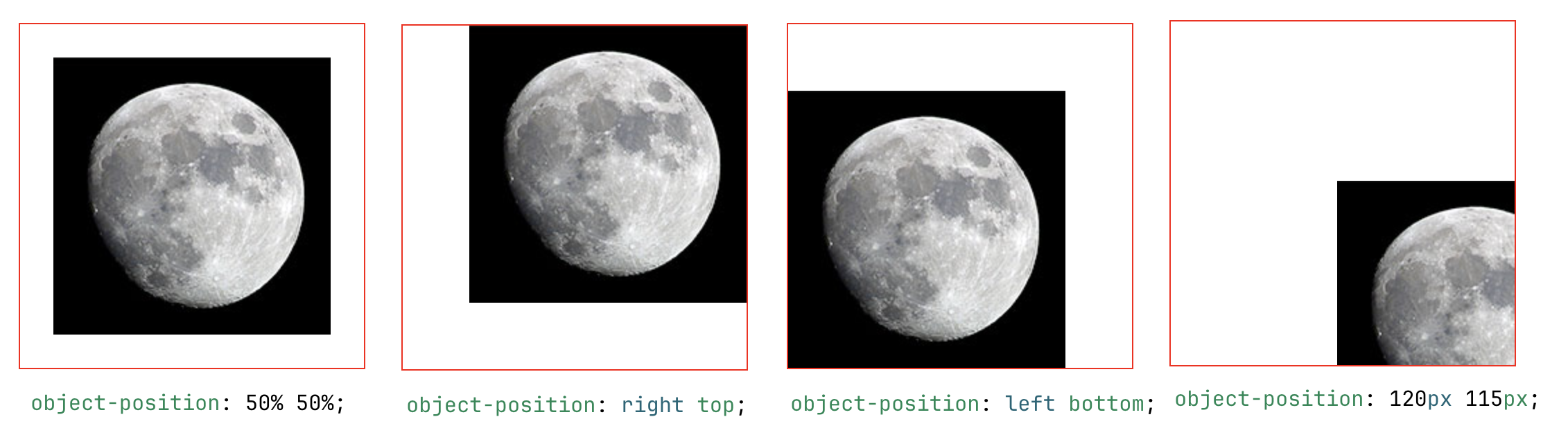
CSS Property: to Adjust Placement of Media in their Container
You may use object-fit to choose how to zoom in/out a media element (such as <img> or <video>) inside its container, and object-position to alter the alignment of it, below are examples from MDN documents:
(reference:
- https://developer.mozilla.org/en-US/docs/Web/CSS/object-position
- https://developer.mozilla.org/en-US/docs/Web/CSS/object-fit
My Custom .pretterrc Configuration File
(remove the comment before usage, and delete the “override” section if you are not using twig)
| |
CSS Property: Scroll Related Properties
When you set overflow-x/overflow-y to be scroll, an element will become a scroll container. On a scroll container, where you can use scroll-snap-type property to choose whether to have a snapping alignment of its children during scroll. And on its direct child children of a scroll container, you can use scroll-snap-align property to choose how to align.
Below are few examples:
scroll-snap-type: x mandatory+scroll-snap-align: center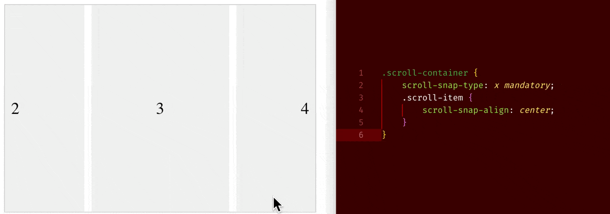
scroll-snap-type: x mandatory+scroll-snap-align: start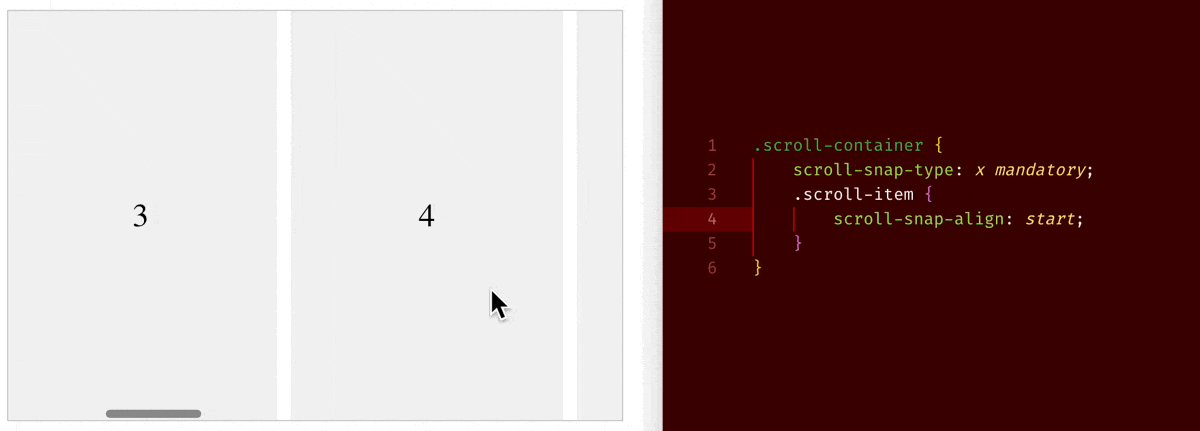
scroll-snap-type: x proximity+scroll-snap-align: center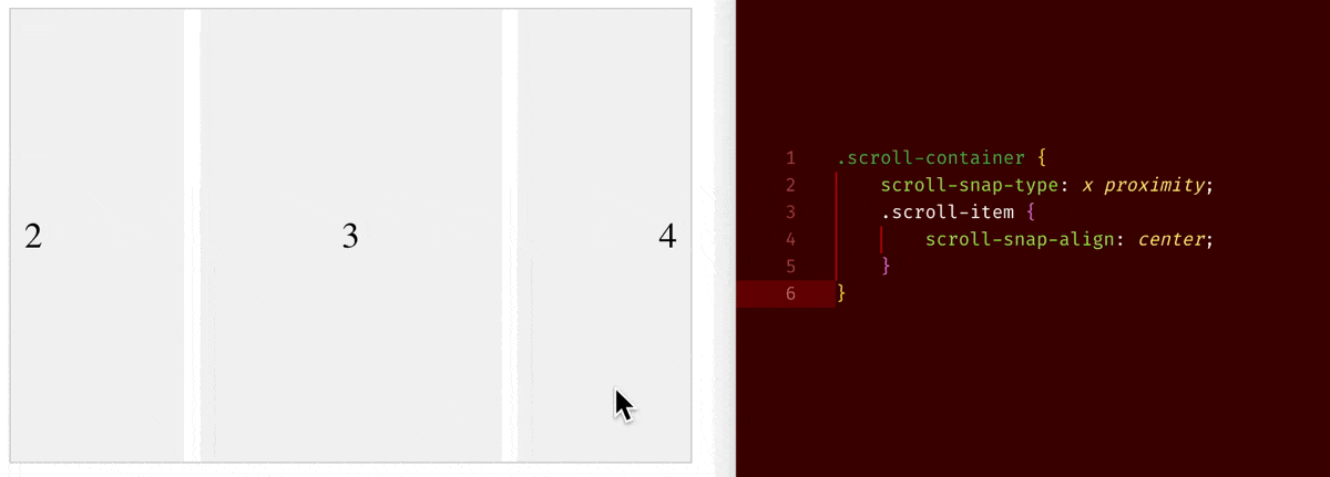
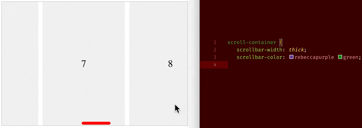
An you may use scrollbar-width: thin/medium/thick and scrollbar-color: indicator-color track-color property to change the scrollbar indicator’s colour:
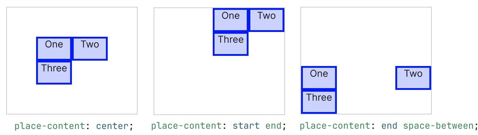
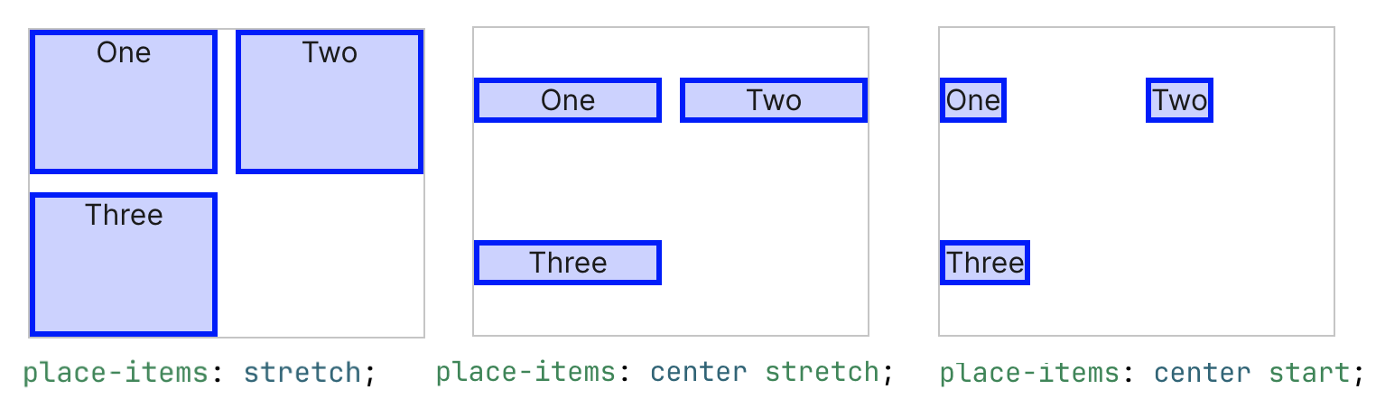
CSS Property: Place Content/Items
If you have done a lot of flex layout/container, you must be familiar with:
justify-content: align box of items along the flex-axis (Horizontal axis ifflex-direction:row)justify-items: stretch/align items in their boxes along the flex-axis (Horizontal axis ifflex-direction:row)align-content: align box of items along the cross-axis (Vertical axis ifflex-direction:row)align-items: stretch/align items in their boxes along the cross-axis (Vertical axis ifflex-direction:row)
The place-content and place-items are just shorthand version of it:
place-content: <align-content> <justify-content>place-items: <align-items> <justify-items>- (if only value provided then it will be applied to both axis)
Below are few examples from MDN document:
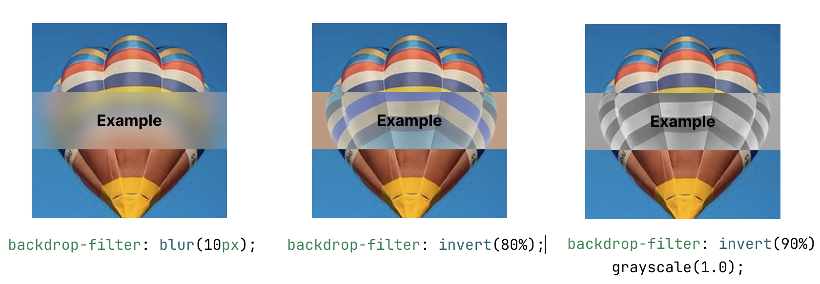
CSS Property: Filter (& Backdrop Filter)
You can use filter to apply special effects such as blur, grayscale, sepia, hue-rotate, invert or adjusting brightness, contrast. And alike transition property, you can apply multiple filters at once:
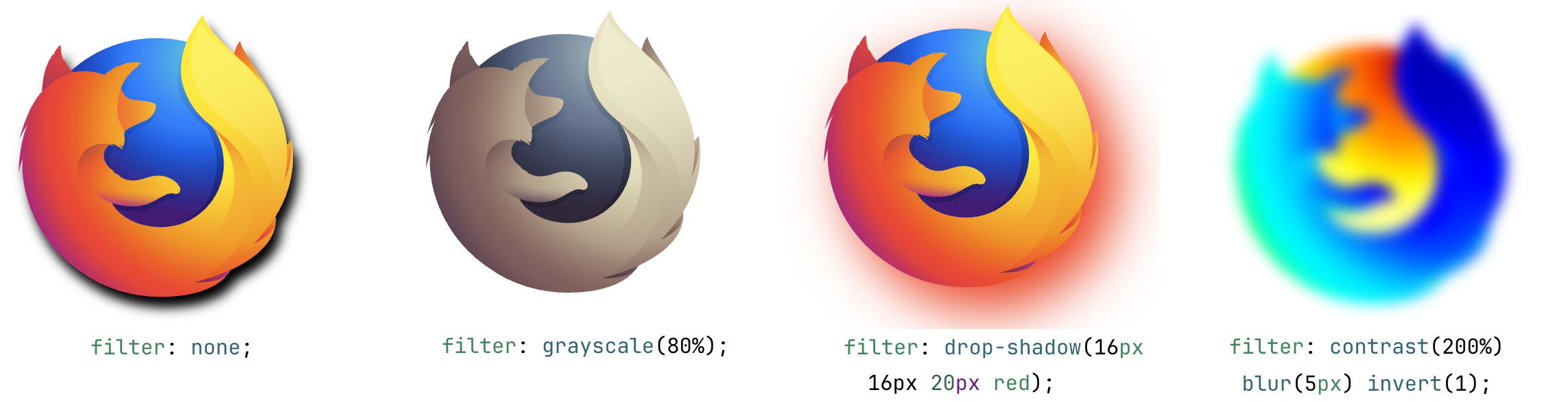
The same effect could be used for its back-drop (if its have a semi-transparent background, the filter will be applied to the background):
Reference:
- https://developer.mozilla.org/en-US/docs/Web/CSS/filter
- https://developer.mozilla.org/en-US/docs/Web/CSS/backdrop-filter
CSS Property: 2D / 3D Transformation
The traditional 2D translate & transformation is based on XY coordinate system:
transform: translate(<translate-on-x-axis> <translate-on-y-axis>);transform: rotate(<rotation-based-on-z-axis>);transform: scale(<scale-on-x-axis>, <scale-on-y-axis>);
Where as the 3D translation is based on XYZ coordinate:
transform: translate3D(<translate-on-x-axis> <...-y-axis> <...-z-axis>);transform: rotate3d(<x,y,z-vector-that-specify-a-rotation-axis>, <degree>);transform: scale(<scale-on-x-axis>, <...-y-axis>, <...-z-axis>);
You may use one of the following tool to generate your desired transform property:
Reference:
2D Transformation
3D Transformation