Vue in Drupal: Basic Component (Counter)#
For reference purpose I have put the relevant files mentioned in this section in a .zip file: Archive-1.zip
To begin with, before we complicate things by bring the Nuxt UI component library into the equation, let’s first setup Vue framework and make sure it is operating properly by setting up a simple counter that uses ref() reactivity API.
Firstly, proceed to your theme folder (for demo purpose I’ll use the web/core/theme/olivero as an example) and install the dependencies for vue there, and create an main.js with some placeholder content (which will later be the entry point for Vue):
 1
 2
 3
 4
 5
 6
 7
 8
 9
10
11
12
13
14
15
16
17
18
19
20
21
22
23
24
25
26
27
28
29
30
| > npm init
package name: (olivero) olivero-vue
version: (1.0.0)
description:
entry point: (index.js)
test command:
git repository:
keywords:
author:
license: (ISC)
type: (commonjs)
About to write to /Users/suowei_hu/Sites/ddev/ddev-drupal-20260304T090741/web/core/themes/olivero/package.json:
{
"name": "olivero-vue",
"version": "1.0.0",
"description": "Olivero is the default theme for Drupal 10. It is a flexible, colorable theme with a responsive and mobile-first layout, supporting 13 regions.",
"main": "index.js",
"directories": {
"test": "tests"
},
"scripts": {
"test": "echo \"Error: no test specified\" && exit 1"
},
"author": "",
"license": "ISC",
"type": "commonjs"
}
Is this OK? (yes) yes
|
1
2
3
4
| > npm install vue
added 23 packages, and audited 24 packages in 617ms
found 0 vulnerabilities
|
1
2
| // core/themes/olivero/src/vue/main.js
console.log("Vue - Main.js Loaded");
|
Remember to amend the package.json file to point the entry point towards this “entry-point” file that you created; Also amended the type field in package.json file from being CommonJS to modules, this will ensure all the *.js files in the project, that is getting built (later) will be treated as ES Modules (otherwise the import/export statement won’t be available and top level await statement won’t be supported)
 1
 2
 3
 4
 5
 6
 7
 8
 9
10
| // [File: core/themes/olivero/package.json]
{
"name": "olivero-vue",
...
- "main": "index.js"
+ "main": "src/vue/main.js",
- "type": "commonjs",
+ "type": "module",
}
|
Also install the development dependencies required for the vite bundler for building JavaScript (and CSS), and create a vite build configuration file with the following content:
1
2
3
4
| > npm install vite @vitejs/plugin-vue --save-dev
added 11 packages, and audited 35 packages in 3s
found 0 vulnerabilities
|
 1
 2
 3
 4
 5
 6
 7
 8
 9
10
11
12
13
14
15
16
17
18
| // [FIEL: core/themes/olivero/vite.config.js]
import { defineConfig } from 'vite'
import vue from '@vitejs/plugin-vue'
export default defineConfig({
plugins: [vue()],
build: {
// Use the Vue entry file at src/vue/main.js
rollupOptions: {
input: { main: 'src/vue/main.js' }, // Same as the one specified in package.json earlier
output: { entryFileNames: '[name].js' }, // By default vite append content hashes to filename (e.g. [name]-[hash].js)
},
// Output compiled assets into dist/vue
outDir: 'dist/vue',
emptyOutDir: true,
},
})
|
Once the above steps are done, you should have the an additional package.json file and a node_modules folder containing the installed modules; Finally we’ll need to amend the package.json file to add a few extra scripts for convenience of access later:
 1
 2
 3
 4
 5
 6
 7
 8
 9
10
11
12
13
| // [File: core/themes/olivero/package.json]
{
"name": "olivero-vue",
...
- "scripts": {
- "test": "echo \"Error: no test specified\" && exit 1"
- },
+ "scripts": {
+ "build": "vite build",
+ "watch": "vite build --watch"
+ },
}
|
1
2
3
4
5
6
7
8
9
| > npm run build
vite v7.3.1 building client environment for production...
✓ 1 modules transformed.
dist/vue/main.js 0.04 kB │ gzip: 0.06 kB
✓ built in 24ms
> npm run watch
(... same as above ...)
change the main.js file will automatically trigger the re-build
|
Step-2: Attaching Vue.js as Library#
After running npm run build/watch command in the previous step, you’ll get this additional dist/vue/main.js bundled, build artefacts in your core/themes/olivero theme, we’ll need to include it to Drupal via amending the olivero.library.yml file and one of the twig template file.
Declaring the additional library for vue:
1
2
3
4
5
| // [File: core/themes/olivero/olivero.libraries.yml]
+ vue-components:
+ version: VERSION
+ js:
+ dist/vue/main.js: {}
|
For demonstration purpose we’ll override the front page by creating a page--front.html.twig file with content identical content as the page.html.twig to begin with, and amend the <main> section:
 1
 2
 3
 4
 5
 6
 7
 8
 9
10
11
12
13
14
15
16
17
18
19
20
21
22
23
24
25
26
27
28
29
30
31
32
33
34
35
36
37
| {# [File: core/thems/olivero/tempalte/layout/page--front.html.twig] <--- content copied from page.html.twig #}
<div id="page-wrapper" class="page-wrapper">
<div id="page">
<div id="main-wrapper" class="layout-main-wrapper layout-container">
<div id="main" class="layout-main">
<div class="main-content">
{# =============================================================================================================== #}
{# =============================================================================================================== #}
{#
{{ page.highlighted }}
{{ page.breadcrumb }}
{% if page.sidebar %}
<div class="sidebar-grid grid-full">
<main role="main" class="site-main">
{{ page.content_above }}
{{ page.content }}
</main>
...
...
...
#}
<div style="min-height:60vh;">
HELLO WORLD !
</div>
{{ attach_library("olivero/vue-components") }}
{# =============================================================================================================== #}
{# =============================================================================================================== #}
...
...
...
...
...
...
|
Then eventually you should see the following print out in your website console when you visit the front page:
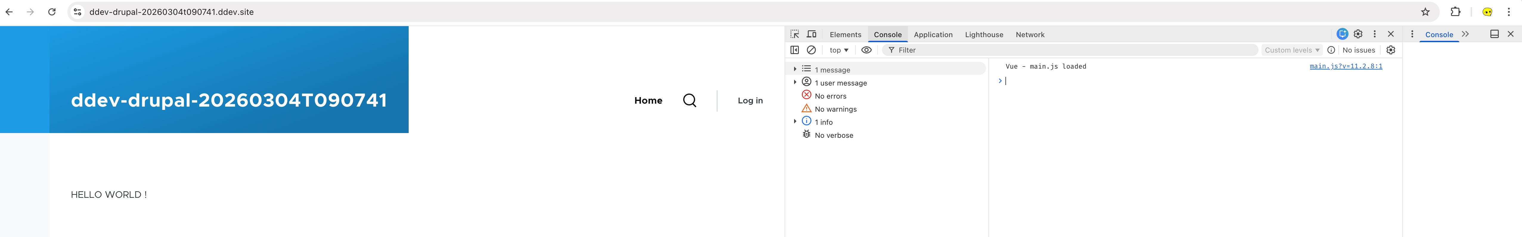
Step-3: Implementing Vue “Counter” Component#
Here I’ll borrow the counter example from vue official documentation: https://vuejs.org/guide/essentials/event-handling, to showcase that Vue is working in Drupal by calling its ref() reactivity API.
Amend the page--front.html.twig to add an entry point to be used by Vue.js:
 1
 2
 3
 4
 5
 6
 7
 8
 9
10
11
12
| {# [File: core/thems/olivero/tempalte/layout/page--front.html.twig] #}
...
...
<div class="main-content">
<div style="min-height:60vh;">
- HELLO WORLD !
+ <div id="vue-counter-example"></div>
</div>
{{ attach_library("olivero/vue-components") }}
...
...
|
Create the counter component under src/vue/components folder:
 1
 2
 3
 4
 5
 6
 7
 8
 9
10
11
12
13
14
| <!-- File: src/vue/components/Counter.vue -->
<template>
<div>
<button @click="counter--"> - </button>
<div>Current Count Value: {{counter}}</div>
<button @click="counter++"> + </button>
</div>
</template>
<script setup>
import {ref} from 'vue';
const counter = ref(0);
</script>
|
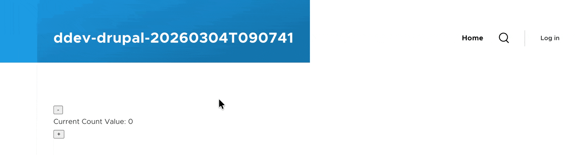
Amend the src/vue/main.js to add the logic to replace the div#vue-counter-example with the “Counter” component:
1
2
3
4
5
6
7
8
9
| // File: src/vue/main.js
import { createApp } from 'vue';
import Counter from './components/Counter.vue';
document.addEventListener('DOMContentLoaded', () => {
const app = createApp(Counter);
app.mount('#vue-counter-example');
});
|
Then refresh your browser you should see your counter component appearing:
(* If you are seeing error: Cannot use import statement outside a module in your console, check your olivero.libraries.yml file to ensure you are importing the built artefact at dist/vue/main.js instead of the src/vue/main.js file)
Optionally, you can enable sourcemap in vite.config.js file via adding build { sourcemap:true }. The generated source map file will help you figure out the source file of the build file in dist folder, and this is especially useful for debugging in a development scenario, but you might wanna turn it off in the production website to prevent the source code from being visible to the public audience.
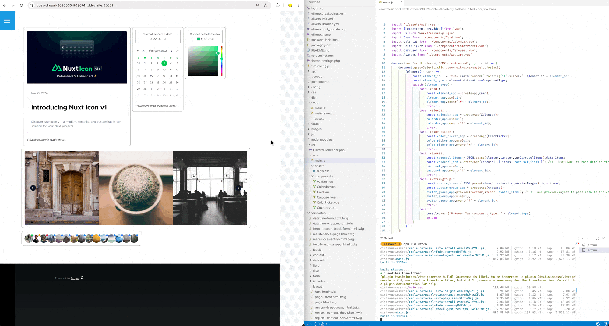
Nuxt UI in Drupal: Static Component (Card)#
For reference purpose I have put the relevant files mentioned in this section in a .zip file: Archive-2.zip
We’ll follow the steps mentioned in the “vue” installation option on official Nuxt-UI documentation: link
Step-1: Install Nuxt-UI its dependencies#
install the Nuxt UI package via NPM
1
| npm install @nuxt/ui tailwindcss
|
*you might also wanna install vue-router , a client-side router (as some of the component needs current route to function properly )
Step-2: alter vite build configuration#
add the Nuxt UI vite plug in in vite.config.js
 1
 2
 3
 4
 5
 6
 7
 8
 9
10
11
12
| # File: core/theme/olivero/vite.config.js
import { defineConfig } from 'vite'
import vue from '@vitejs/plugin-vue'
+ import ui from '@nuxt/ui/vite'
export default defineConfig({
plugins: [
vue(),
+ ui()
]
})
|
Step-3: add CSS libraries#
import tailwind css and nuxt ui in your CSS
1
2
3
4
| # File: core/theme/olivero/src/aseets/main.css
+ @import "tailwindcss";
+ @import "@nuxt/ui";
|
1
2
3
4
| # File: core/theme/olivero/src/main.js
+ import './assets/main.css'
import { createApp } from 'vue';
|
Since wildcard library importing isn’t supported in *.libraries.yml file, we also need to amend the vite.config.js file to ensure the same dist/assets/main.css is generated on every build (instead of a file with different hash in it, such as main-gGb8L75q.css)
 1
 2
 3
 4
 5
 6
 7
 8
 9
10
11
12
13
14
15
16
17
18
19
20
| # File: core/theme/olivero/vite.config.js
...
export default defineConfig({
plugins: [vue(), ui()],
build: {
// Use the Vue entry file at src/vue/main.js
rollupOptions: {
input: { main: 'src/vue/main.js' },
output: {
entryFileNames: '[name].js' ,
+ assetFileNames: (assetInfo) => {return 'assets/[name][extname]'},
},
},
// Output compiled assets into dist/vue
outDir: 'dist/vue',
emptyOutDir: true,
},
})
|
Also amend the olivero.libraries.yml file to include the additional (built) dist/assets/main.css file:
1
2
3
4
5
6
7
8
9
| # File: core/theme/olivero/olivero.libraries.yml
vue-components:
version: VERSION
js:
dist/vue/main.js: {}
+ css:
+ component:
+ dist/vue/assets/main.css: {}
|
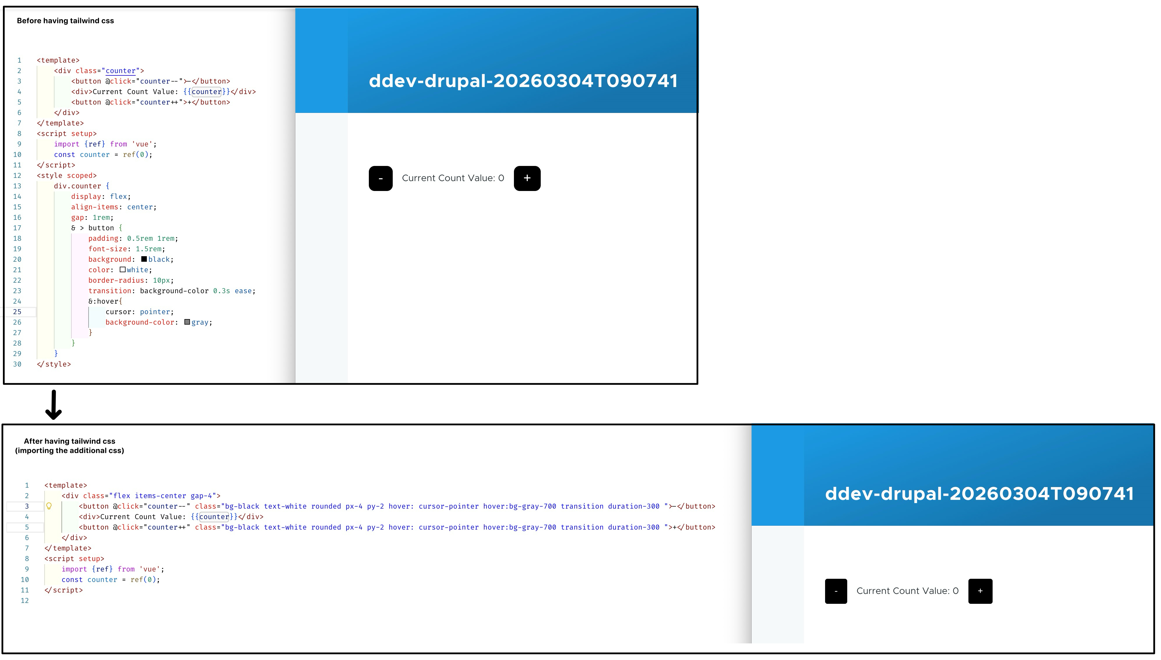
You can add some tailwind utility class to the Counter component earlier to verify:
Step-4: createApp using Nuxt UI component#
Use the Nuxt UI Vue plugin, and component
 1
 2
 3
 4
 5
 6
 7
 8
 9
10
11
12
13
| {# [File: core/thems/olivero/tempalte/layout/page--front.html.twig] #}
...
...
<div class="main-content">
<div style="min-height:60vh; display:flex; gap:10px; flex-wrap:wrap; padding-bottom:100px;">
- <div id="vue-counter-example"></div>
+ {# the class "isolate" here is to ensures the component lives in a new stacking context: https://tailwindcss.com/docs/isolation.#}
+ <div class="vue-nuxt-ui-example" class="isolate" data-vue-component-type="card"></div>
</div>
{{ attach_library("olivero/vue-components") }}
...
...
|
 1
 2
 3
 4
 5
 6
 7
 8
 9
10
11
12
13
14
15
16
17
18
19
20
21
22
23
24
25
26
27
28
29
30
31
32
| // File: core/theme/olivero/src/vue/main.js
import './assets/main.css';
import { createApp } from 'vue';
import ui from '@nuxt/ui/vue-plugin'
import Card from './components/Card.vue';
document.addEventListener('DOMContentLoaded', () => {
document.querySelectorAll('.vue-nuxt-ui-example').forEach(
(element) => {
// assinging an id for "mount" later
const element_id = 'vue-'+Math.random().toString(16).slice(2); element.id = element_id;
const element_type = element.dataset.vueComponentType;
// use different rootComponent in createApp dependning on "data-vue-component-type" data attribute
switch (element_type) {
case 'card':
const element_app = createApp(Card);
element_app.use(ui);
element_app.mount('#' + element_id);
break;
// ...
// ... more case will be added here later
// ...
default:
console.warn('Unknown Vue component type: ' + element_type);
return;
}
}
);
});
|
 1
 2
 3
 4
 5
 6
 7
 8
 9
10
11
12
13
14
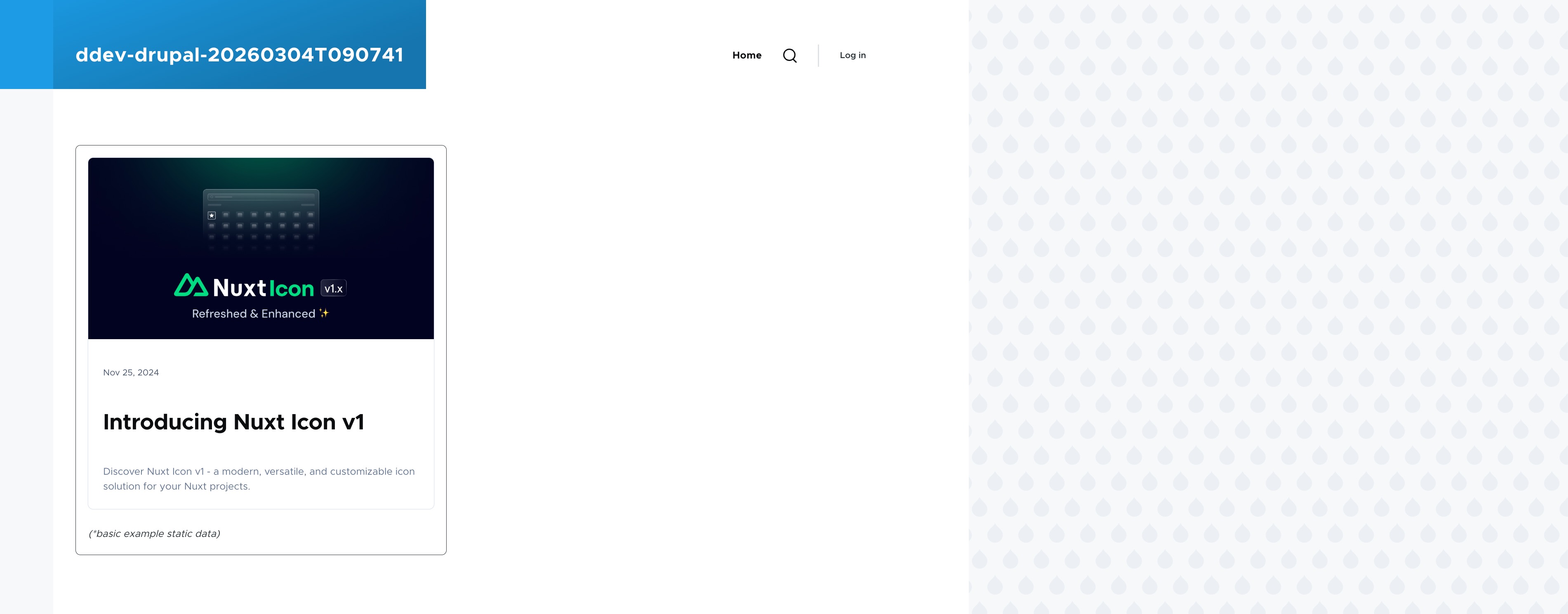
| // File: core/theme/olivero/src/vue/component/Card.vue
// Source: https://ui.nuxt.com/docs/components/card
<template>
<div class="max-w-150 border p-5 rounded-lg">
<UBlogPost
title="Introducing Nuxt Icon v1"
description="Discover Nuxt Icon v1 - a modern, versatile, and customizable icon solution for your Nuxt projects."
image="https://nuxt.com/assets/blog/nuxt-icon/cover.png"
date="2024-11-25" />
<br>
<i>(*basic example static data)</i>
</div>
</template>
|
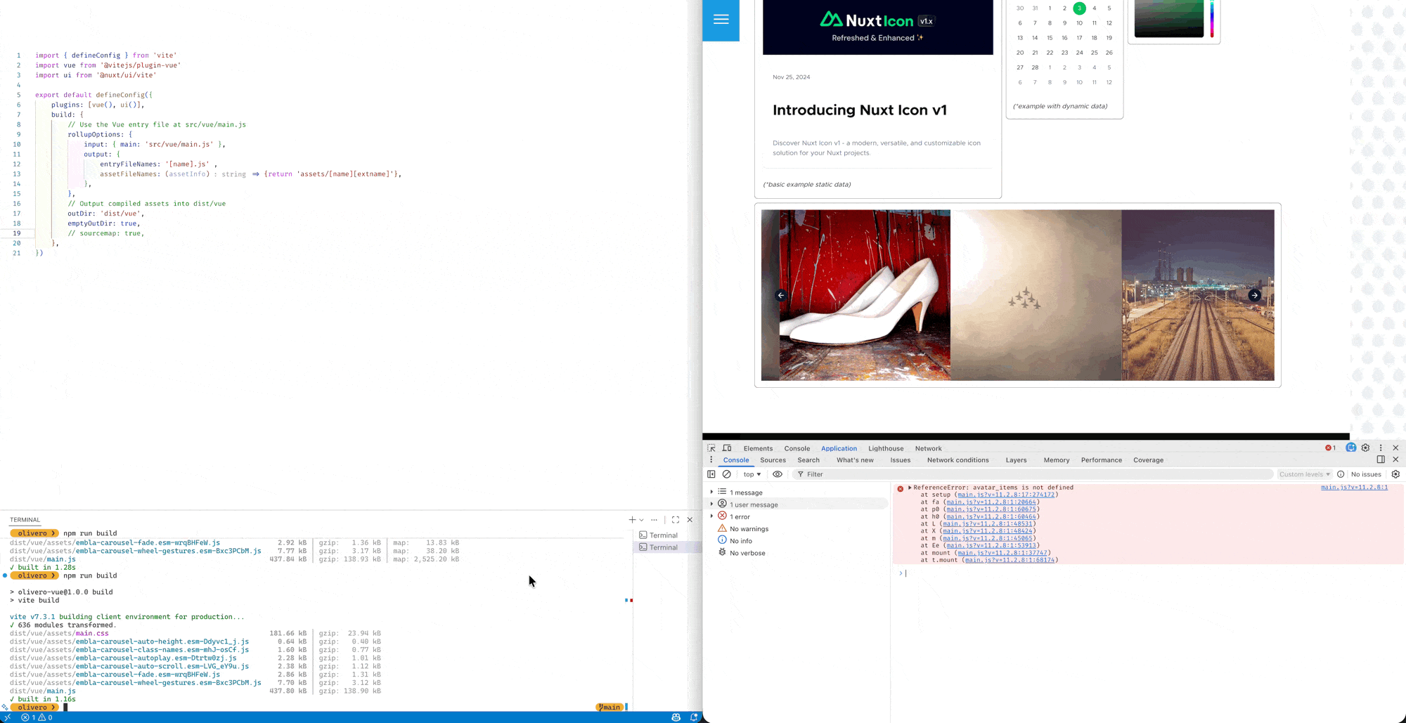
Run npm run build && ddev drush cr, and open your browser to check final outcome:
Nuxt UI In Drupal: Dynamic Component (Calendar, Color-Picker)#
For reference purpose I have put the relevant files mentioned in this section in a .zip file: Archive-3.zip
Below are example of “dynamic” Nuxt UI components using ref and shallowRef:

 1
 2
 3
 4
 5
 6
 7
 8
 9
10
11
12
13
| {# [File: core/thems/olivero/tempalte/layout/page--front.html.twig] #}
...
...
<div class="main-content">
<div style="min-height:60vh; display:flex; gap:10px; flex-wrap:wrap; padding-bottom:100px;">
<div class="vue-nuxt-ui-example" class="isolate" data-vue-component-type="card"></div>
+ <div class="vue-nuxt-ui-example" class="isolate" data-vue-component-type="calendar"></div>
+ <div class="vue-nuxt-ui-example" class="isolate" data-vue-component-type="color-picker"></div>
</div>
{{ attach_library("olivero/vue-components") }}
...
...
|
 1
 2
 3
 4
 5
 6
 7
 8
 9
10
11
12
13
14
15
16
17
18
19
20
21
22
23
24
25
26
27
28
29
30
31
32
33
34
35
36
37
38
39
| // File: core/theme/olivero/src/vue/main.js
import './assets/main.css';
import { createApp } from 'vue';
import ui from '@nuxt/ui/vue-plugin'
import Card from './components/Card.vue';
document.addEventListener('DOMContentLoaded', () => {
document.querySelectorAll('.vue-nuxt-ui-example').forEach(
(element) => {
// assinging an id for "mount" later
const element_id = 'vue-'+Math.random().toString(16).slice(2); element.id = element_id;
const element_type = element.dataset.vueComponentType;
// use different rootComponent in createApp dependning on "data-vue-component-type" data attribute
switch (element_type) {
case 'card':
const element_app = createApp(Card);
element_app.use(ui);
element_app.mount('#' + element_id);
break;
+ case 'calendar':
+ const calendar_app = createApp(Calendar);
+ calendar_app.use(ui);
+ calendar_app.mount('#' + element_id);
+ break;
+ case 'color-picker':
+ const color_picker_app = createApp(ColorPicker);
+ color_picker_app.use(ui);
+ color_picker_app.mount('#' + element_id);
+ break;
default:
console.warn('Unknown Vue component type: ' + element_type);
return;
}
}
);
});
|
 1
 2
 3
 4
 5
 6
 7
 8
 9
10
11
12
13
14
15
16
17
| // File: src/vue/components/Calender.vue
// Ref: https://ui.nuxt.com/docs/components/calendar
<script setup lang="ts">
import { shallowRef } from 'vue';
import { CalendarDate } from '@internationalized/date'
const value = shallowRef(new CalendarDate(2022, 2, 3))
</script>
<template>
<div class="max-w-130 border p-4 rounded-lg">
<div class="border p-2 text-center">Current selected date: <br> {{ value }}</div> <br>
<UCalendar v-model="value" />
<br>
<i>(*example with dynamic data)</i>
</div>
</template>
|
 1
 2
 3
 4
 5
 6
 7
 8
 9
10
11
12
13
14
15
16
| // File: src/vue/components/ColorPicker.vue
// Ref: https://ui.nuxt.com/docs/components/color-picker
<script setup>
import { ref } from 'vue';
const value = ref('#00C16A')
</script>
<template>
<div class="p-4 rounded-lg border">
<div class="border p-2 text-center mb-4">
Current selected color: <br> <div class="size-4 inline-block translate-y-[2px]" :style="{ backgroundColor: value }"></div> {{ value }}
</div>
<UColorPicker v-model="value" />
</div>
</template>
|
Nuxt UI in Drupal: Passing Data from Twig to via json_encode() (Carousel, AvatarGroup)#
For reference purpose I have put the relevant files mentioned in this section in a .zip file: Archive-4.zip, olivero.zip
In the below example, we show case data passing from Drupal (’s twig template) to Vue (’s component) using Carousel and AvatarGroup component in Nuxt UI.

We’ll be passing value via two different approach:
- using
props: passing value from a parent component to its child component (see: link) – used on Carousel - using
provide/inject: allow you to pass data from parent component to deeply nested component (see: link) – used on AvatarGroup
 1
 2
 3
 4
 5
 6
 7
 8
 9
10
11
12
13
14
15
16
17
18
19
20
21
22
23
24
25
26
27
28
29
30
31
32
33
34
35
36
37
38
39
40
41
42
43
44
45
46
47
48
49
50
| {# [File: core/thems/olivero/tempalte/layout/page--front.html.twig] #}
...
...
<div class="main-content">
<div style="min-height:60vh; display:flex; gap:10px; flex-wrap:wrap; padding-bottom:100px;">
- <div class="vue-nuxt-ui-example" class="isolate" data-vue-component-type="card"></div>
- <div class="vue-nuxt-ui-example" class="isolate" data-vue-component-type="calendar"></div>
- <div class="vue-nuxt-ui-example" class="isolate" data-vue-component-type="color-picker"></div>
+ {% set carousel_items = {
+ data:{
+ items: [
+ 'https://picsum.photos/640/640?random=1',
+ 'https://picsum.photos/640/640?random=2',
+ 'https://picsum.photos/640/640?random=3',
+ 'https://picsum.photos/640/640?random=4',
+ 'https://picsum.photos/640/640?random=5',
+ 'https://picsum.photos/640/640?random=6'
+ ]
+ }
+ } %}
+ <div class="vue-nuxt-ui-example" class="isolate" data-vue-component-type="carousel" data-vue-carousel-items="{{ carousel_items|json_encode()}}"></div>
+ {% set avatar_images = {
+ data:{
+ items: [
+ {src:"https://github.com/benjamincanac.png", hover_alt:"Benjamin Canac", chip:"success" },
+ {src:"https://github.com/romhml.png", hover_alt:"Romain Hamel", chip:"warning" },
+ {src:"https://github.com/noook.png", hover_alt:"Neil Richter", chip:"error" },
+ {src:"https://picsum.photos/200/200?random=123", hover_alt:"More Name ...", chip:"info" },
+ {src:"https://picsum.photos/200/200?random=124", hover_alt:"More Name ...", chip:"info" },
+ {src:"https://picsum.photos/200/200?random=125", hover_alt:"More Name ...", chip:"info" },
+ {src:"https://picsum.photos/200/200?random=126", hover_alt:"More Name ...", chip:"info" },
+ {src:"https://picsum.photos/200/200?random=127", hover_alt:"More Name ...", chip:"info" },
+ {src:"https://picsum.photos/200/200?random=128", hover_alt:"More Name ...", chip:"info" },
+ {src:"https://picsum.photos/200/200?random=129", hover_alt:"More Name ...", chip:"info" },
+ {src:"https://picsum.photos/200/200?random=130", hover_alt:"More Name ...", chip:"info" },
+ {src:"https://picsum.photos/200/200?random=131", hover_alt:"More Name ...", chip:"info" },
+ {src:"https://picsum.photos/200/200?random=132", hover_alt:"More Name ...", chip:"info" },
+ {src:"https://picsum.photos/200/200?random=133", hover_alt:"More Name ...", chip:"info" },
+ {src:"https://picsum.photos/200/200?random=134", hover_alt:"More Name ...", chip:"info" },
+ ]
+ }
+ } %}
+ <div class="vue-nuxt-ui-example" class="isolate" data-vue-component-type="avatar-group" data-vue-avatar-images="{{ avatar_images|json_encode()}}"></div>
</div>
{{ attach_library("olivero/vue-components") }}
...
...
|
 1
 2
 3
 4
 5
 6
 7
 8
 9
10
11
12
13
14
15
16
17
18
19
20
21
22
23
24
25
26
| // File: src/vue/components/Carousel.vue
// Ref: https://ui.nuxt.com/docs/components/carousel
<script setup>
const props = defineProps(["items"]) //<-- passed in via props method
</script>
<template>
<div class="border rounded-lg p-4">
<UCarousel
v-slot="{ item }"
loop
arrows
:autoplay="{ delay: 2500 }"
wheel-gestures
:prev="{ variant: 'solid' }"
:next="{ variant: 'solid' }"
:items="items" :ui="{
item: 'basis-1/3 ps-0',
prev: 'sm:start-8',
next: 'sm:end-8',
container: 'ms-0'
}">
<img :src="item" width="640" height="640">
</UCarousel>
</div>
</template>
|
 1
 2
 3
 4
 5
 6
 7
 8
 9
10
11
12
13
14
15
16
17
18
19
20
21
22
23
24
25
26
27
28
| // File: src/vue/components/Avatars.vue
// Ref: https://ui.nuxt.com/docs/components/avatar-group
<script setup>
import { TooltipProvider } from 'reka-ui'
import { inject } from 'vue';
const avatar_items = inject('avatar_items'); // <-- passed in via provider/inject method
</script>
<template>
<div class="flex items-center justify-center gap-4 border rounded-xl p-4 mt-2">
<TooltipProvider>
<UAvatarGroup>
<UTooltip
v-for="(item, index) in avatar_items"
:key="index"
:text="item.hover_alt">
<UAvatar
:src="item.src"
:alt="item.hover_alt"
loading="lazy"
size="3xl"
:chip="{ inset: true, color: item.chip }"
/>
</UTooltip>
</UAvatarGroup>
</TooltipProvider>
</div>
</template>
|