Incentive#
@starting-style solves a real problem we have faced: browsers refuse to animate/transition an element the moment it appears on the page (display:none to block/grid/flex). For instance, of you’re showing a modal for the first time or revealing something that was hidden, the browser has no “before” state to animate from, hence it just pops in instantly.
This at-rule lets you tell the browser: “here’s what this element should look like the instant it loads (from display:none). Transition from here to the regular show state.” So instead of reaching for JavaScript hacks (like those setTimeout tricks to delay animations) or using Keyframe Animation (which may be slightly overkill for this), you can now write pure CSS that smoothly fades, slides, or animates elements in and out (toggling between hidden and visible).
Transition without @starting-style#
Traditionally, without @starting-style, when we need to add transition for certain components from its initial state (display:none) to its target state, we will need to either use JavaScript or Keyframe animation:
Transition Based on JavaScript#
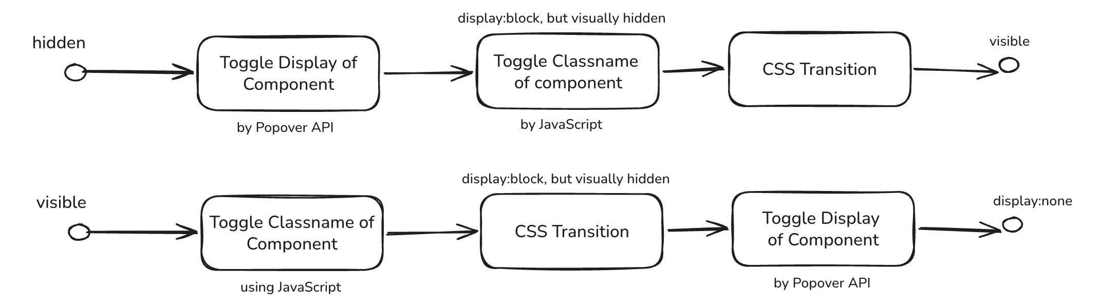
Transition using JavaScript involves enforcing to use classname to control the “visual” presence of component, and toggling “display” property along with these controlling classnames:
1
2
3
4
5
6
7
8
9
| <div class="example-section">
<h2>JavaScript Transition</h2>
<button id="js-open-btn">Open JS Popover</button>
<div id="js-popover" popover="manual" class="popover-box">
<h3>JS Animated Popover</h3>
<p>I animate using JavaScript class toggling.</p>
<button id="js-close-btn" class="close-btn">Close</button>
</div>
</div>
|
1
2
3
4
5
6
7
8
9
| #js-popover {
transition: opacity 0.3s ease, transform 0.3s ease; /* Basic transition styles */
opacity: 0;
transform: scale(0.9);
}
#js-popover.is-open { /* .is-open <-- Class added by JS after display:block is applied */
opacity: 1;
transform: scale(1);
}
|
 1
 2
 3
 4
 5
 6
 7
 8
 9
10
11
12
13
14
15
16
17
18
19
20
21
22
23
24
25
26
27
28
29
30
31
32
33
34
35
36
37
38
39
40
| const jsPopover = document.getElementById('js-popover');
const jsOpenBtn = document.getElementById('js-open-btn');
const jsCloseBtn = document.getElementById('js-close-btn');
// [OPEN LOGIC]
jsOpenBtn.addEventListener('click', () => {
// This add display:block to the popover element, but since .is-open is not
// added just yet , it will stil be opacity:0 and transform:scale(0.9)
jsPopover.showPopover();
// We need a slight timeout/delay for the browser to apply display:block before adding the class for transition
// (alternatively you can also use requestAnimationFrame which allows you run function on next frame)
// [Method-1] timeout/delay (delay 100ms)
setTimeout(
()=>{jsPopover.classList.add('is-open');},
100
);
// [Method-2] requestAnimationFrame (next, next frame)
requestAnimationFrame(() => {
requestAnimationFrame(
() => { jsPopover.classList.add('is-open');}
);
});
});
// [CLOSE LOGIC]
jsCloseBtn.addEventListener('click', () => {
// First remove the class to trigger the exit transition, but since
// the popover close is not triigered yet, the display:block still applies
jsPopover.classList.remove('is-open');
// Wait for the transition to finish before actually hiding the popover
jsPopover.addEventListener('transitionend', function handler(e) {
if (e.target === jsPopover) {
jsPopover.hidePopover();
jsPopover.removeEventListener('transitionend', handler);
}
});
});
|
Outcome:
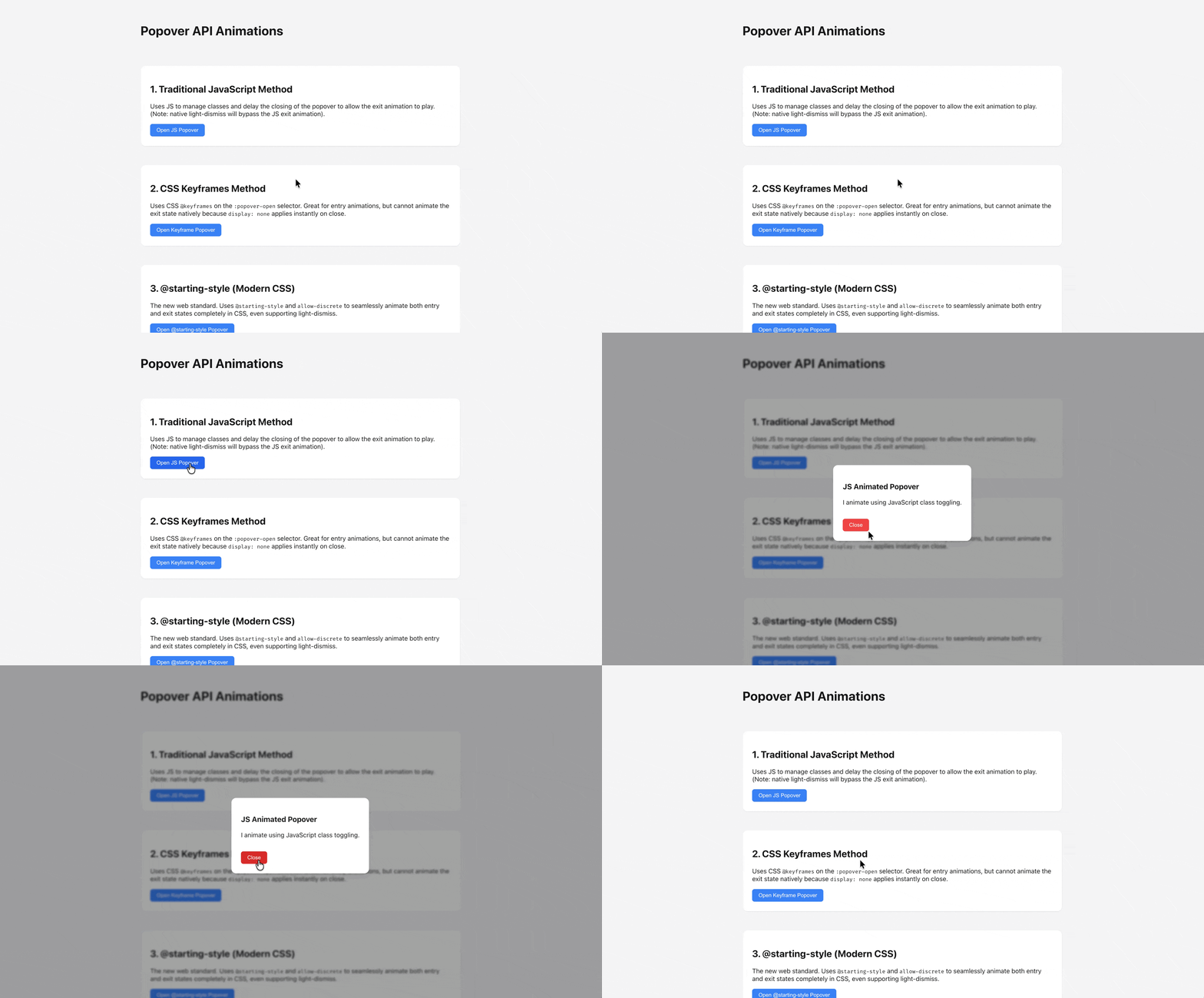
How transition based on JavaScript works:
- When opening:
- First, call
.showPopover() to make the popper target display:block, but visually it is still hidden due to CSS - Second, wait for either a fixed timeframe, or for certain number of frames of render.
- Third, add CSS class
.is-open the browser will automatically transition the opacity and transform property to appear
- When closing:
- First, remove the class
.is-open the browser will automatically transition the opacity and transform property to make the popover dialog to disappear - Second, add a event listener that listens for transition finish
- Third, when the transition is finished (when dialog target visually disappears), the callback function for the listener will be triggered to call
.hidePopover() to make the popover target become display:none
Transition Based on CSS Keyframe#
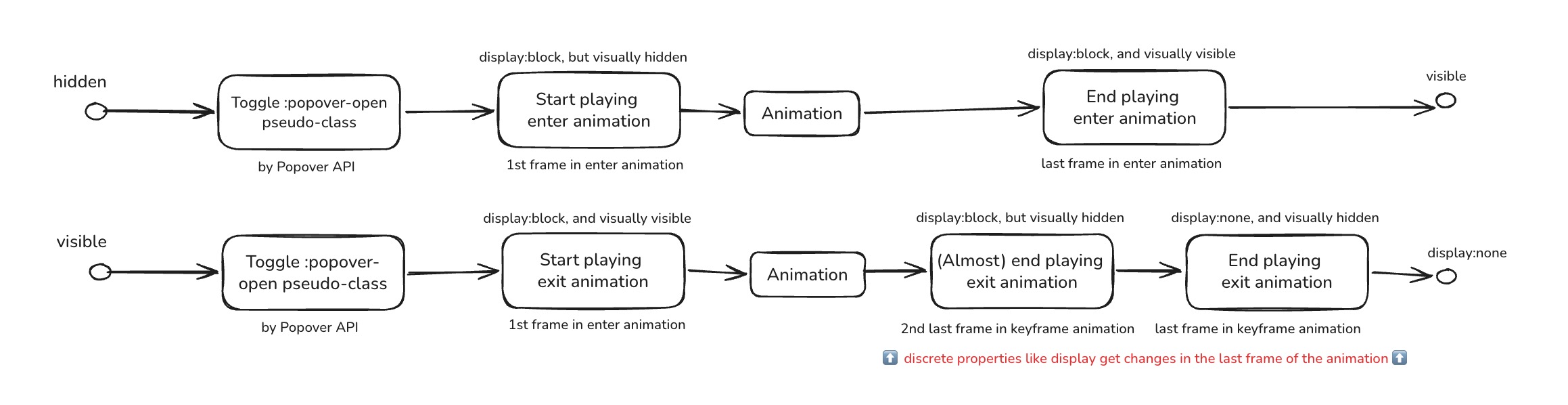
When you implement transition using CSS Keyframe, you’re basically declaring an entrance and exit animation for the component based on its :popover-open pseudo-class, that only plays forward once (one iteration), and only when the component appear on the page:
1
2
3
4
5
6
7
8
9
| <div class="example-section">
<h2>Keyframes Transition</h2>
<button popovertarget="keyframe-popover">Open Keyframe Popover</button>
<div id="keyframe-popover" popover class="popover-box">
<h3>Keyframe Popover</h3>
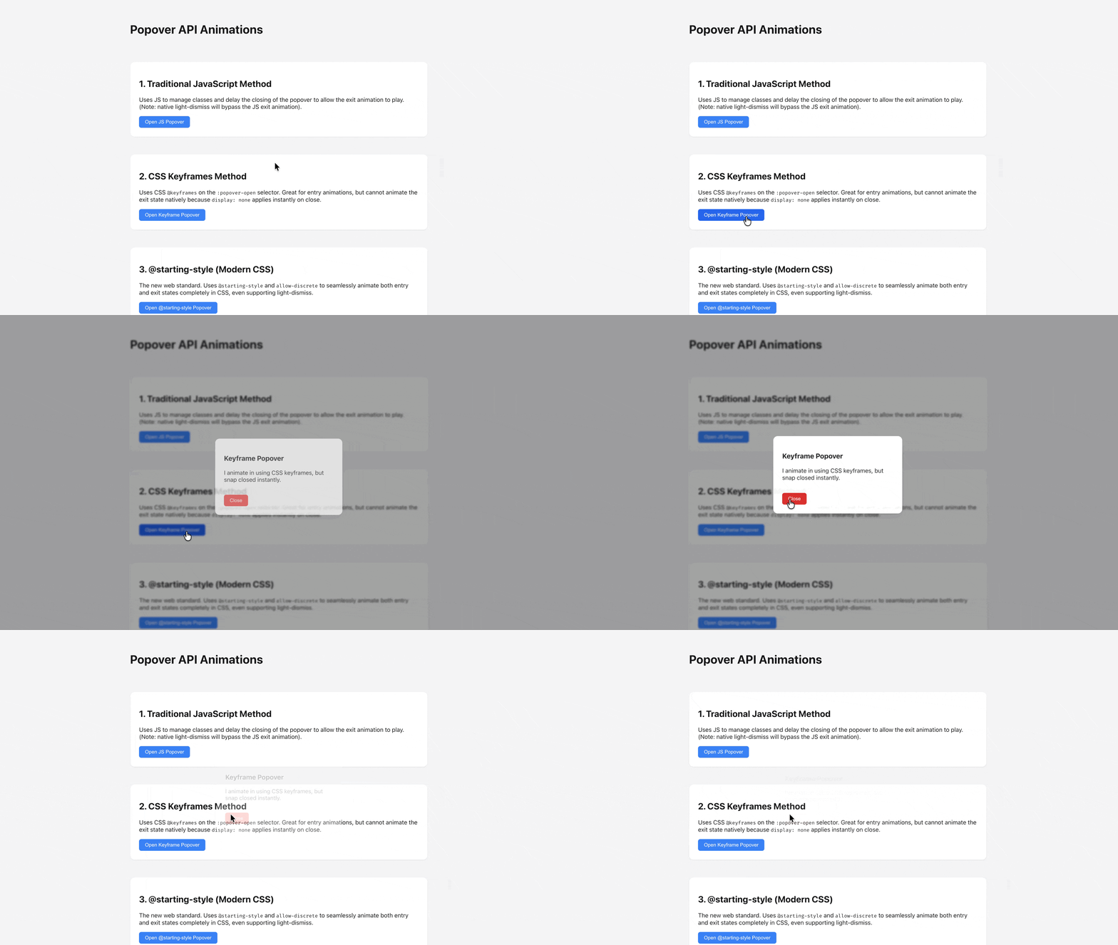
<p>I animate in using CSS keyframes, but snap closed instantly.</p>
<button popovertarget="keyframe-popover" popovertargetaction="hide" class="close-btn">Close</button>
</div>
</div>
|
 1
 2
 3
 4
 5
 6
 7
 8
 9
10
11
12
13
14
15
| /* Entry animation works well with keyframes when the popover opens */
#keyframe-popover:popover-open {
animation: popIn 2.4s cubic-bezier(0.16, 1, 0.3, 1) forwards;
}
#keyframe-popover:not(:popover-open) {
animation: popOut 2.4s cubic-bezier(0.16, 1, 0.3, 1) forwards;
}
@keyframes popIn {
0% { opacity: 0; transform: translateY(20px) scale(0.95); }
100% { opacity: 1; transform: translateY(0) scale(1); }
}
@keyframes popOut {
0% { display:block; opacity: 1; transform: translateY(0) scale(1); }
100% { display:none; opacity: 0; transform: translateY(20px) scale(0.95); }
}
|
(* Notice that:
- we’re adding
0%{display:block} and 100%{display:none} for the exit animation, because if we don’t do so, the display property would immediately be switched to “none” when the popover is closed; - And “display” just happen to be a discrete property that if you would add it to an keyframe animation, the change only happens on the last frame (during the
popOut animation, display:block remains unchanged from 0% ~ 99%; The display:block → none change only happens exactly when hitting 100% in the popOut animation). More about what this discrete animation mean can be found on Kevin’s video: https://youtu.be/vmDEHAzj2XE?t=361
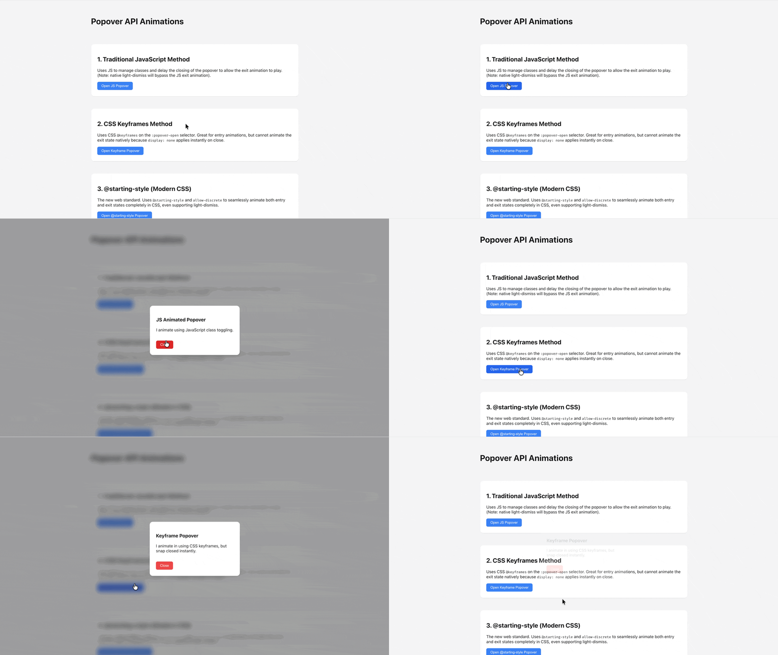
Outcome:
Transition for Backdrop#
(Transition for area outside the Popup Model) As you might have realised, we have got transition for the model popup holding the content, but the background of the model is still switching instantly as we toggle the popup; To add transition for the backdrop, need to apply similar technique to the ::backdrop pseudo class:
 1
 2
 3
 4
 5
 6
 7
 8
 9
10
| /** JavaScript Approach **/
#js-popover::backdrop {
transition: opacity 1.0s ease;
opacity: 0;
backdrop-filter: blur(0px);
}
#js-popover.is-open::backdrop {
opacity: 1;
backdrop-filter: blur(10px);
}
|
 1
 2
 3
 4
 5
 6
 7
 8
 9
10
11
12
13
14
15
| /** CSS Keyframe Approach **/
@keyframes backdropFadeIn {
0% { opacity: 0; backdrop-filter: blur(0px); }
100% { opacity: 1; backdrop-filter: blur(10px);}
}
@keyframes backdropFadeOut {
0% { display: block; opacity: 1; backdrop-filter: blur(10px);}
100% { display: none; opacity: 0; backdrop-filter: blur(0px); }
}
#keyframe-popover:popover-open::backdrop{
animation: backdropFadeIn 1.0s cubic-bezier(0.16, 1, 0.3, 1) forwards;
}
#keyframe-popover:not(:popover-open)::backdrop{
animation: backdropFadeOut 1.0s cubic-bezier(0.16, 1, 0.3, 1) forwards;
}
|
Transition with @starting-style#
With @starting-style you can use regular transition property to add transition for certain components from its initial state (display:none);

 1
 2
 3
 4
 5
 6
 7
 8
 9
10
| <div class="example-section">
<h2>3. @starting-style (Modern CSS)</h2>
<button popovertarget="starting-style-popover">Open @starting-style Popover</button>
<div id="starting-style-popover" popover class="popover-box">
<h3>Modern CSS Popover</h3>
<p>I animate smoothly in both directions with purely modern CSS.</p>
<button popovertarget="starting-style-popover" popovertargetaction="hide"
class="close-btn">Close</button>
</div>
</div>
|
 1
 2
 3
 4
 5
 6
 7
 8
 9
10
11
12
13
14
15
16
17
18
19
20
21
22
23
24
25
26
| #starting-style-popover {
/* 1. Base transition, including display and overlay (allow-discrete) */
transition:
opacity 0.4s ease,
transform 0.4s cubic-bezier(0.16, 1, 0.3, 1),
overlay 0.4s allow-discrete,
display 0.4s allow-discrete;
/* 2. State when popover is closed (exit state) */
opacity: 0;
transform: translateY(-20px);
}
/* 3. State when popover is open */
#starting-style-popover:popover-open {
opacity: 1;
transform: translateY(0);
}
/* 4. State BEFORE the popover opens (entry state) */
@starting-style {
#starting-style-popover:popover-open {
opacity: 0;
transform: translateY(-20px);
}
}
|
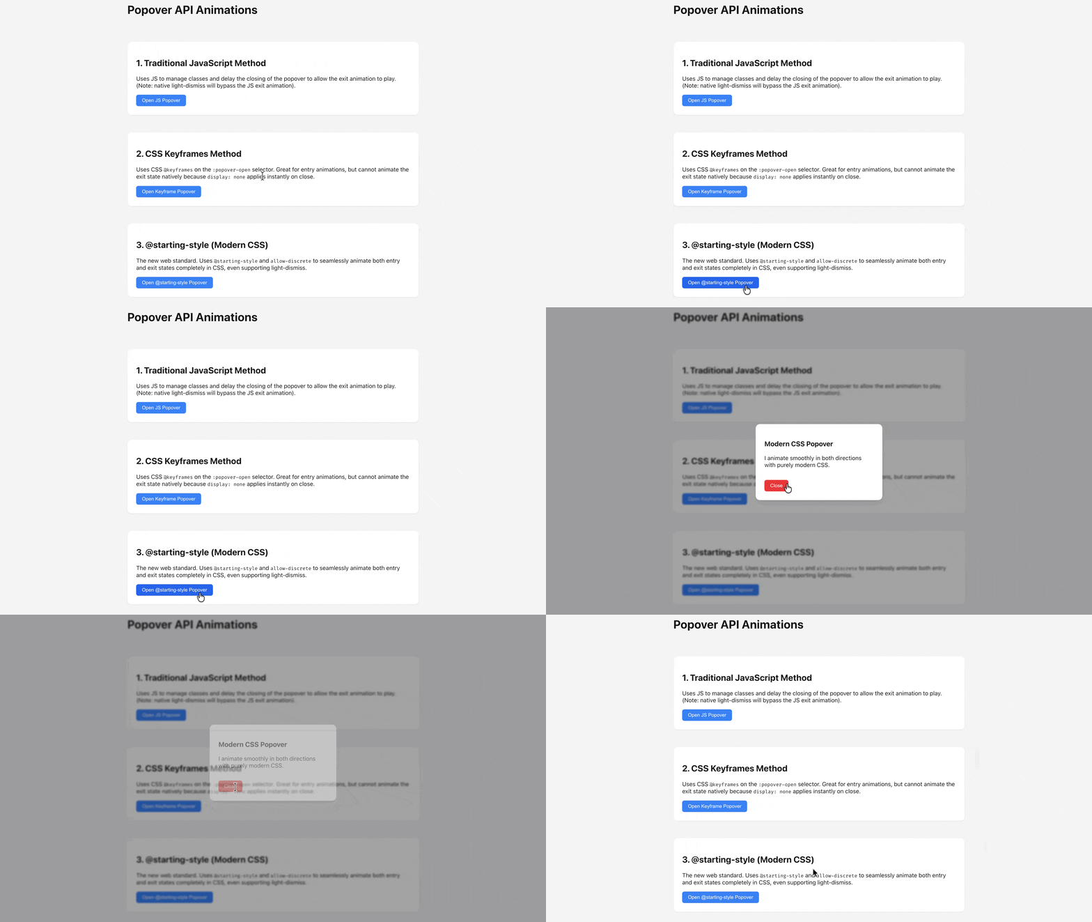
(*Note that in order for the exit transition to work:
you will also need to have transition-behavior being allow-discrete for display
you can either declare this with the transition declarations:
1
2
3
4
5
| transition:
opacity 0.4s ease,
transform 0.4s cubic-bezier(0.16, 1, 0.3, 1),
+ overlay 0.4s allow-discrete,
+ display 0.4s allow-discrete;
|
or you can declare it separately separate from the transition declaration:
1
2
3
4
5
6
| transition:
opacity 0.4s ease,
transform 0.4s cubic-bezier(0.16, 1, 0.3, 1),
+ overlay 0.4s ease,
+ display 0.4s ease;
+ transition-behavior: allow-discrete;
|
Outcome:
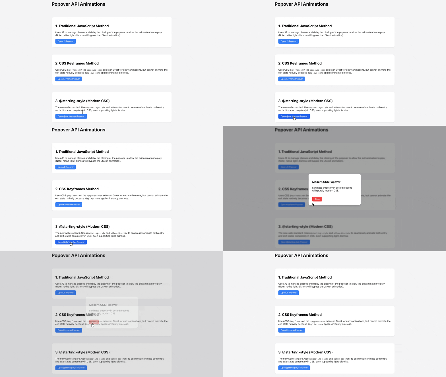
Similarly let’s declare transition for the backdrop pesudo element:
 1
 2
 3
 4
 5
 6
 7
 8
 9
10
11
12
13
14
15
16
17
18
19
20
21
22
| #starting-style-popover::backdrop {
/* 1. Base transition, including display and overlay (allow-discrete) */
transition:
opacity 0.4s ease,
overlay 0.4s allow-discrete,
display 0.4s allow-discrete;
/* 2. State when popover is closed (exit state) */
opacity: 0;
}
/* 3. State when popover is open */
#starting-style-popover:popover-open::backdrop {
opacity: 1;
}
/* 4. State BEFORE the popover opens (entry state) */
@starting-style {
#starting-style-popover:popover-open::backdrop {
opacity: 0;
}
}
|
Outcome:
Reference#
Example Code#