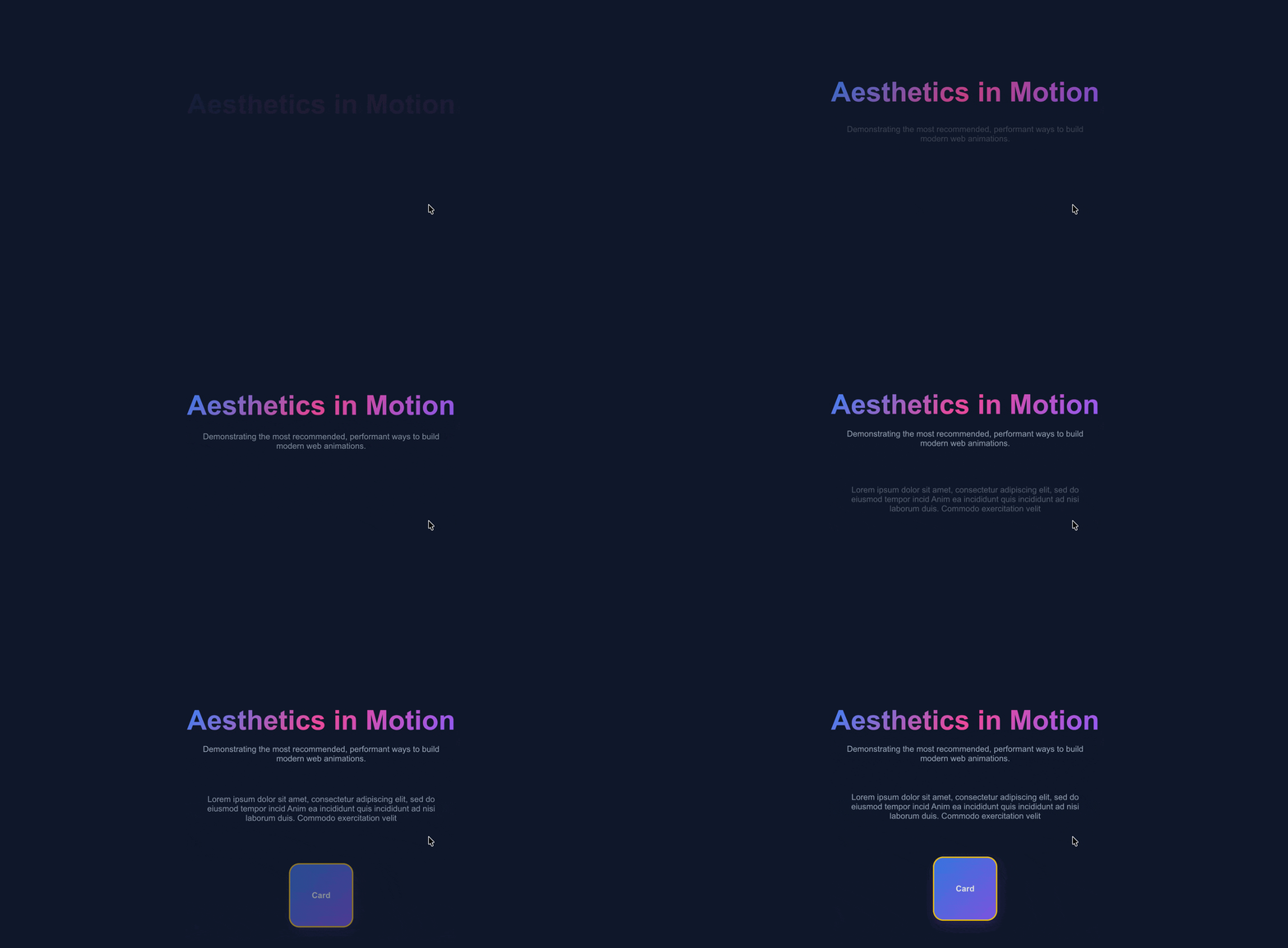
Enter Animation (forwards)#
1
2
3
4
| <h1 class="enter-animation">Aesthetics in Motion</h1>
<p class="enter-animation delay-1">Demonstrating the most recommended, performant ways to build modern web animations.</p>
<p class="enter-animation delay-2">Lorem ipsum dolor sit amet, consectetur adipiscing elit, sed do eiusmod tempor incid Anim ea incididunt quis incididunt ad nisi laborum duis. Commodo exercitation velit </p>
<div class="box enter-animation delay-3" style="margin-top: 2rem;">Card</div>
|
 1
 2
 3
 4
 5
 6
 7
 8
 9
10
11
12
13
14
15
| @keyframes slideUpFade {
from{ opacity: 0; transform: translateY(-10); }
to { opacity: 1; transform: translateY(0); }
}
.enter-animation {
opacity: 0;
transform: translateY(40px);
animation: slideUpFade 3s cubic-bezier(0.16, 1, 0.3, 1) forwards;
}
/* Staggered delays for enter animations */
.delay-1 { animation-delay: 0.5s; }
.delay-2 { animation-delay: 1.5s; }
.delay-3 { animation-delay: 2.0s; }
|
Loop Animation (infinite)#

1
2
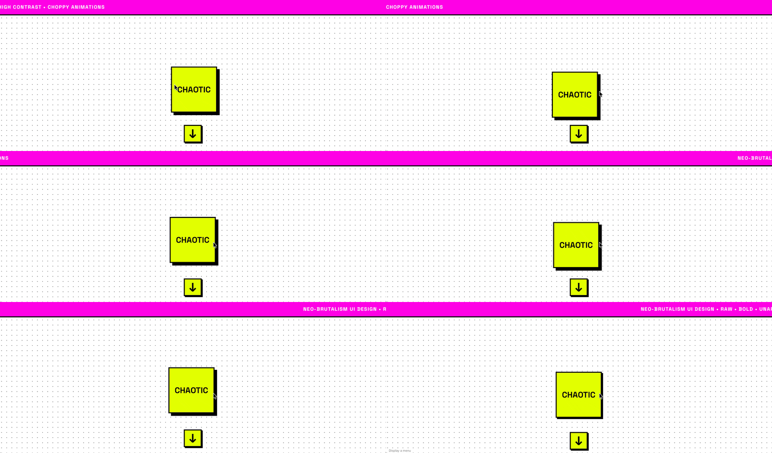
| <div class="box loop-anim delay-3" style="margin-top: 2rem;">Looping</div>
<div class="scroll-indicator">↓</div>
|
 1
 2
 3
 4
 5
 6
 7
 8
 9
10
11
12
13
14
15
| @keyframes float {
0%, 100% { transform: translateY(0); }
50% { transform: translateY(-20px); }
}
@keyframes bounce {
0%, 20%, 50%, 80%, 100% { transform: translateY(0); }
40% { transform: translateY(-15px); }
60% { transform: translateY(-7px); }
}
.loop-anim {
animation: float 3s ease-in-out infinite;
}
.scroll-indicator {
animation: bounce 2s infinite;
}
|
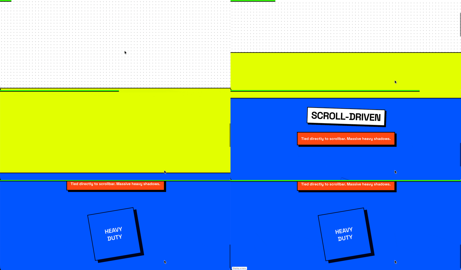
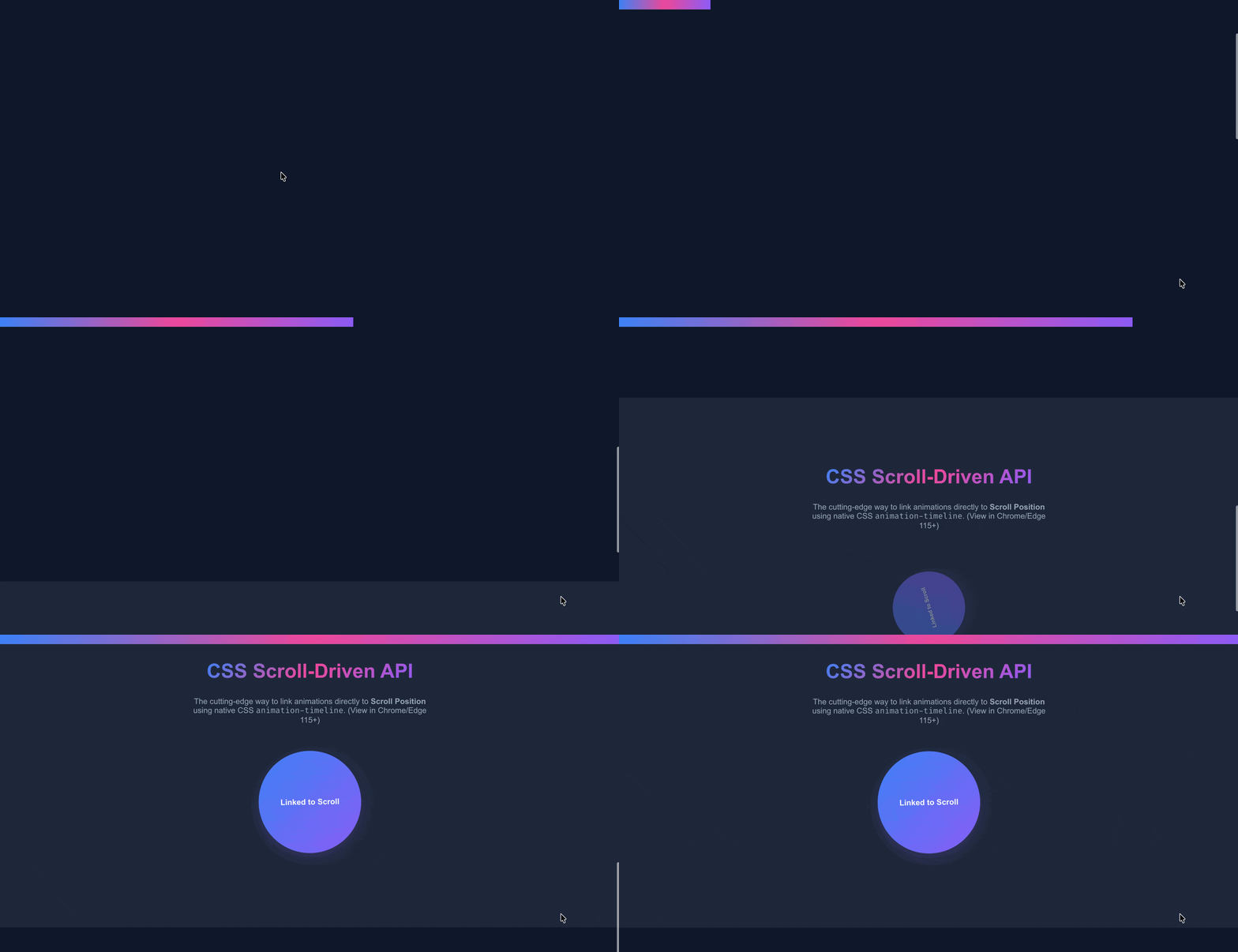
(animation-timeline:scroll() OR ``animation-timeline:view()`)
1
2
| <div class="scroll-driven-progress"></div>
<div class="box scroll-driven-box" style="width: 250px; height: 250px; border-radius: 50%;">Linked to Scroll</div>
|
 1
 2
 3
 4
 5
 6
 7
 8
 9
10
11
12
| /* Global progress bar linked to page scroll */
.scroll-driven-progress {
animation: scrollProgress linear;
animation-timeline: scroll();
}
/* Element animation linked to its view timeline */
.scroll-driven-box {
animation: rotateFade linear forwards;
animation-timeline: view();
animation-range: entry 10% cover 50%; /* Animates while crossing from 10% to 50% of the viewport */
}
|
Intersection-Triggered Animation (Intersection Observer)#
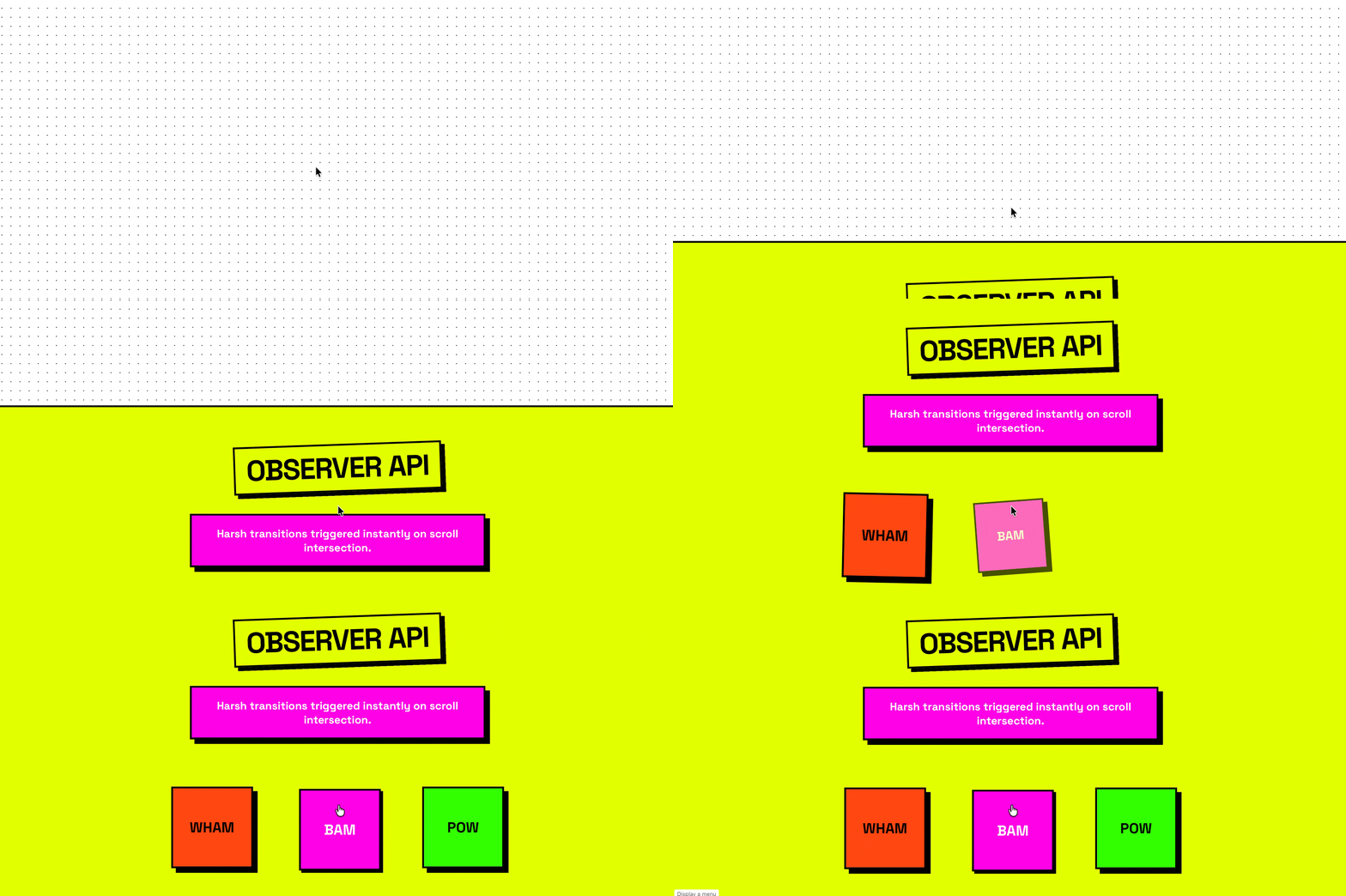

(using JavaScript to toggle classname)
 1
 2
 3
 4
 5
 6
 7
 8
 9
10
| .scroll-trigger-element {
opacity: 0;
transform: scale(0.8) translateY(30px);
transition: all 0.8s cubic-bezier(0.175, 0.885, 0.32, 1.275);
}
.scroll-trigger-element.is-visible {
opacity: 1;
transform: scale(1) translateY(0);
}
|
 1
 2
 3
 4
 5
 6
 7
 8
 9
10
11
12
13
14
15
16
17
18
19
20
21
22
23
24
25
26
27
28
29
30
31
32
| const initScrollTriggers = () => {
// Configuration for the observer
const options = {
root: null, // Defaults to the browser viewport
rootMargin: '0px',
threshold: 0.2 // Trigger when 20% of the element is visible
};
const observer = new IntersectionObserver((entries, observer) => {
entries.forEach(entry => {
if (entry.isIntersecting) {
// Add class to trigger the CSS transition
entry.target.classList.add('is-visible');
// Optional: Stop observing if you only want the animation to happen once
// observer.unobserve(entry.target);
} else {
// Optional: Remove class so it animates again when scrolled back into view
entry.target.classList.remove('is-visible');
}
});
}, options);
// Select all elements that need to be animated on scroll
const elementsToAnimate = document.querySelectorAll('.scroll-trigger-element');
// Start observing each element
elementsToAnimate.forEach(el => observer.observe(el));
};
// Initialize when the DOM is fully loaded
document.addEventListener('DOMContentLoaded', initScrollTriggers);
|
If you want the intersection appear to only happen once, uncomment line-16 (OR remove line-19) from the above
1
2
| + observer.unobserve(entry.target);
- entry.target.classList.remove('is-visible');
|
Reference#