⚠️ Warning:
This is just an scribble / excerpt of the evidence that I find convincing for using Tailwind and Storybook
It is not an official blog post yet, and likely it never will be ….
Why Tailwind ?
Comparing what we’re doing at the moment, which is using Bootstrap-fashioned self-maintained SCSS library, using the utility based Tailwind CSS library has a lots of benefits:
① Consistent utility tokens
Tailwind out of the box gives you almost every single CSS property out there but in classnames, and it is consistent, declared automatically by Tailwind. If you would declare those utility classes yourself, it would be harder to guarantee that you use the same naming convention throughout (e.g. h-100 OR h100) and you would probably have to come up with your own documentation for these collection of classes of yours.
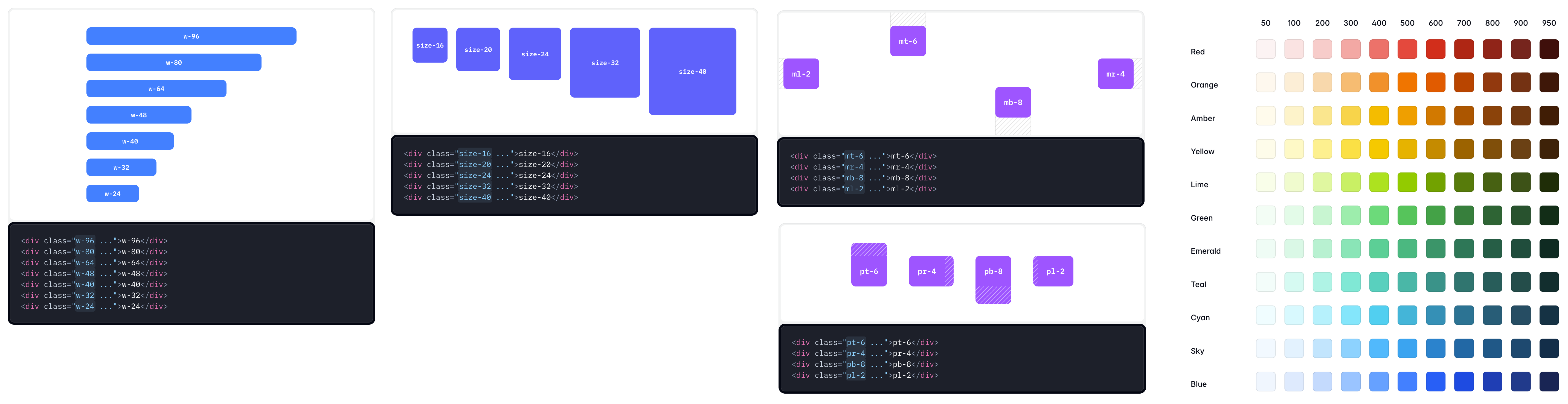
Tailwind is also very flexible, if you need to define your own utility class, for instance,
mt-2being20pxinstead of16px(using--spacer:10px)- declare new color utility classes such as
bg-anu-800/color-anu-800
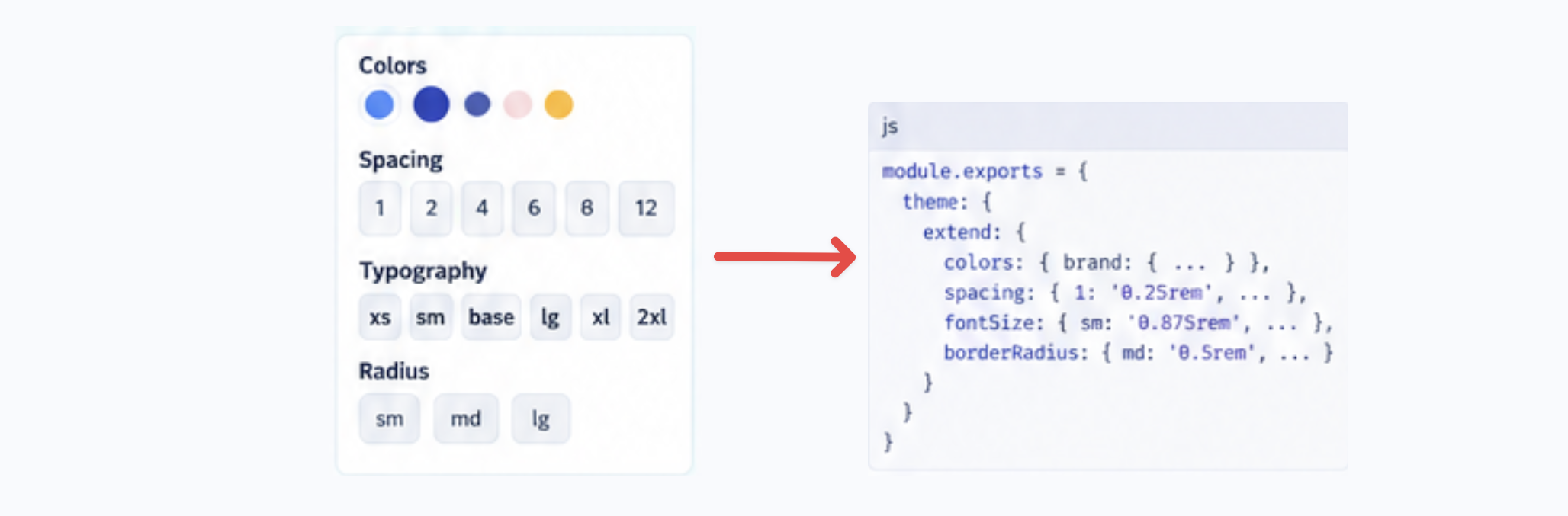
Tailwind offers you a systematical way of defining/configuring those:
Basically your design system will be a part of the configuration that automatically gets applied globally, rather than a convention you will have to force the developer to follow (for instance , mt-5 is automatically margin-top of 5 * var(--spacer))
② More Modular Codebase
This can be divided into two parts: more coherent codebase, and less coupling between components
2.1 More coherent codebase
Declaration and usage of style happens in the same place; Comparing to the original: declare styles/classnames in SCSS/CSS, consume styles/classname in HTML, in Tailwind styleis local to the component; For instance, this is a card component example: https://flowbite.com/docs/components/card/.
2.2 Less coupling between components
Since except for the utility classnames, there is no shared classes between component (e.g. anu-card-container), each components’ styles are independent of one another; Which means changing one of the component will have no side effect to the other component.
③ No conflict with historical library
To prevent conflict with existing styles in the website, you can generate all Tailwind utility classnames with prefix without having to manually adding prefixes yourself, simply just add one line the configuration file: @import "tailwindcss" prefix(anu-una); to avoid conflict with existing classnames already in function (e.g. drop-shadow-xs now becomes anu-una-drop-shadow-xs)

https://tailwindcss.com/docs/upgrade-guide#using-a-prefix
Moreover, we could potentially declare tailwind css in a different layer than the original CSS
④ Flexible responsive and grid-layout
4.1 responsiveness
Instead of declaring every single responsive classnames (e.g. col-lg-4, br-lg-20, mt-lg- ←you need to define these yourself !)
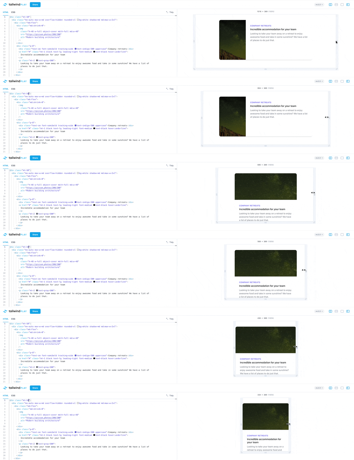
In Tailwind, every utility class can be applied conditionally at different breakpoint without any additional setup (e.g. lg:col-4, md:rounded-xs , max-sm:mt-2 ← tailwind will automatically generate responsive classnames for you)
https://tailwindcss.com/docs/responsive-design
4.2 grid-layout
Instead of the fixed 12-columns grid in Bootstrap, you can define your own number of columns:
- parent:
<div class="grid grid-cols-10 gap-4 ..."> - child:
<div class="col-span-7">,<div class=”col-span-3”>
(But of course you can use grid-cols-12 which is equivalant to Bootstrap’s number of columns )
https://tailwindcss.com/docs/grid-column
⑤ Export from Figma designs
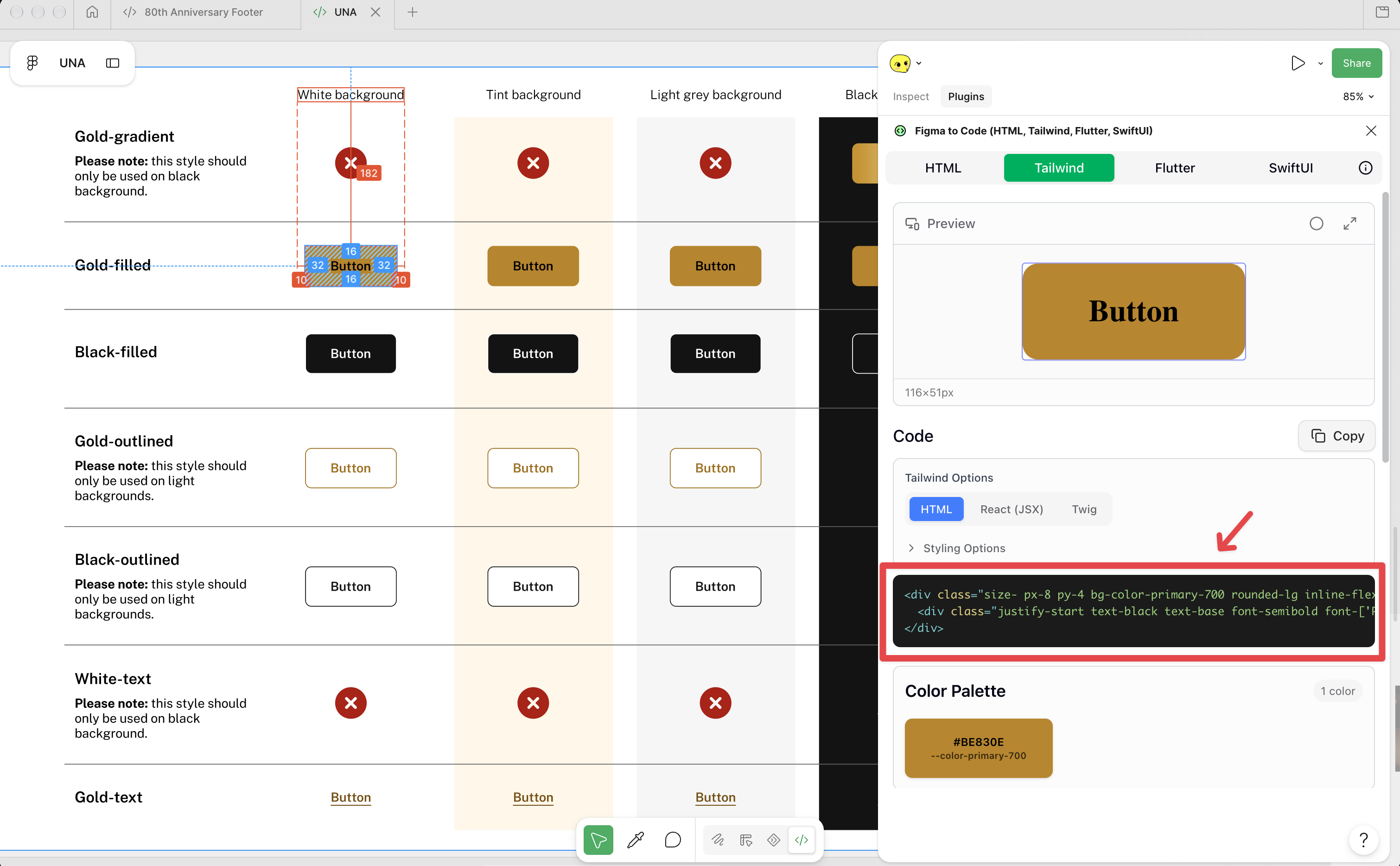
You can export from Figma design to HTML code (with Tailwind classes) with a click of a button to get a baseline functional component (and the best part is that even the design tokens like primary-700 are passed along):
⑥ Abundant component libraries
There’s a bunch of component libraries based on Tailwind, many of them have even became industry standard or the phenomenal base library for other projects, for instance:
- ShadCN/UI: https://ui.shadcn.com/docs/components
- Daisy UI: https://daisyui.com/components/
- Flowbite: https://flowbite.com/blocks/
- Preline UI: https://preline.co/docs/components.html
- Hyper UI: https://www.hyperui.dev/
(*and much much more, I can confidently say there’re more than hundreds of component libraries using Tailwind)
Thought we might not be completely taking a any component library onboard, they can be good reference for our coding standards; And since so many libraries existed based on Tailwind, the popular AI models have got bunch of training data relating to Tailwind, and hence, if you ask Agentic Tools of any model to write front-end code with Tailwind, it will generally produce better outcome comparing to if you would let them to write the same thing using other less popular libraries.
⑦ Always flexible for variants
If you write a component using Tailwind, then you can always override its styles using the utility classes with important modifier (e.g. !mt-2); Which means if required, you can always add more classnames in the original component HTML. Comparing to having to declare more styles in CSS, then remove/modify classnames in HTML, this ensures there’s always a single source of truth for components, and variants are only modified version of that; Once the original copy gets modified then its variants should change too.
This also discourage the giant-sass-codebase problem, since everything can be overridden using utility token, you won’t need to have layers of CSS’s to modify the look of the component depending on which variant it is or where it is located at (e.g. _base.css → _card.scss → _card_teaser.scss → _campaign_landing.scss), everything can be in HTML
⑧ More …
- Component Scoped CSS (e.g.
@layer components {...}, see more: link) - Container Query (e.g.
@container > @max-md:flex-col, see more: link) - Attributed selector (e.g.
data-[size=large]:p-8, see more: link) - Dynamic Utilities (e.g.
pt-*,*can be any number, and tailwind will automatically pick that up and generate the corresponding code for you) - Preflight (CSS Reset / Normalise)
- OKLCH color space (Perceptual Uniformity, link)
- Conditional Utility Class based on states (e.g.
hover:bg-red-200, see more: link)
🙋🏻 Yes …. But … (The Caveats)
What if they find out we’re using Tailwind, and start writing their own component using Tailwind, without following our branding guideline?
Well, this is a forever going question, if they decide to choose to deviate from our branding guideline, they always can, no matter which tech-stack we use !!!
For instance, even if as of now we use bootstrap-liked CSS library, they can still create and import additional
global-override.cssto override our existing styles that fits the branding guidelines:E.G. we have
.anu-button { /* background-copper, text-white, gold-ring-when-focus */ }in our library, but they don’t want to use this style of button, they can always have.anu-button { /* background-red, text-green, ... */ }.Even if we use Drupal SDC component, they can find out what
selectorwe are using (e.g.div[data-sdc-component="card"] > ... > ... > .anu-button), and find way to add more specific selector to override our styling (e.g.html.content--campaign > ... > div[data-sdc-component="card"] > ... > ... > .anu-button)
So if an individual/agency/division is happy to comply and use our component (whether it is code snippet, react/vue component, web component, single-directory-component (SDC) for drupal), they will, and we should make sure it is easy and convinient for everyone (including any third-party agencies on different CMS)
For those who is not a big fan of the super long classname ? You may also have “==component scoped CSS==” in Tailwind !
Some might argue that the HTML written using tailwind is hard to read, because every single component will have a handful of utility classes stacked in class property, and it will become even harder to read after you added the responsiveness and accessibility related classnames such as max-lg:max-w-50 and focus:ring-2;
Below is an example:
| |
(https://play.tailwindcss.com/9sOcRbn1Sk)
This example is easy to solve, you can use @apply to inline any existing utility classes into your own custom CSS:
| |
| |
(https://play.tailwindcss.com/4PlS0XWoCc)
But if you have control over how the HTML is written (e.g. you have your own SDC component in twig) then maybe you should use something other than the class property (to differentiate from the utility class we can set on DOM) such as a *-component-class property (This also helps preventing your components’s custom CSS from leaking to the other portion of the page):
| |
| |
(https://play.tailwindcss.com/8BPQk8ovmm)
With the above approach, you can also take advantage of the CSS layering in tailwind and override the default style using class property in <button> component (layer in tailwind is: ➡️ 0: properties ➡️ 1: theme ➡️ 2: base ➡️ 3: components ➡️ 4: utilities):
| |
| |
(https://play.tailwindcss.com/65H6SbPMIw)
Tailwind Documentation also has a dedicated section for how to deal with duplication: https://tailwindcss.com/docs/styling-with-utility-classes#managing-duplication
But (regarding to the last approach) I also don’t like to introduce additional classnames for every component, because I will then have to maintain a separate piece of CSS per component …. is there any other way around ?
Glad you’ve asked ! The other work around would be to use CVA (class variance authority) package: it is a tiny library for building type-safe, variant-driven class names with Tailwind CSS or any other styling approach.
| |
Read more about this at:
And Drupal have its own version of CVA in twig filter: html_cva, below is an example from the button component of the Drupal Mercury theme: https://git.drupalcode.org/project/mercury/-/blob/1.x/components/button/button.twig?ref_type=heads
| |
You can also learn more about this at:
- https://www.drupal.org/project/cva (added into core since 11.4, so no need to install manually)
- https://twig.symfony.com/doc/3.x/functions/html_cva.html
- https://www.drupal.org/project/mercury
- https://git.drupalcode.org/project/mercury
I would recommend you to stick with the CVA because it is a good alignment with what’s available in Drupal (html_cva), but if you’re working in an environment outside of Drupal, I think it will also worth your time taking a look at this project:
Since tailwind optimises its bundle size by only those utility classes that are detected to be used in your codebase, what if I want certain utility class that isn’t used in the code base, but will be used in the backend ?
If there are certain utility classes that you want to always include in the final bundle, no matter if it is detected in the code base or not, potentially because you want to use it in a view, a custom block, or full html content (e.g. use grid-cols-3, gap, col-span-1 classes in a view block for cards).
You may safelist those utilities using the @source directive in Tailwind: https://tailwindcss.com/docs/detecting-classes-in-source-files#safelisting-specific-utilities. Below are some examples from the official documentation:
| |
| |
| |
You may also create a safelist.txt file and source it using @source "./safelsit.txt":
| |
| |
(Reference: morphos/tailwindcss/index.css, morphos/tailwindcss /safelist.txt)
I want to expose some, but not all of the Tailwind utilities to Content Editors through CKEditors, such that the content author could apply some base styling for some basic component themselves; How could I do that elegantly ?
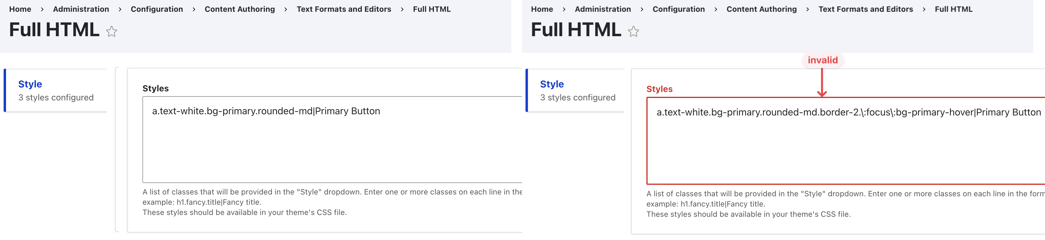
Though you may expose certain utility classes in Drupal through CKEditor’s Style, you CANNOT use ALL the utilities available in tailwind in CKEditor’s Style settings (e.g. below the :focus selectors are not valid !)
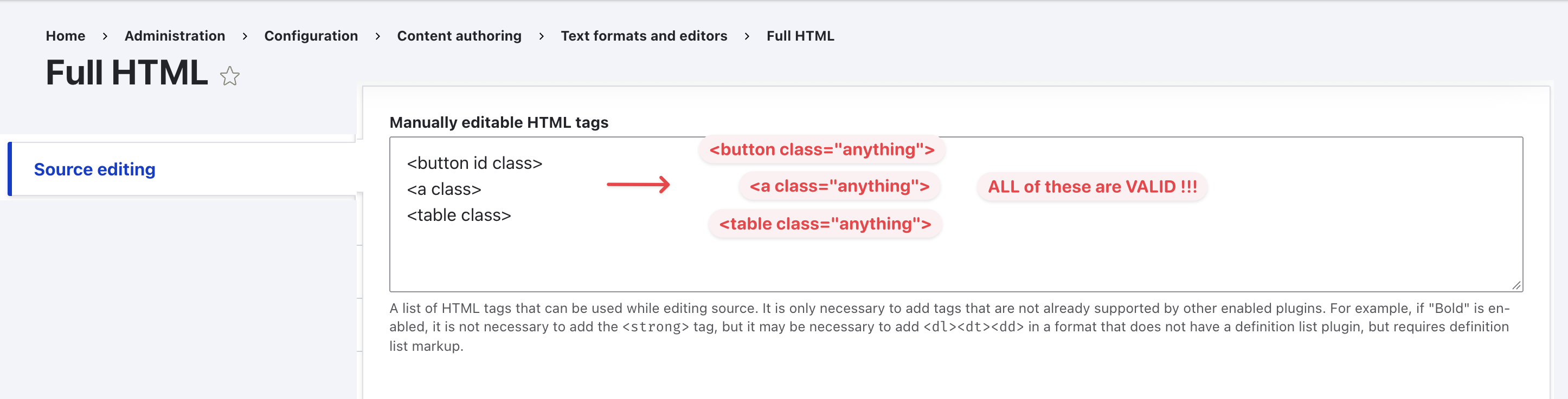
Though you may allow manual editing of classes in Drupal through CKEditor’s Source Editing, you CANNOT constrain it to ONLY allow certain classnames but not all classnames (e.g. when you have <a class> in Source Editing, the content author can put ANYTHING in the class property !); Such level of privilege to the non-technical content authors may lead-to/allow random, ill-formatted custom component being created in-place on pages for ad-hoc changes.
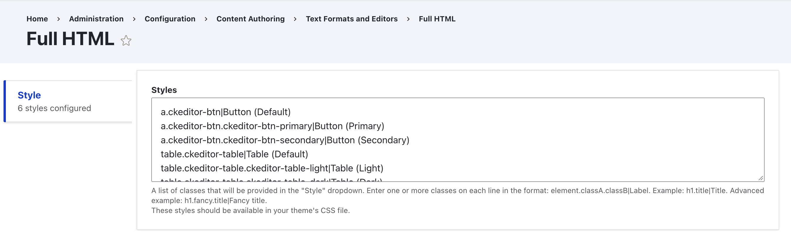
Hence I would recommend instead, is to declare your own CKEditor related utilities (utility classes), and use the CKEditor Style to provide them to the content authors; This way you can have the best of both world (reference, idea from: morphos/base/ckeditor.css):
declare your
ckeditor-btn,ckeditor-table,ckeditor-...styles in ackeditor.cssat component layer (and import it in the main source file where tailwind is imported):1 2 3 4 5 6 7 8 9 10 11 12 13 14 15 16 17 18 19 20 21 22 23 24 25 26 27@layer component{ a.ckeditor-btn, button.ckeditor-btn { @apply text-white bg-primary hover:bg-primary-hover hover:cursor-pointer ...; &.ckeditor-btn-primary { @apply bg-primary hover:bg-primary-hover ...; } &.ckeditor-btn-secondary { @apply bg-secondary hover:bg-secondary-hover ...; } ... } table.ckeditor-table { @apply ... ; &.ckeditor-table-light { @apply ...; & > thead { @apply ... } & > tbody { @apply ... } } &.ckeditor-table-dark { @apply ...; & > thead { @apply ... } & > tbody { @apply ... } } &.ckeditor-table-zebra{ & > tbody tr:where(:nth-child(2n)) { @apply } } ... } ... ... }add those styles into the list of available
**(For my own notes) the available additional libraries / plugin around tailwind ? **
- tailwind-forms
- tailwindcss-typography
- tw-animate-css
- hero-icons
- flow-bite
- daisy-ui
Why Storybook ?
① What it is ? and What Problem does it solve ?
(Basic Incentives)
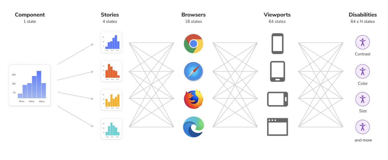
Problem:
- we want to capture the reusable visual patterns inside the website,
- and reuse them in a more rigid, modular, maintainable way (not hard-coded in HTML)
- which is why we’re building components
- but render these component in an actual website takes a lot of time and effort for a developer to setup, and may involve business logic (which means there can be edge condition that you don’t see)
- and testing can be hard sometimes cause the testing tools are usually dealing with the whole page not just any single component, and lots of back-and-forth communication between UI/UX and developer may need to be involved
Solution:
- storybook helps by being an isolated environment that lives separate from the actual website,
- it acts as a small, development-only, component workshop to render and test component variants
- without the interference from other components and business logic.
- it provides an simple interface that both developer and designer can work on at the same time
- it provides automated testing (and manual testing) for components
Reference:
② Simulated User Behaviour (play/interaction-test)
E.g. ::focus, ::visited, tab-keypress,::hover
Reference:
- https://storybook.js.org/docs/writing-tests/interaction-testing
- https://storybook.js.org/docs/writing-stories/play-function
③ Integration with Figma
using plug-in to add Storybook’s iframe embedding in Figma (powered by Chromatic)
same does the other way around: for every component’s story/document you can add Figma link
④ Stack and Asset Independent
Stack independent: CMS (Drupal / WordPress), React, Vue, Svelte
Asset independent: font (can be stored locally), image (aspect ratio), content (card title)
⑤ Automated A11y Testing
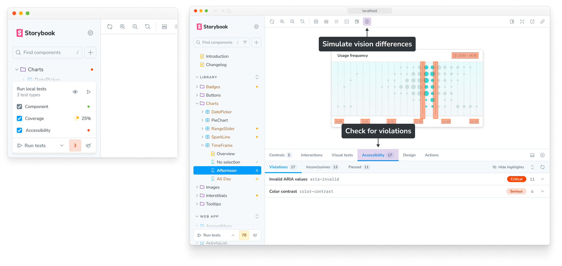
Base-line accessibility testing
- Powered by official
@storybook/addon-a11yadd-on: - Automatically test for some basic WCAG compliance check:
- natively has
['wcag2a', 'wcag2aa', 'wcag21a', 'wcag21aa', 'best-practice', 'wcag2aaa']
- natively has
- It is built on top of Deque’s
axe-corelibrary (link), which automatically catches up to57%of WCAG issues (link).
Custom Unit/E2E testing:
- ==(*I need more investigation on this one)==
- Unit Test using Vitest
- You can write your own test suite using
@storybook/addon-vitestadd-on:
- You can write your own test suite using
- End-to-end Tests using Playwright
- https://storybook.js.org/docs/writing-tests/integrations/stories-in-end-to-end-tests
- It is also recommended that you write Playwright CT E2E tests in Storybook via
storybook-addon-playwrightadd-on:- https://storybook.js.org/addons/storybook-addon-playwright (enables ==Cross-Browser Testing==)
- https://storybook.js.org/blog/portable-stories-for-playwright-ct/
⑥ Visual regression testing

Powered by Chromatic, so you can test: how small change have impacted globally
For instance if you have changed a padding base unit
--shadow-lg(or--padding-base-spacing), you will have changed almost all the components usingshadow-lg(orp*-{#n}) classnames(& you can get notification when something is worth your attention via via “Web-hook” OR “Slack”)
⑦ Responsive viewport testing
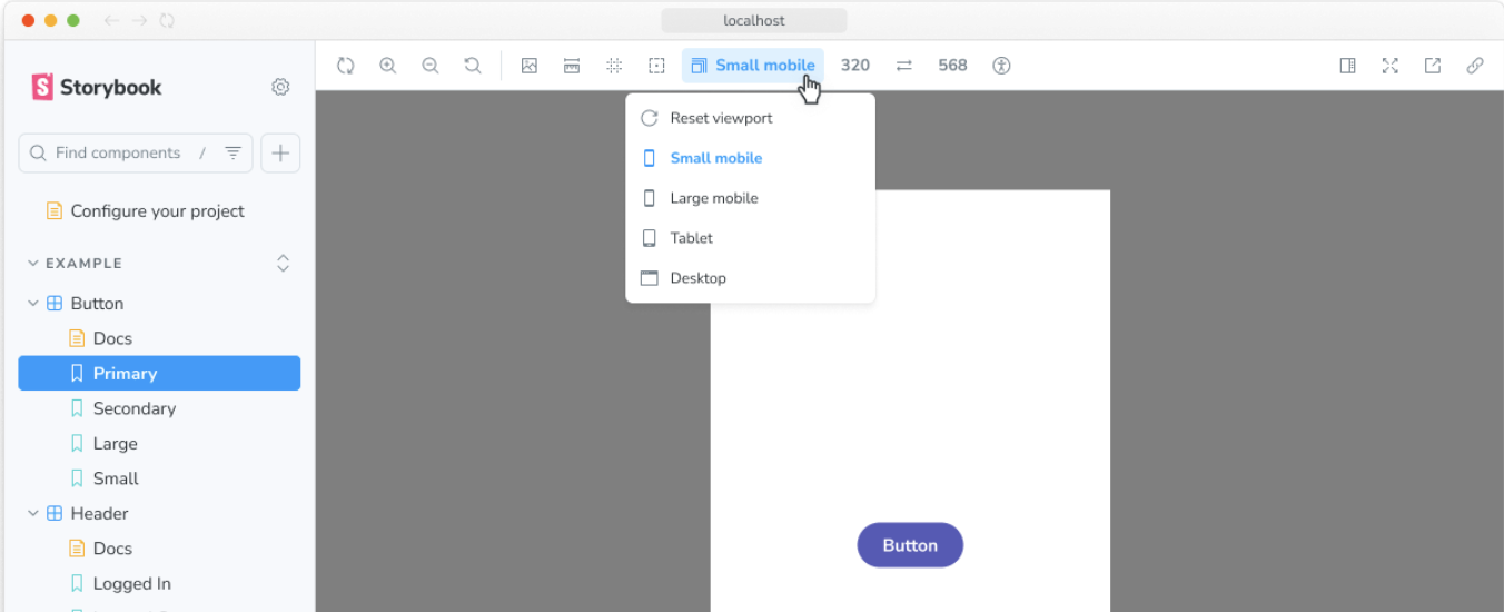
The viewport feature allows you to adjust the dimensions of the iframe your story is rendered in. It makes it easy to develop responsive UIs.
(https://storybook.js.org/docs/essentials/viewport)
⑧ More …
AI Support
Agentic setup: https://storybook.js.org/docs/ai/setup
MCP server: https://storybook.js.org/docs/ai/mcp/overview
🙋🏻 What happened to existing storybook(s) ?
The one Chaz built: ==Unusable because it is static==
- Is only a statically built version living inside the style server at
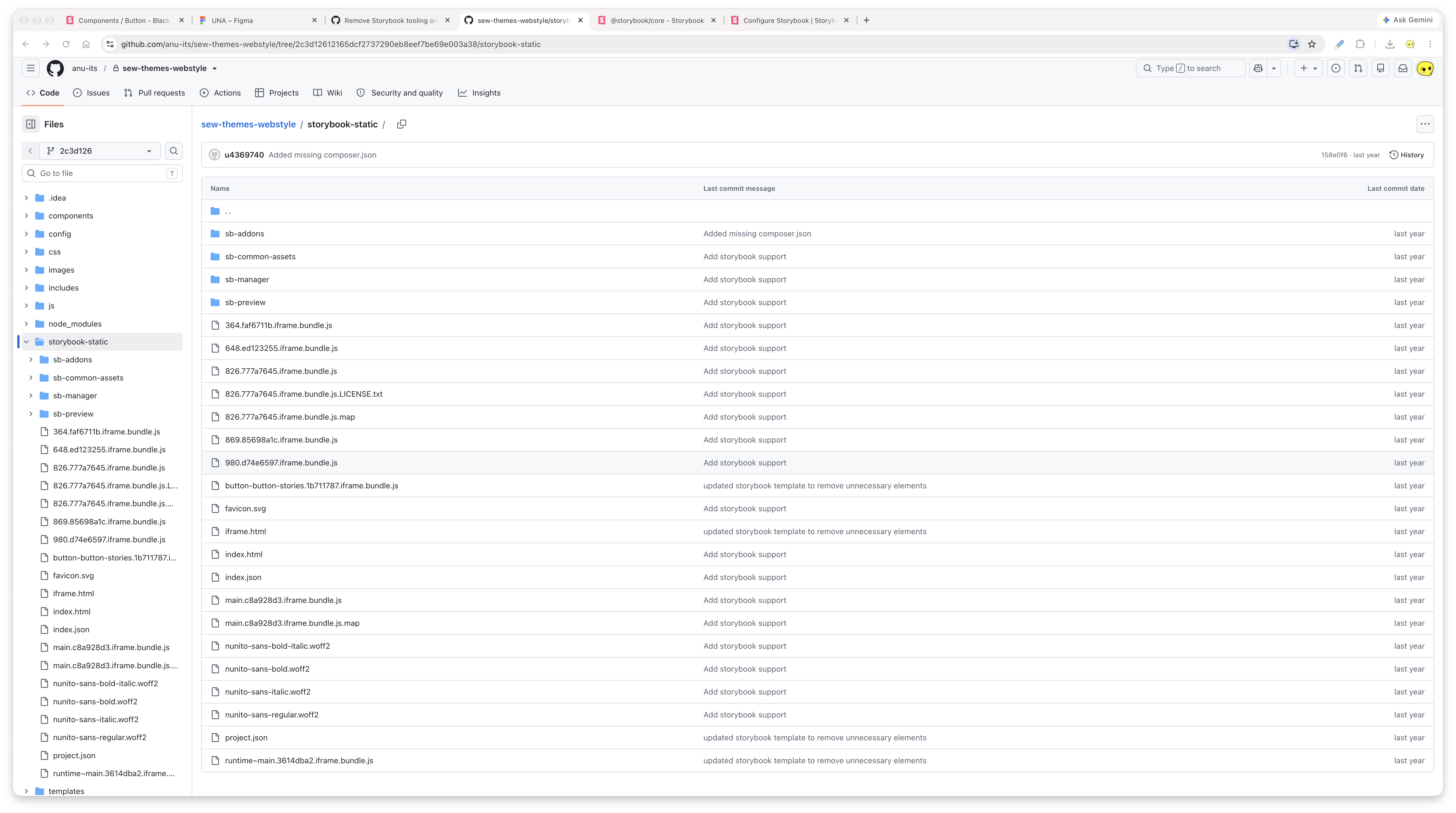
sew-websites-webstyle/styles/sample_html/component-library/, it was kept there away from the GitHub because the management at the time is not willing to share for some political reasons … - It is only on version
8.3.5, which was released on September-2024, its next release, the8.4.0is released on October-2024; So it is likely to be build between those two dates. (see screenshot: 2026-09-19T221848) The latest version as of September-2026 is:10.6.0. - reference link

The one ITS built: ==Unusable because it was not actively maintained==
The twig stories lives inside the SDC as
component-name.stories.twigfile (in Drupal theme):1 2 3 4 5 6 7 8 9 10 11 12 13 14 15 16 17{# some/path/in/your/code/base/my-card.stories.twig #} {% stories my_card with { title: 'Components/Examples/Card' } %} {% story default with { name: '1. Default', args: { cardHeader: 'I am a header!', buttonText: 'Learn more', buttonIconType: 'power' } } %} {# Write any Twig for the "default" story. The `args` above will be #} {# made available as variables for the template 👇 #} {% embed '../examples/my-card.html.twig' with { header: cardHeader } %} {% block card_body %} <p>I am the <em>card</em> contents.</p> {# You can use *any* valid Twig here, including SDCs #} {{ include('my-theme:my-button', { text: buttonText, iconType: buttonIconType }) }} {% endblock %} {% endembed %} {% endstory %} {% endstories %}will get compiled into json stories where Storybook application is able to comprehend (using the Storybook Drupal Module): https://git.drupalcode.org/project/storybook/-/blob/1.x/README.md#installation
1 2 3 4 5 6 7 8 9 10 11 12 13 14 15 16 17 18 19 20 21 22 23{ "title": "Components/Examples/Card", "parameters": { "server": { "url": "https://my-site.lndo.site/storybook/stories/render" } }, "stories": [ { "name": "1. Default", "args": { "cardHeader": "I am a header!", "buttonText": "Learn more", "buttonIconType": "power" }, "parameters": { "server": { "id": "eyJwYXRoIjoic29tZVwvcGF0aFwvaW5cL3lvdXJcL2NvZGVcL2Jhc2VcL215LWNhcmQuc3Rvcmllcy50d2lnIiwiaWQiOiJkZWZhdWx0In0%3D" } } } ] }BUT !!!!!
it is not in active maintenance, and not all SDC component in theme has stories
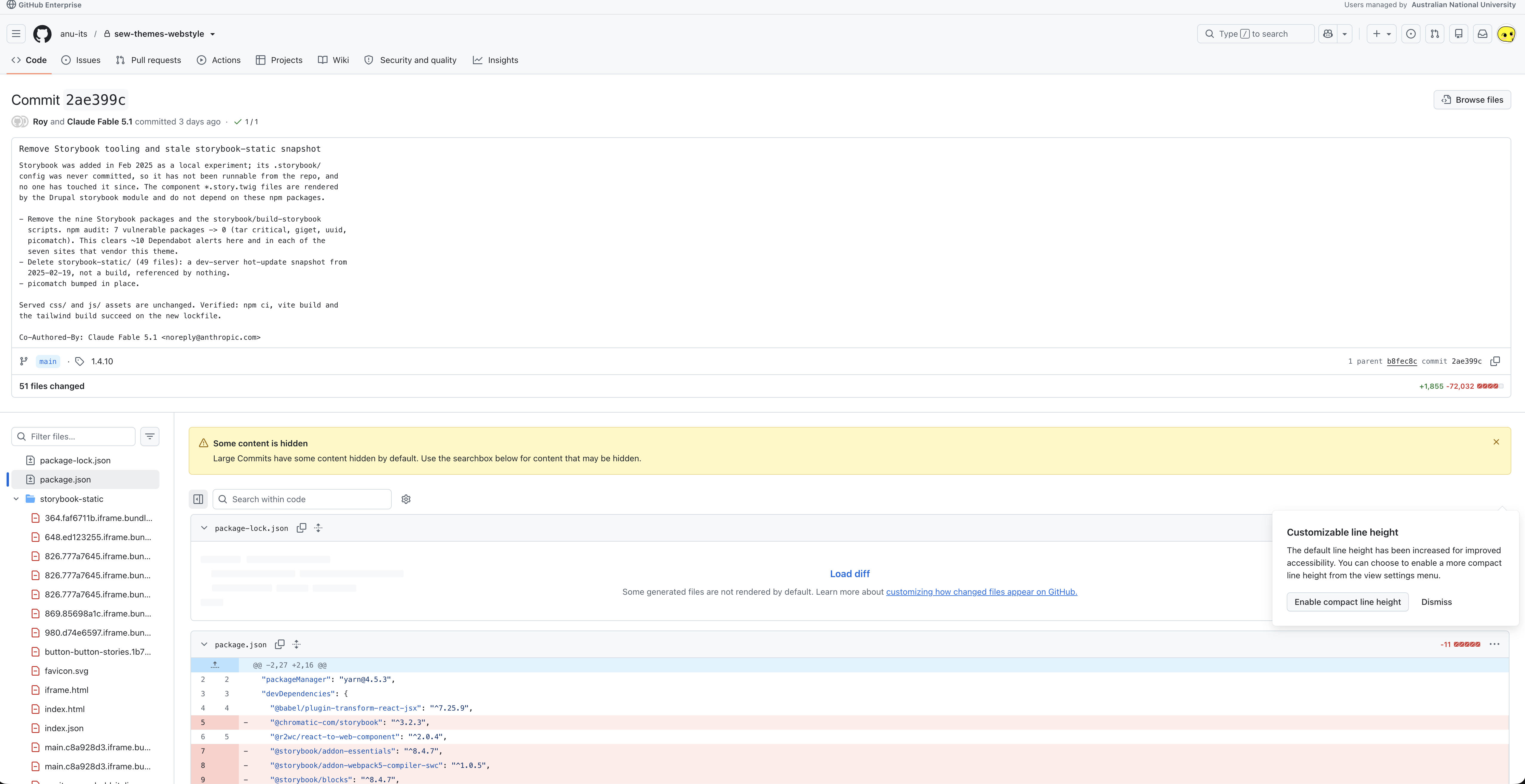
at September-2026, the dependencies to run Storybook was completely removed from the repo by Roy (see screenshot: 2026-09-18T214521), but Roy was kind of doing the right thing, there is on entry-point / configuration file:
.storybook/main.js, and the last time the storybook was built intostorybook-staticwasFeb 2025?! (see screenshot: 2026-09-18T215915)Trying to rebuild the storybook stories from source also fails:
- running
lando drush storybook:generate-all-stories --force --uri=https://content.anu.edu.au(as per instructed inwebstyle/components/Readme/mdyields errorThere are no commands defined in the "storybook" namespace. - after running
drush pm:enable storybook -yto install storybook, followed bydrush pm:list --status=enabled | grep storybook, the samedrusherror persists
And after some digging around I ==suspect== that the current storybook are written based on the older version of the Drupal (potentially Drupal 10), before the
sew-drupal-isfsrepository was established (it started as Drupal 11), hence the API for Single-Direcoty-Component are different (and likely so does the Storybook APIs, but I need to investigate to find out)- running
🙋🏻 Yes …. But … (The Caveats)
The upcoming major update is under the way, what should we do ? (The current version-10’s first stable release is on Nov-2025, the next major update version-11 is expected to rollout on Nov-2026)
We cannot bear the cost of waiting until the next major release to start the experimenting, so we might just have to use version-10 for now, the benefit is that it is stable, got plenty of documentation, and add-on supporting the current version; The version-11 may be world changing (MVP, Framework Expansion, Performance), but it is likely not going to be stable on its early game, and does not impact how we use Storybook, the underlying principle will remain the same.
Reference:
Release plan: https://github.com/storybookjs/storybook/discussions/36230
A comprehensive migration guide is dev in-progress at: https://github.com/storybookjs/storybook/blob/next/MIGRATION.md#from-version-10x-to-1100
Someone will have to continue to support the storybook ?
Since storybook is isolated from the actual framework, we have to maintain it separate from the main theme/library; If no active care is given for the stories, it will quickly become outdated and becomes useless. Hence it is encouraged that the team update it alongside the theme and library, ideally it should be a part of the release workflow (dev -> storybook -> prod).
Storybook only support ESM (does not support CommonJS) ?
Storybook has removed support for CommonJS in its major version-10 update, hence all your dependencies such as package has to have ESM version of the release package.
Presentation Preparation
For the Developers
Tailwind
Consistent Design System(Spacing, Colour, Naming…)
Easy Responsive-ness & Future-proof Dark Mode
Deep Customisability
Optimised Prod Bundle
But overall…
It is not that important whether we use Tailwind, Bootstrap, or something else, at the end of the day we would want it to clip with our deisgn system in Figma, that’s really all that matters, so it is really just to pick one on and stick with it.
And I think tailwind is the go to for us at the moment, because it provides a complete system of utility classes that’s more than enough for most use cases, while only exposing a small scope of opinonated set of configurations for users to customize.
Of course you can (and we have been) achieve the same thing that tailwind did, with Bootstrap or other tools (like Atomic CSS), but you’ll never get the same level of completeness, and its a lots of hussle to declare and maintain your own utilities, and tailwind comes with its nice official documentation for everything (so no more guess work).
Storybook
Stack and Asset Independent
Responsive Viewport
Accessibility Testing
Other (less important for us dev):
Integration with Figma
Visual Regression Testing
Simulate interation like hover/click
For the UI/UX Designers
Tailwind
Dynamic Maintainable Utility Classes based on Design tokens (CSS Variables)
Conditional Utility Class based on State (Hover, Focus)
Cross-Browser Support (Same CSS may render differently, but not for Tailwind …)
Future Support for Dark / Light Mode
Other
Component Scoped Styling (CSS under @components layer)
Support for custom columns in grid
Mobile first-responsie system
Container Query & Component Scoped CSS
There are just a million reasons for why Tailwind is better than writing our utility based on Bootstrap-liked SCSS
Storybook
Component as Living Documentation
- to host on certain domain, so that everyone including you UI/UX specialist, developers, and even external stakeholders
- you can write additional guide around how a component should be used, and setup control for components so you can check how component behaves in different states (for instance, when you give different image to a card component, you can upload image live in Storybook and see how the Card component changes)
- you can preview components in different viewport to check responsiveness
- you can also check dark mode …
Automated Baseline A11y Testing
both locally when building storybook
and on the chromatic platform: https://www.chromatic.com/docs/accessibility/
Disability Discrimination Act 1992 (DDA) we have to be minimal WCAG 2.1 AA level compliance
Storybook is able to perform some baseline testing for the following ruleset:
Automated Visual Regression Testing
- if you pay for the premium tier for chromatic, you can also get cross browser visual regression testing to ensure the same component looks all the same and consistent across different browsers
Reference
Speech / Podcast / Tutorials
YouTube - Syntax - Storybook Has Evolved w/ Jeppe Reinhold
1 2 3 4 5 6 7 8 9 10 11 121. Introduction to Jeppe Reinhold and Storybook [00:00] 2. What is Storybook and its three pillars (Development, Documentation, Testing) [01:43] 3. Transition to Vite and modern build tool integrations [05:07] 4. Reducing bundle size, dependencies, and "bloat" in Storybook 9 [07:12] 5. Codebase modernization and upgrading from older versions [11:42] 6. Component-based testing and the new Vitest integration [17:39] 7. Visual regression testing with Chromatic [25:20] 8. Best practices for component design (Presentational vs. Smart components) [29:57] 9. Automated accessibility testing with Axe core [35:14] 10. Useful Storybook add-ons (Record/replay interactions, CSS state forces, viewports) [41:19] 11. Documentation features and TypeScript prop inference [45:09] 12. Sick picks and shameless plugs [47:03]YouTube - Syntax - Writing Maintainable CSS
1 2 3 4 5 6 7 8 9 10 11 12 13 14 15 16 17 18 19 20 21 221. Welcome 2. Understanding CSS Manageability 3. This CSS doesn’t leak to other parts of website. (and same does the other way around, it is not dependent on the parent) 4. This CSS is easy to maintain. 5. This CSS is reusable. 6. Global Solutions Instead of Local Solutions. 7. Flexibility and Adaptability in CSS 8. Fluid Typography and Responsive Design 9. Variables and Consistency in CSS 10. Brought to you by Sentry.io. 11. Values vs Variables. 12. Choosing the Right CSS Methodology 13. Utility CSS and Atomic CSS 14. Exploring StyleX and Other Approaches 15. Panda CSS. 16. Component Scoped CSS: A Preferred Approach 17. The Evolution of CSS Modules 18. Global CSS: Best Practices 19. Harnessing CSS Variables 20. Understanding CSS Layers 21. The Power of CSS Scoping 22. Enforcing CSS Standards with ToolsYouTube - Figma - How to create pixel perfect UIs with StoryBook
1 2 3 4 5 6 7 8 9 10 11 12 13 14 15 16 17 18 19 20 21 22 231. Introduction & The Iterative Loop [01:58] - Overview: Explains why strict, linear handoffs (Design $\rightarrow$ Code) fail and why UI development is an iterative loop requiring collaboration. - What it means for UI/UX: Designers must design systems that can evolve rather than expecting static files to translate into production without back-and-forth adjustments. 2. Managing Complexity with Variants & Stories [05:21] - Overview: Compares Figma component variants ("sticker sheets") with Storybook stories, which isolate coded components to render every state (loading, error, dark mode) outside the main app. - What it means for UI/UX: Figma variants serve as the structural spec for engineering; Storybook acts as the exact code equivalent, providing a shared taxonomy and mental model between designers and developers. 3. Bridging Tools with Side-by-Side Embeds [14:42] - Overview: Demonstrates how embedding Figma files directly inside Storybook reduces context-switching between tools. - What it means for UI/UX: Developers can inspect design intent, spacing, and typography tokens right inside their coding documentation environment without constantly jumping back into Figma. 4. Collaborative UI Reviews via Chromatic [18:30] - Overview: Introduces cloud-based review workflows (via Chromatic) where pull requests expose live component stories for team feedback. - What it means for UI/UX: Designers are brought back into the loop before code merges, allowing them to review actual rendered UI states and pin comments directly to components instead of relying on screenshots. 5. Automated Visual Regression Testing [25:26] - Overview: Explains how automated tools use stories to run pixel-by-pixel comparisons against established baselines to catch accidental layout breaks. - What it means for UI/UX: Protects design system integrity at scale, ensuring that updates made by developers don't unintentionally break components across the rest of the application. 6. Syncing Production with Figma Dev Mode [27:27] - Overview: Discusses linking Figma variants directly to Storybook stories to keep design files and live production code synchronized. - What it means for UI/UX: Designers can click a component variant in Figma Dev Mode and instantly preview the live, production-ready code version, maintaining a single source of truth.(⚠️PENDING) YouTube - Syntax - UI Components: ShadCN, Tailwind UI, Headless, React Aria, Radix UI
1 2 3 4 5 6 7The four categories of Ul libraries or frameworks. 1. Headless 2. Unstyles 3. Styled Started 4. UI Kit / Design System What does a UI component need to do? ....YouTube - Syntax - Tailwind 4 is HERE!
1 2 3 4 5 6 7 8 9 10 11 12 13 14 15 16Welcome to Syntax! [0:00] Brought to you by Sentry.io. [0:16] Tailwind 4. [1:03] Wes' favorite new feature. [2:53] property. [5:45] The config is now a CSS file. [7:28] Tailwind Oxide. [8:25] P3 color space. [10:48] Dynamic Utilities + Variants. [12:36] Data attributes. [13:36] First class container query support. [15:32] Starting Style. [17:03] When to use inline styles. [19:22] Descendant selector. [20:13] Why not just use "normal" CSS? [20:48] No text shadow support. [22:03]
Tailwind Related Tutorial / Documentation
- Core Concepts > Styling with utility classes > Managing duplication: link
- Core Concepts > Adding custom styles > Adding component classes: link
Storybook Related Tutorial / Example
Tutorial
React Storybook Crash Course: https://www.youtube.com/watch?v=FUKpWgRyPlU
Storybook Tutorial in Next.js: https://www.youtube.com/watch?v=vn-mz2iRDBs
Storybook Official - Tutorial: https://storybook.js.org/tutorials/intro-to-storybook/
1 2 3 4 5 6 7 8 91. Get started 2. Simple component 3. Composite component 4. Data 5. Screens 6. Deploy 7. Visual Testing 8. Accessibility Testing 9. Conclusion(PENDING) Component Driven User-Interface: https://www.componentdriven.org/
(PENDING) Connect Storybook to MCP: https://storybook.js.org/docs/ai
(PENDING) UI Testing Handbook: https://storybook.js.org/tutorials/ui-testing-handbook/
(PENDING) Visual Testing Handbook: https://storybook.js.org/tutorials/visual-testing-handbook/
Chromatic Cross-Browser Testing: https://www.chromatic.com/docs/browsers/
Example
- Storybook Official - Examples: https://storybook.js.org/showcase/
- Good Reference for us (Jannie and Naomi found!):
- Vibe Design System (Monday.com): https://vibe.monday.com/?path=/docs/welcome--docs
- University of Queensland: https://design-system.uq.edu.au/storybook-html/index.html?path=/story/introduction-overview--overview
- More Storybook Examples I found:
- Civic Theme: https://uikit.civictheme.io/
- Daisy UI: https://react.daisyui.com/
- ShadCN Craft: https://storybook.shadcncraft.com/
- Chakra UI: https://chakra-ui.netlify.app/
- BBC UK: https://www.bbc.co.uk/
- WordPRes: https://wordpress.github.io/gutenberg/
- Wix.com: https://www.wix-pages.com/wix-design-system-employees
- JetBrains Ring UI: https://jetbrains.github.io/ring-ui/master
- Three.JS Example: https://drei.pmnd.rs/
RedNote
- Overview of Storybook, What problem does it solve: 2026-09-28T112702
- Comparing to Ladle and Historie, Caveat of Storybook: 2026-09-28T112919
- Example Storybook with play interaction: 2026-09-28T113026
- Summary and take away: 2026-09-28T113050
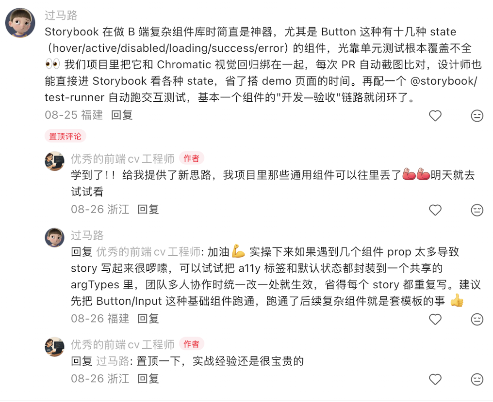
- Comment: 2026-09-28T113157
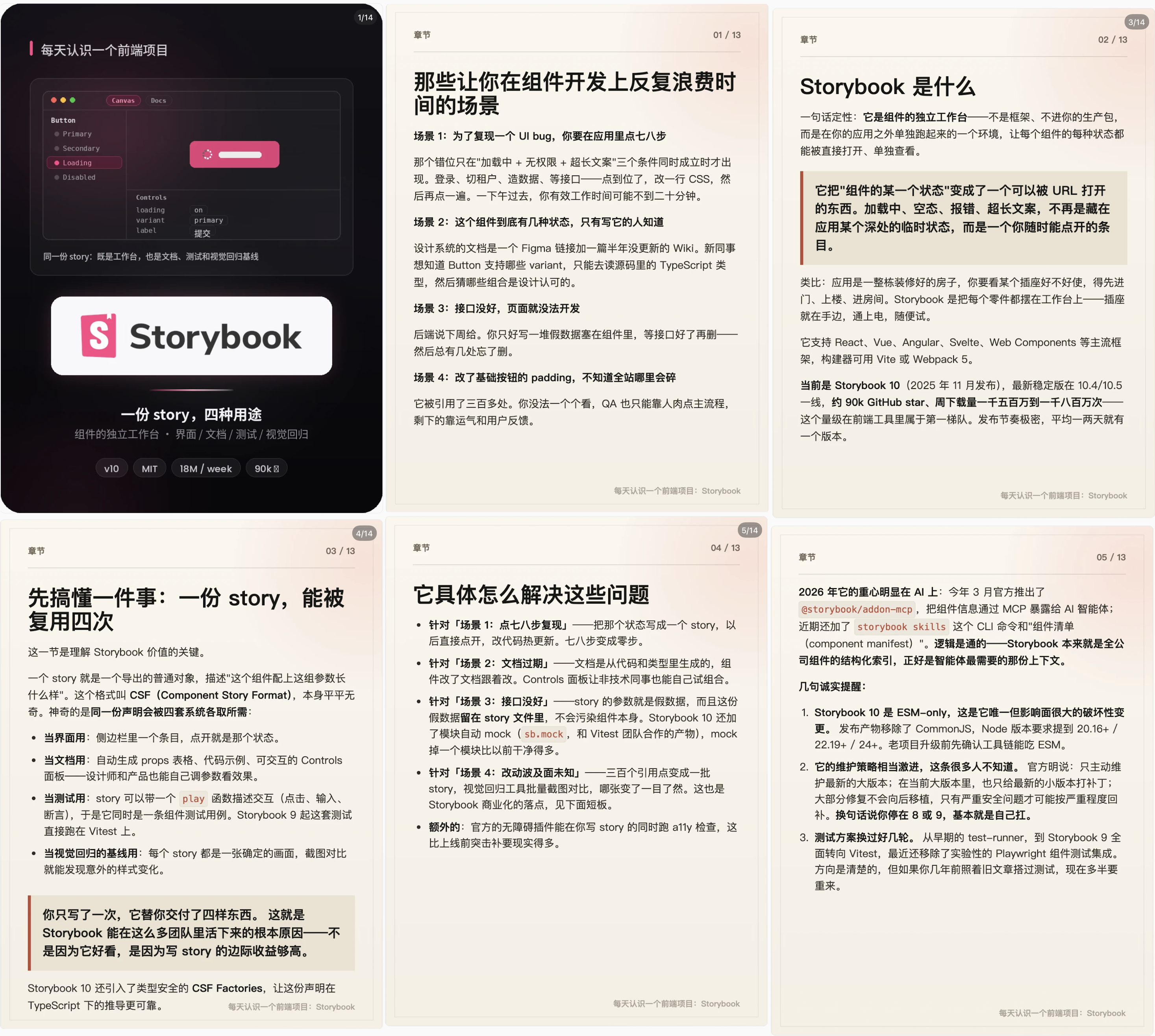
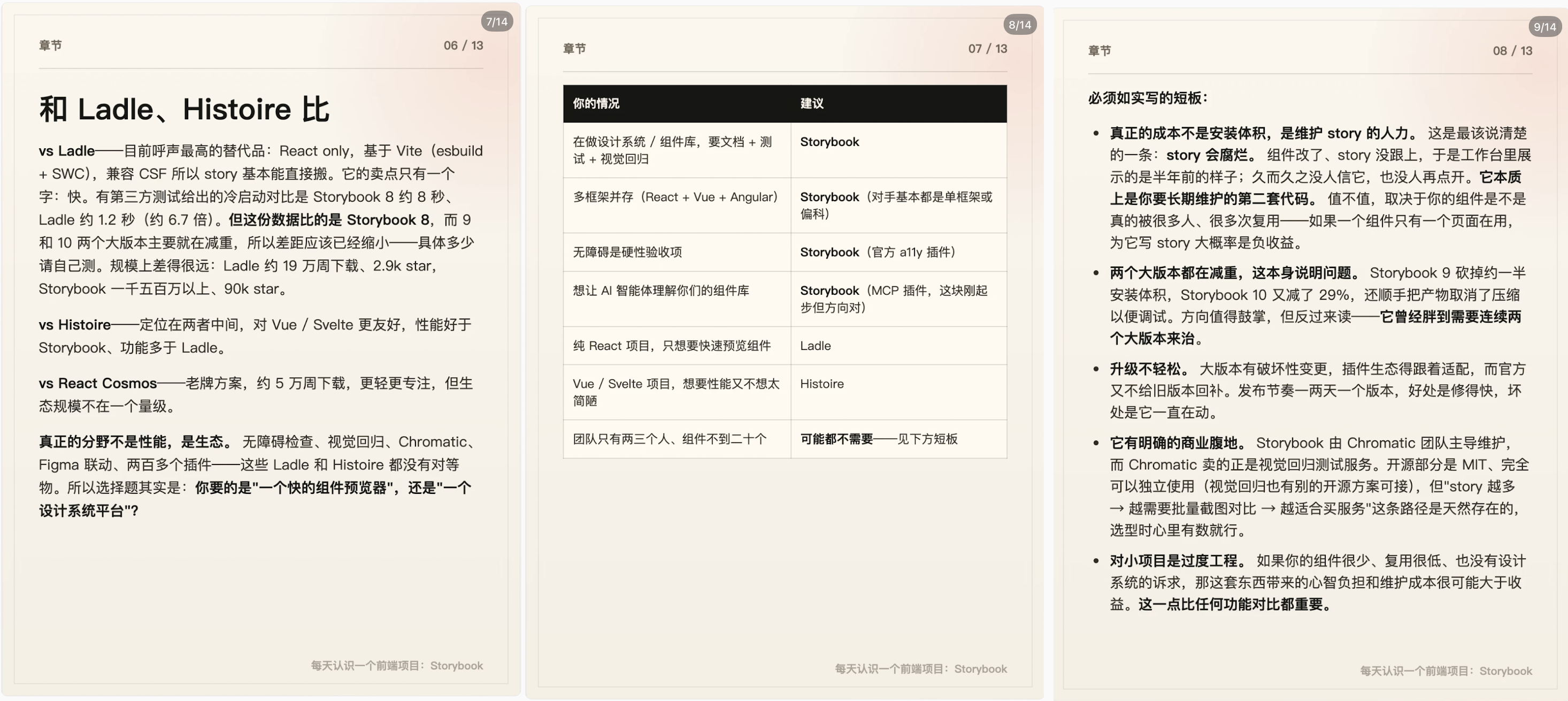
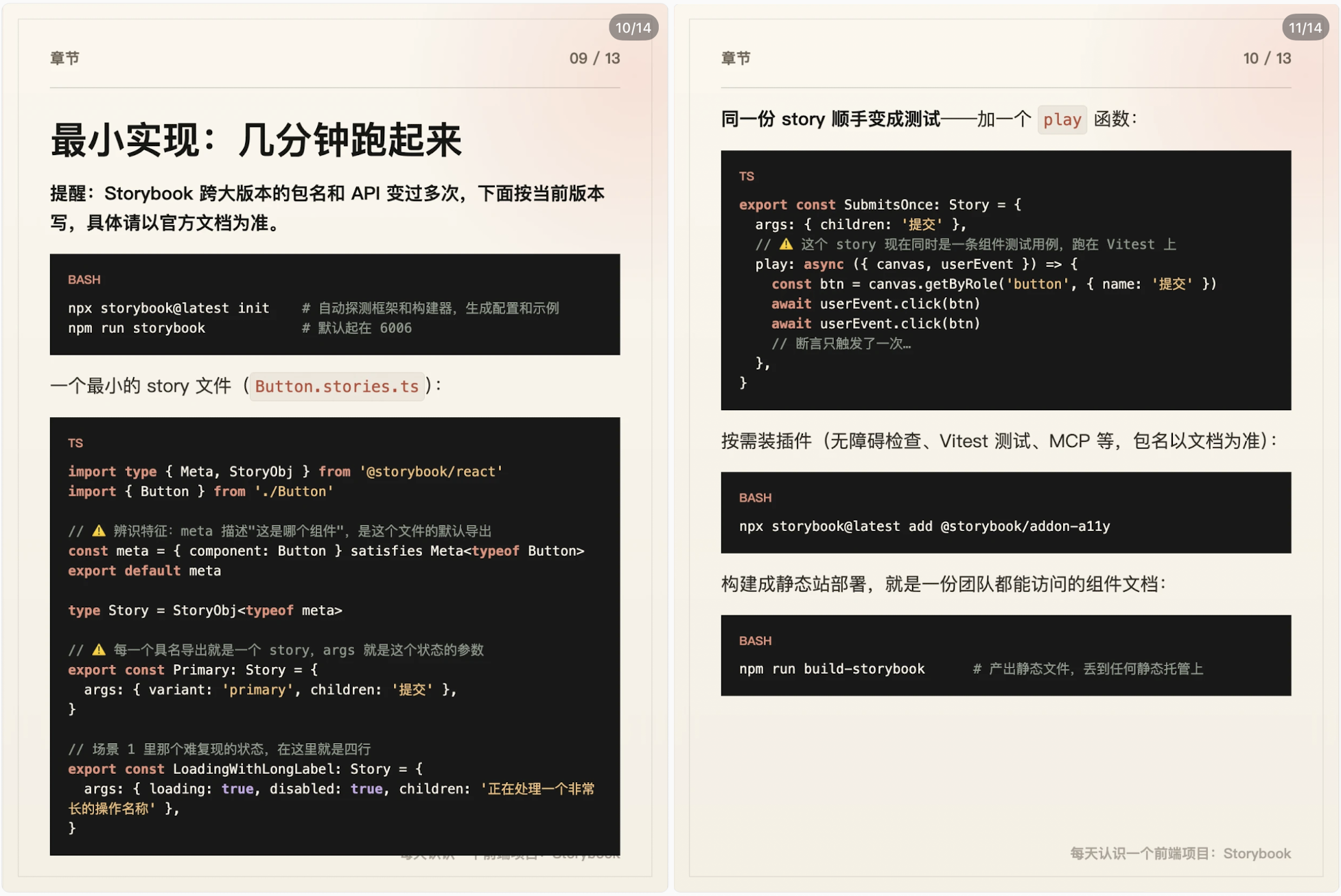
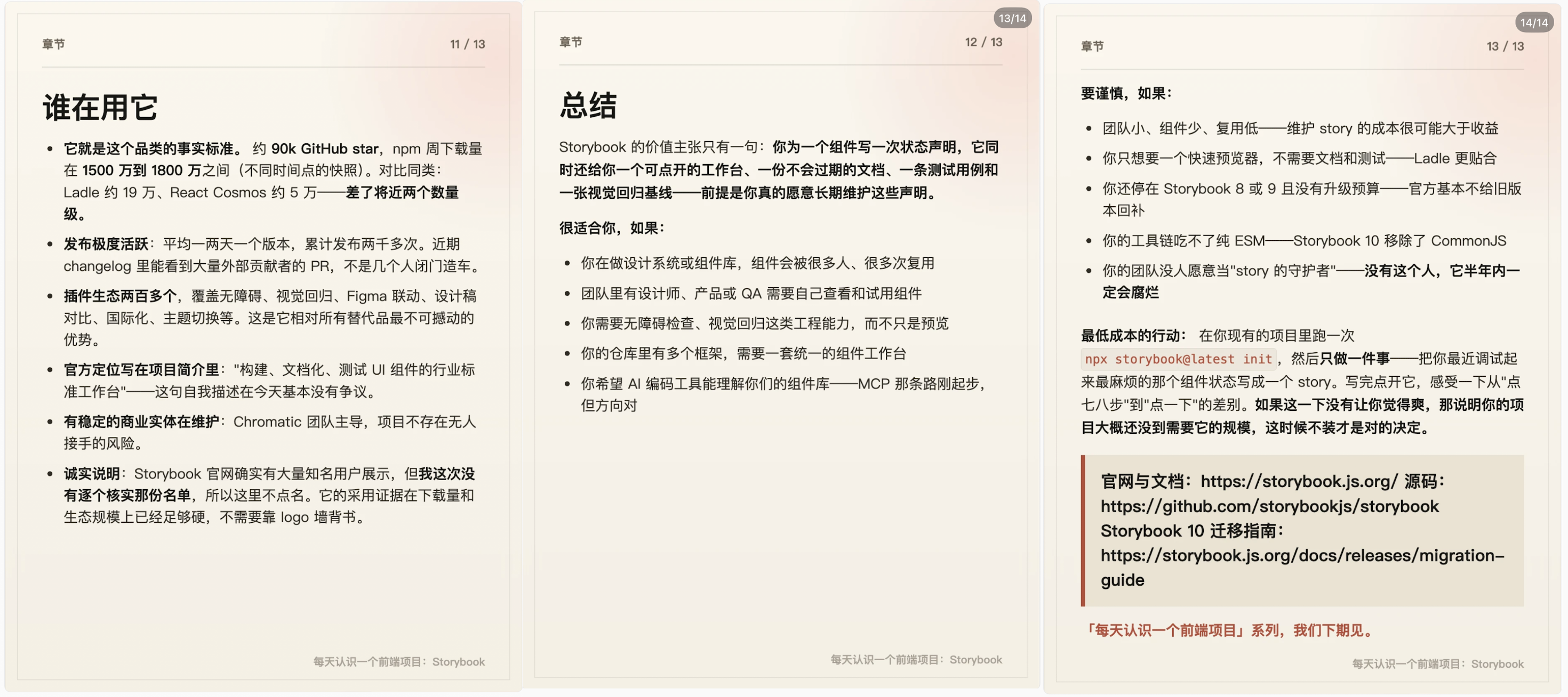
Theme Best Practice
Also it is good to bring up this blog post of mine form a while back when I build my first in-house theme based on tailwind:
█████████████████████████
Drupal Theme - Best Practice / Principal to Follow
https://blog.simon-hu.org/posts/2026/01---january/2026-01-01-drupal-theme-best-practice/
█████████████████████████
⬇️ Indicative Table of content ⬇️
DESIGN PHASE
CODE PHASE
Design Pattern & Modularity
Responsive & Accessibility
Configuration
Miscellaneous
█████████████████████████