Incentive of using CVA
My Personal Take for Why ?
Whatever front-end stack you’re working on, a common pattern that you’ll come across is “Component“, and often times, for each of the component, you will need more than one variants to use it across different scenarios.
For example, for a “Button“ component, you might need:
intentvariants: for different colour combination (e.g.primary,secondary,tertiary)sizevariants: for different padding and font sizes (e.g.xs,sm,md,lg,xl)disabledvariants: for when the button is disabled (e.g.true,false)child_typevariants: to differentiate button’s styles when its inner child is different (e.g.text_only,icon_only,text_with_icon)
**Without CVA **, you can achieve variants of the component through: hand-rolled map (manually storing the mapping from each variant to its corresponding styles/classname):
| |
With CVA (with cva(default, {...}) function), you can avoid several problems by design, below is an example of the above manual hand-rolled mapping Button component written with CVA:
| |
Below is a quick comparison table between the two examples (we’ll get back to the details in the next section):
| Concern | Hand-rolled maps ❌ | CVA ✅ |
|---|---|---|
| Shared base classes | Repeated or forgotten | First argument |
| Defaults | Ternary per prop, inline | defaultVariants |
| Variant combinations | Conditionals that keep growing | compoundVariants |
| Prop types | Written by hand, drift from the maps (using key of type of variant_map) | Built by VariantProps |
| Boolean variants | Typed as string keys ("true" and "false") | Real boolean |
Reuse on <a>/<Link> | Copy and paste | Call buttonVariants() |
Another good insentive for people to use CVA is that, the well renowned and popular ShadCN/UI component library is using CVA to manage its variants:
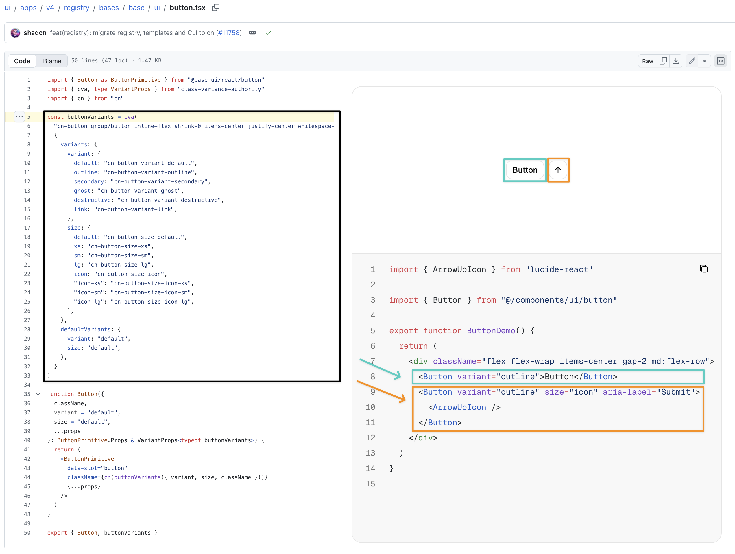
Source:
- Button Component Declaration: shadcn/ui/apps/v4/registry/bases/base/ui/button.tsx)
- Button: Component Usage: shadcn/ui official documentation > components > button)
CVA Official Documentation
cvais a tiny library (≈10KB) for building type-safe, variant-driven class names with Tailwind CSS or any other styling approach.Creating variants with the “traditional” CSS approach can become an arduous task: manually matching classes to props, and manually adding types.
cvatakes away those pain points, so you can focus on building your UI.CSS-in-TS isn’t for everyone, though. You may need full control over your stylesheet output, use a framework such as Tailwind CSS, or prefer writing your own CSS.
– Source: https://cva.style/
Why is CVA Better (Breakdown)
Type Safety (Prop Type)
- rather than the
key ofthe manually created mapping
```diff
export interface Button_withoutCVA_Props extends React.ButtonHTMLAttributes<HTMLButtonElement> {
-	 intent?:     key of typeof btn_intent,
-	 size?:       key of typeof btn_size,
-	 disabled?:   key of typeof btn_disabled,
-	 child_type?: key of typeof btn_child_type,
-    className?:  string
}
```
Types comes from the config in the CVA function:
 1
 2
 3
 4
 5
 6
 7
 8
 9
10
11
12
13
14
15
16
17
18
19
20
21
export const buttonVariants = cva( "...", { variants: { + intent: { + primary: "...", secondary: "...", tertiary: "...", + }, + size: { + xs: "...", sm: "...", md: "...", lg: "...", xl: "...", + }, + disabled: { + true: "...", false: "...", + }, + child_type: { + text_only: "...", icon_only: "...", text_with_icon: "...", + }, }, compoundVariants: [ ... ], defaultVariants: { ... }, } );Type can also be shared across different components (e.g.
<a>,<Link>,<Button>may have the same variants)1 2 3 4 5 6 7 8 9 10export const sharedVariants = cva("...", {}) export interface aProps + extends VariantProps<typeof sharedVariants>; export interface linkProps + extends VariantProps<typeof sharedVariants>; export interface ButtonProps + extends VariantProps<typeof sharedVariants>;
Concise Default Values
rather than using
variant_name ? variant_name : variant_defaultternary operation to provide the default when the variant value is not provided (nullornone):1 2 3 4 5 6 7 8 9 10 11 12 13 14 15 16export default Button_withoutCVA = ({ ... }:Button_withoutCVA_Props) => { return ( <button /* you might want to use tailwind merge to resolve potential classname conflict but here for demonstration purpose we're skipping this step */ className={ - `${btn_intent[ intent ? intent : "primary"] }` + " " + - `${btn_size[ size ? size : "md"] }` + " " + - `${btn_disabled[ disabled ? disabled : "false"] }` + " " + - `${btn_child_type[ child_type ? child_type : "text_only"]}` + " " + `${className}` } {...rest} /> ); }default lives in the same place as the variants:
1 2 3 4 5 6 7 8 9 10 11 12 13export const buttonVariants = cva( "default_classnames ..." { variants: { ... }, compoundVariants: [ ... ], + defaultVariants: { + intent: "primary", + size: "md", + disabled: false, + child_type: "text_only", }, } );
Combination of Variants (the biggest win)
instead of having to write your own logic (
if-elseinside component’s render function) to manually add certain classname when certain condition is met (e.g.if(btn_intent=="primary" && btn_disabled=="true"){className+="..."})you get to use Compound Variants feature in CVA:
1 2 3 4 5 6 7 8 9 10 11 12export const buttonVariants = cva( "base_classes ...", { variants: { ... }, compoundVariants: [ + { child_type: "icon_only", size: "xs", class: "size-6" }, + { child_type: "icon_only", size: "md", class: "size-9" }, + { intent: ["primary", "secondary"], disabled: true, class: "bg-gray-200 text-gray-500" }, ], defaultVariants: { ... }, } );
Shared Base Classes
Instead of having to repeat all identical base styling across all variants
1 2 3 4 5 6 7 8 9 10 11 12 13 14 15 16 17 18 19 20const btn_intent = { + /* ↓↓↓↓↓↓↓↓↓↓↓↓↓↓↓↓↓ Shared Classes ↓↓↓↓↓↓↓↓↓↓↓↓↓↓↓↓↓↓↓↓↓↓↓*/ + primary: "inline-flex items-center justify-center gap-2 rounded-md font-medium transition-colors ... (primary---specific-classes)", + secondary: "inline-flex items-center justify-center gap-2 rounded-md font-medium transition-colors ... (secondary-specific-classes)", + tertiary: "inline-flex items-center justify-center gap-2 rounded-md font-medium transition-colors ... (tertiary--specific-classes)", } export default Button_withoutCVA = ({ ... }:Button_withoutCVA_Props) => { return ( <button className={ `${btn_intent[ intent ? intent : "primary"] }` + " " + `${btn_size[ size ? size : "md"] }` + " " + `${btn_disabled[ disabled ? disabled : "false"] }` + " " + `${btn_child_type[ child_type ? child_type : "text_only"]}` + " " + `${className}` } {...rest} /> ); }OR declare additional
base_classvariable (but you may easily forgot to do so….)1 2 3 4 5 6 7 8 9 10 11 12+ const btn_base = "inline-flex items-center justify-center gap-2 rounded-md font-medium transition-colors export default Button_withoutCVA = ({ ... }:Button_withoutCVA_Props) => { return ( <button className={ + `${btn_base}` + " " + `${btn_size[ size ? size : "md"] }` + " " + `${btn_disabled[ disabled ? disabled : "false"] }` + " " + `${btn_child_type[ child_type ? child_type : "text_only"]}` + " " + `${className}` } {...rest} /> ); }if you use CVA the first parameter of the
cva()function if the shared styles/classnames:1 2 3 4 5 6 7 8 9 10 11 12 13 14 15 16 17 18 19 20 21 22 23 24 25 26 27 28 29 30export const buttonVariants = cva( + // Base: classes every button shares (styling/classname that are always applied) + "inline-flex items-center justify-center gap-2 rounded-md font-medium transition-colors", { variants: { ... }, compoundVariants: [ ... ], defaultVariants: { ... }, } ); export interface ButtonProps extends React.ButtonHTMLAttributes<HTMLButtonElement>, VariantProps<typeof buttonVariants> {} export function Button({ intent, size, disabled, child_type, className, ...rest }: ButtonProps) { return ( <button disabled={disabled ?? undefined} className={ cn( + buttonVariants( + { intent, size, disabled, child_type } + ), className ) } {...rest} /> ); }
Tailwind Classname Conflict
As you might have noticed in the above example, we have imported an additional function cn(), it is a utility function meant for efficiently merge tailwind CSS classes in JS without causing style conflicts.
This is because sometimes you may come up with classname such as <div class='px-2 py-1 bg-red-500 hover:bg-red-700 p-3 bg-[#B91C1C]'> ... , since all of those tokens are utility tokens of the same level, which one will take precedence will only be dependent on their position of declaration in the CSS file (which is controlled by the bundler at the runtime, hence we have no control over it), hence for the above example, we aren’t quite sure what will the final background colour applied to the <div>…
What cn() function does, is to solve the conflicting classes (e.g. bg-red-500, bg-[#B91C1C]) by solves this by understanding Tailwind’s utility structure. It intelligently removes redundant or conflicting utilities so your components can be safely customized externally: cn('px-2 py-1 bg-red-500 hover:bg-red-700', 'p-3 bg-[#B91C1C]') ➡️ 'hover:bg-red-700 p-3 bg-[#B91C1C]'
Actually, you may use either one of the approach to resolve this:
- cn (by ShadCN)
- tailwind-merge
- twig-tailwind-merge
I’m not intending to figure out the differences between the two JavaScript tailwind merge package at the moment, but maybe you should do so if you’re interested….
Competitor: Tailwind-Variants
If you’re using Tailwind, it might also worth your attention to take a look at this project: Tailwind Variants; It provides additional features including: slots, build-in merge, compound slots, , and design system-oriented API.
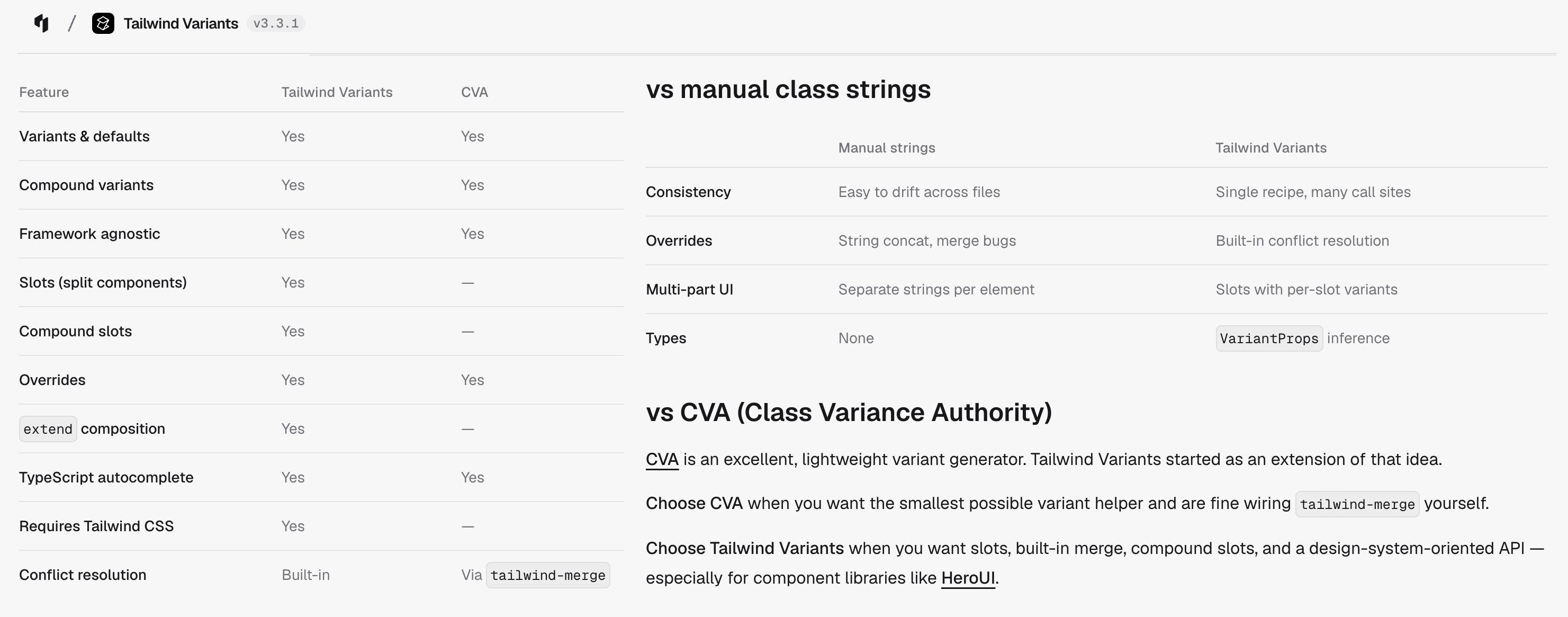
(source: https://www.tailwind-variants.org/docs/comparison)
But there are also two main drawbacks of tailwind-variants that you should consider:
- it is of larger bundle size (
≈300KBvs≈20KB) - it has less attention and downloads comparing to CVA
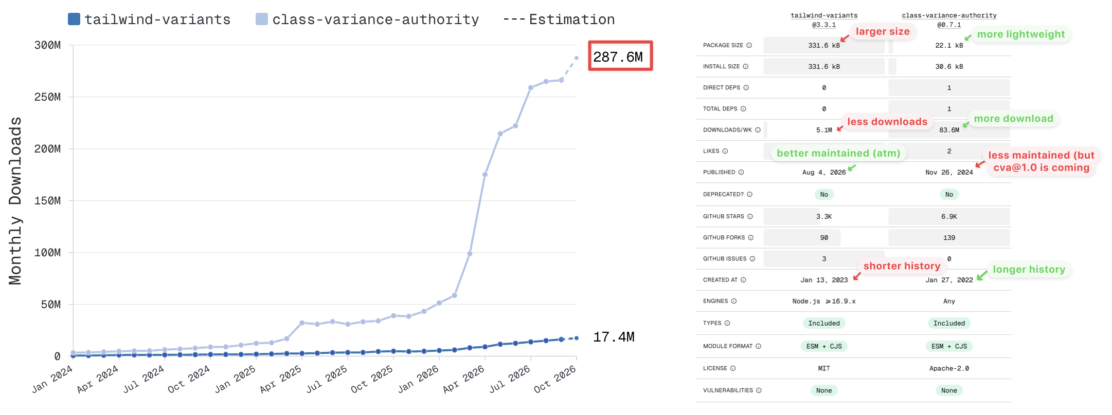
(source: https://npmx.dev/compare?packages=tailwind-variants,class-variance-authority)
Reference
CVA (class variance authority)
Merge Classname for Tailwind
- cn (by ShadCN)
- tailwind-merge
- twig-tailwind-merge
Tailwind Variants